|
Hey Reader,
Here is your tip to Engage with Ease!
Level Up Your Email Strategy with Click Maps
What’s new?
Understanding where your users click on emails is invaluable for analysing user behaviour. Each click brings the user closer to or further from completing a goal. Hence, these clicks can act as a genuine user data goldmine if studied and analyzed correctly!
Imagine being able to gauge which portion of your emails users find most persuasive or pinpoint what receives low clicks and needs extra attention. Sounds useful?
Well, WebEngage’s new feature aids with just that:
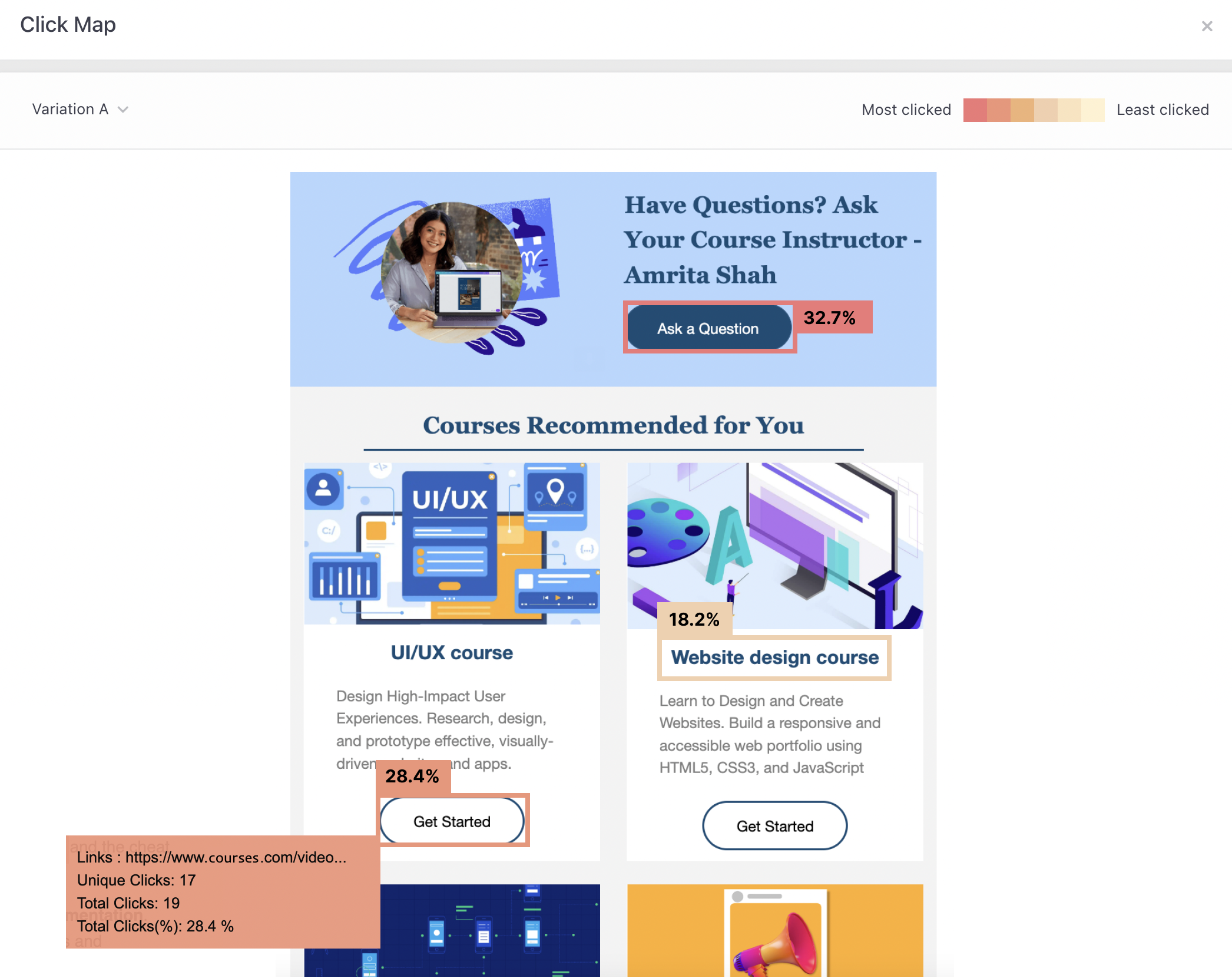
Our Email Click Maps provide a visual representation of links that users have clicked in the email. Now, you can compare link performance and understand where the users are clicking (or not clicking).

Okay, so how does this impact me?
Click maps shed light on behavioral patterns and provide actionable insights on factors such as location, design, etc., impacting the performance of links. By using click maps, you can:
- Understand user behavior and personalize user experience,
- Boost engagement and improve conversions,
- Understand what elements are performing well or underperforming,
- Update your design, marketing, and sales strategy and improve your email layout or content accordingly, and
- Return on investment (ROI) tracking; understand the response to your investment in email campaigns.
How can I get started with Click Maps?
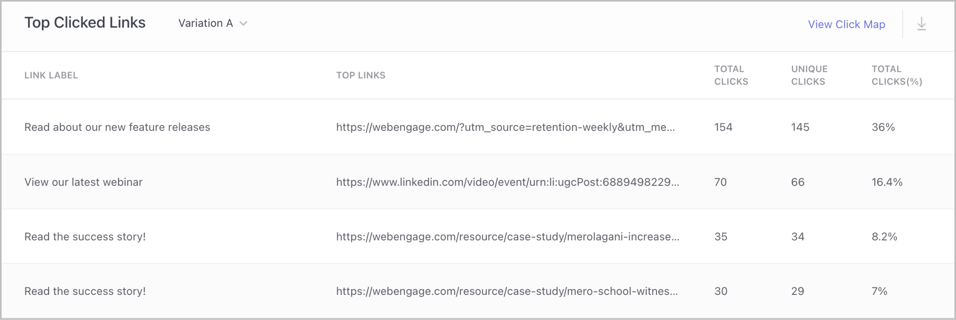
- When you analyze your email campaigns on the campaign overview page, scroll down to the ‘Top Clicked Links’ card.
- Then select ‘View Click Map’ and you will see a preview of the email and the data for each link in the Top clicked links table will be mapped to its own ‘Link Label’.

- Links with more clicks will be darker, while those with fewer clicks will be lighter. On hovering, further details of the link will be shown.
• • •
So, what are you waiting for?
Get started today
Please note: These features are currently access controlled. Reach out to your CSM or drop in a few lines at product@webengage.com to get access.
Happy Engaging!

|

Customer Data Platform
Web Personalization
App Personalization
Product & Revenue Analytics
User Segmentation
 WebEngage AI
Campaign Orchestration
Omnichannel Engagement


