


User experience is an anchor of modern business. You can’t maintain a long-term profitability if you don’t satisfy the needs and preferences of your customers. Web design plays a major role in this field because judgments on website credibility are 75% based on its overall aesthetics and usability.
Customer satisfaction ultimately influences conversion rates, so it’s very important to choose the best design solution for your company. At the moment, most designers are arguing over a simple question – which one drives more conversions, responsive or adaptive web design?
In this post, we will try to solve the riddle, so keep reading to find out!
Responsive and adaptive web design explained
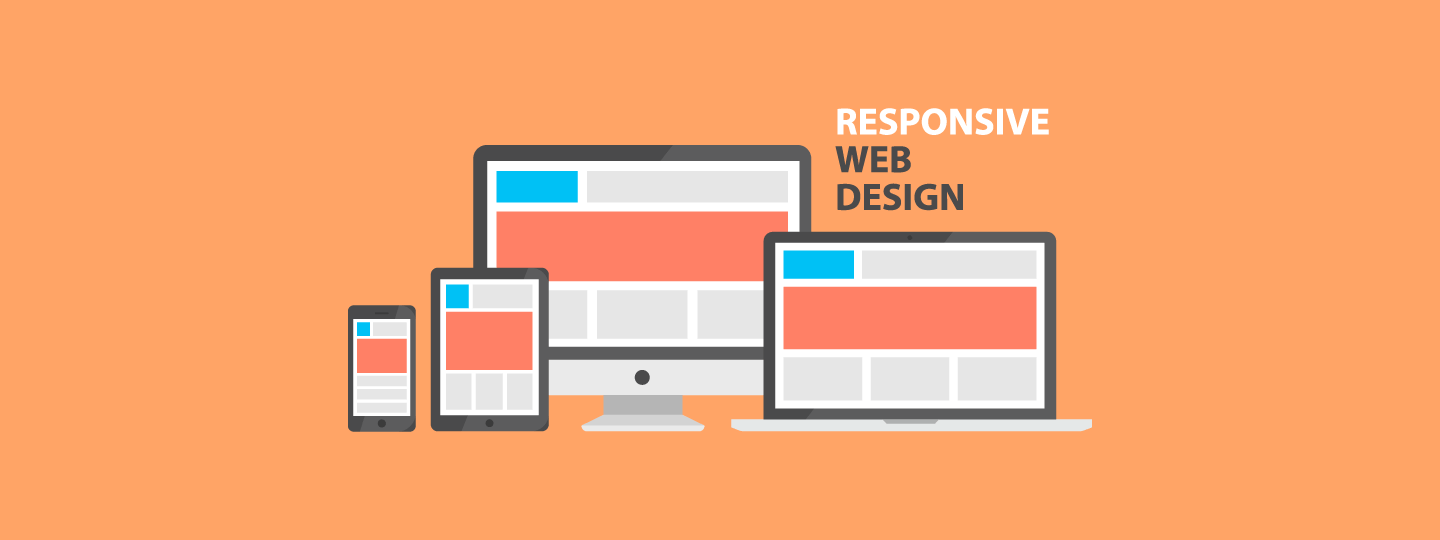
Before we move on to the conversion theme, we must explain the concepts of responsive and adaptive web design. By definition, responsive web design offers users the optimal viewing experience regardless of the device type.
To put it simply, it’s an all-around player that doesn’t require code changes for different devices – mobile, laptop, tablet, etc. Responsive design usually shrinks content on smaller windows, putting priority elements in front and improving the overall readability of the content. This strategy has multiple advantages:
- Faster mobile development at lower costs. It’s easier to make a “one size fits all” solution than to create stand-alone mobile apps
- Reduced maintenance costs as there is no need for additional testing or support
- Responsive design makes the website simple and intuitive, thus decreasing bounce rates
- Improves search engine optimization because it all comes from a single URL
- Easier website analytics and reporting since the entire traffic is coming from one source only

On the other hand, adaptive web design creates different website layouts for different devices and screen dimensions. When a user enters your website, adaptive web design immediately recognizes device type and provides a user with the corresponding layout.
Most companies develop layouts for three types of devices: smartphones, desktop computers, and tablets. Adaptive web design also has a number of comparative advantages:
-
- The adaptive design ensures faster page loads because it only delivers features needed for a specific device
- Optimized customer experience in case of multiplatform browsing
- It serves a wider audience because everyone cannot afford state of the art tools and gadgets
Subscribe to our newsletter to stay updated on the latest in B2C marketing
Responsive and adaptive design: Conversion rate
Now that we’ve seen the benefits of both web design strategies, we can conclude that responsive design makes a stronger impact on the mobile experience, while its adaptive counterpart serves better across various channels.
What does it mean in terms of conversion rates?
According to the study, the conversion rate is nearly three times higher on desktop vs smartphone. Bearing this in mind, we can say that adaptive web design could be declared a winner if your business strongly relies on desktop users.
However, the fact remains that the global PC sales is declining. While the number of laptops and desktop computer remains high – with over 260 million predicted shipments in 2018 – mobile market is growing rapidly and taking over the business supremacy.
Research shows that smartphone devices will soon drive 80% of global internet usage. At the same time, Google reports that 61% of users are unlikely to return to a mobile site they had trouble accessing. Other stats also reveal the same trend:
- Retail ecommerce sales reached $2.3 trillion in 2017, making a 23.2% increase year on year.
- Mobile ecommerce could rake in $3.5 trillion in 2022 and then make up almost three-quarters of entire ecommerce sales.
- Consumers who shop online using their mobile devices tend to spend twice as much via digital channels than those not buying on smartphones.

The stats clearly reveal that the global business is becoming increasingly mobile-oriented. As a result, websites that stick to adaptive web design might experience a declining conversion rate trend. But it doesn’t end with online conversions exclusively.
According to Deloitte, the biggest impact of smartphones isn’t direct sales generated through the mobile channel, but rather the influence they exert over traditional in-store sales to drive in-store conversion and in-store average order size.
Numerous companies already tested both web design versions to see how they influence conversions, and most of them came to the same conclusion. For example, Skinny Ties experienced a 13% conversion growth (71% for iPhone alone) since the introduction of responsive design. Besides that, the company improved a number of other indicators:
- They reached a 42% revenue growth for all devices, including a 377% increase for iPhone
- Bounce rate lowered by 23%
- Visit duration increased by 44%
Another example is O’Neill Clothing, an ecommerce store that decided to test the responsive design. They conducted a six-week trial to explore newly introduced mobile patterns, making the website fluid, increasing font size, and reducing the number of columns. As you can see, the results were staggering:
- iPhone conversions +65%; Android +407%
- iPhone transactions: +112%; Android +333%
- iPhone revenue: +101%; Android +591%

While this is only a couple of examples, it obviously reveals the potential of responsive web design and its effects on conversion rate.
There is no reason to go much further than Amazon, a game-changer in the field of online sales. The global ecommerce giant puts an emphasis on mobile responsiveness building the single column structure, keeping the critical features atop (cart, search…), and using the minimalistic approach to aesthetical elements like colors or graphics.
Therefore, you should stay up to date with the new developments in this field and test responsive web design by yourself – it could become a huge mobiles sales driver relatively soon.
Conclusion
Responsive and adaptive web design both have their own advantages and shortcomings. However, it seems like responsive design wins the battle of mobile conversions, so this may be the right way to go if your company is smartphone-oriented. But if you still expect a lot of desktop users to become your customers, don’t be afraid of embracing adaptive web design.
Bonus Read – 4 Best Practices For Conversion Rate Optimization


 Tina Verma
 Diksha Dwivedi
 Harshita Lal
 Ananya Nigam