


How do I increase my app/website engagement? What can I do to improve conversions on my landing pages? How can I convert more trial users?
A lot of people are facing these questions all the time. Luckily, for all of you who are seeking answers – look no further. This is the place where you’ll find answers with rich data and a great case study.
In this article, we’re going to see:
1. How to improve engagement on landing pages?
2. How to improve in-app engagement?
Let’s get started!
How to improve engagement on landing pages?
Landing pages are a crucial part of every SaaS marketing strategy.
That’s the moment when God flips the coin with two sides – either the user is going to sign-up or leave your website. But, can we increase the chances of getting the positive side of the coin more often than the negative one?
Besides some obvious general rules, there are some other secrets that rarely anyone is ready to share with the world. But I am.
And we’re going to see 6 actionable (and less-known) ways to improve your conversions that are backed up with actual data.
1. Make more landing pages
The unwritten rule is that the landing page should have only one offer. And yet, 48% of landing pages contain more than one offer.
Don’t be like that 48% of companies.
Instead, organize your sitemap, and create more landing pages that are dedicated to a particular goal.
For example, instead of creating one landing page for several use cases, create more landing pages where one landing page explains one use case.
Simple as that!
Making more landing pages won’t make your website more complicated. Instead, it will boost your conversions and user engagement. Data from HubSpot proves that websites with more landing pages can experience more conversions.
To be precise, companies who have 10-15 landing pages observe an increase in leads by 55%, while companies who have more than 40 landing pages have 12X bigger conversions than those with five or less.
To back this up, we asked Steven van Vessum, VP of Community at ContentKing about the results after they created more landing pages:
“By creating landing pages that focus on a specific target audience’s issues we’ve managed to more than quadruple our conversions, and double our average conversion rates. It’s all about understanding your target audience, knowing what issues they’re looking to solve, and offering them help in doing so.”
2. Let your landing pages be frictionless
What is friction in the software? Adding steps to finish a signup form or having too many fields is friction. For example, adding a credit card in the signup form would be friction.
No one likes friction. So don’t make your landing pages confusing. This sounds really obvious, but still, we’re facing a lot of friction-based websites and landing pages (not to mention apps and products).
Data from Pagewiz claims that an average number of fields and forms one landing page has is 11.
Reducing your form fields from 11 to 4 can improve your conversions by more than 120%!
Here’s a case study from Tchibo UK:
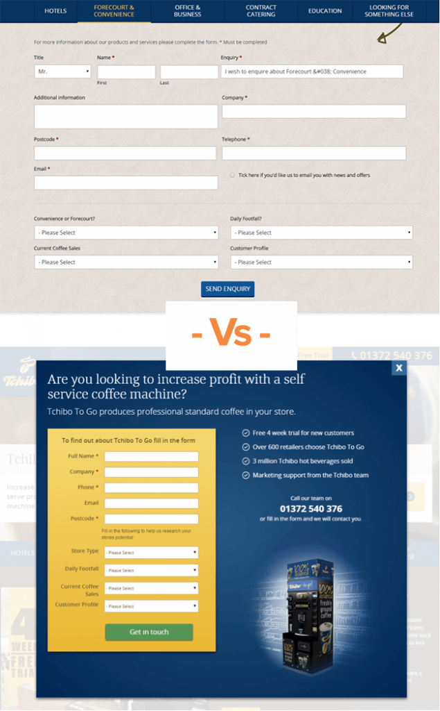
Tchibo UK realized that people aren’t coming in their sales funnel at all. After researching the problem, they figured out that their “conversion” page is full of friction. Tchibo decided to redesign their pages and the efforts paid off heavily. They saw an improvement in conversion by more than 200%.
Besides reducing the number of fields in forms, here are a couple of other actionable tips to reduce your landing page’s friction (before we see the major one):
- Make your headings clear at first sight.
- Think about your colours. Colours should play smoothly with each other.
- CTA is important. Make it eye-catching and clear.
- Surface your benefits
These are the usual and boring tips on how to improve engagement on your website. But here’s something that I’ve never seen before.
Let your website visitors know what’s waiting for them on the other side.
Don’t make them feel confused. For each website visitor, it’s important to know what to expect after they click on your catchy and fancy CTA.
Actually, this is proved by psychology.
Familiarity bias explains how people have a tendency to rather chose familiar things over unfamiliar ones.
Here’s an example:
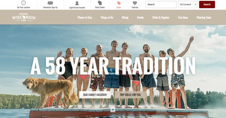
I don’t quite know their target audience, but these two CTAs are really confusing. Should I click on the “Our family vacation” or the “Trip ideas for you”? The second CTA looks more compelling, but what should I do with the first one?
On the other hand, Crazy Egg has a good and compelling CTA:
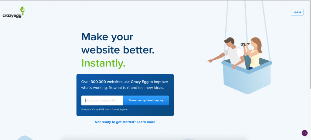
Great colors and only one CTA makes it easy for website visitors to see and react. So, in order to boost your engagement and conversions, don’t make your visitors confused, afraid or skeptical. Prove to them that there’s nothing to fear about and there is something exciting waiting for them.
3. Make ads for your landing page, not your home page
According to MECLABS, 44% of clicks generated by B2B companies direct people to the home page, instead of the landing page.
It’s obvious to lead your visitors to your landing pages, and yet, nearly half of the companies don’t do that.
Landing pages have more potential to convert people than the home page. So when you’re creating your next PPC campaign, make sure that you’re leading your potential customers to your landing pages.
Now when we’ve seen how to improve engagement on the website, it’s time to see how to improve your trial-to-paid conversions.
How to improve in-app engagement?
In-app engagement is really important for your product. It will not just improve your trial-to-paid conversions, but it will also reduce your churn, onboard users more effectively and improve your retention.
Thus, focusing on great in-app experiences that deliver real value to your users is crucial. Let’s see, step-by-step, how Albacross increased user activation rate and in-app engagement by 33% in just 14 days.
Thus, focusing on great in-app customer experience that deliver real value to your users is crucial. Let’s see, step-by-step, how Albacross increased user activation rate and in-app engagement by 33% in just 14 days.
Albacross is a B2B SaaS software that helps you to capture companies who are visiting your website.
Before using Userpilot – user onboarding software to improve its trial-to-paid conversions, Albacross struggled with activation rate, user engagement and adoption. It had a very low number of trial-to-paid conversions. And that was a big problem for the company.
For Albacross, the main user activation rates were when users’ installed the snippet code on their website and invited their team members.
Before implementing the strategies we will mention below, here’s an important stat to look for:
→ Only 20% of users invited team members, while just 25% of trial users actually installed the snippet code.
So, the question is, how Albacross improved the activation rate? What exactly they did?
4. Unleash the “Aha” moment as soon as possible
“Aha” moment is crucial for initial in-app engagement. It’s the moment when your trial users perceive the value of your product and say: “Aha! This product is really something that I can use to improve my business!”
In the 2020s, product-led growth is going to take a major part of every B2B SaaS marketing strategy, and how to unleash the “Aha” moment is going to be a part of it.
Even before you create an account, Albacross triggers your attention with an eye-catching testimonial:
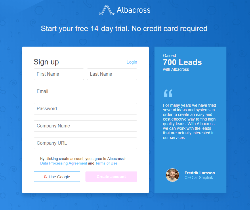
“Fredrik gained 700 high-quality leads with Albacross? I must try it.” – this is what each, new prospect of Albacross is thinking about.
5. Short user onboarding flow can be highly engaging
The era of long user onboarding process and infinite product tour is gone. Now, whenever a user suspects long and dull product tours, he’s ready to skip them and explore the product on his own.
When this happens, you’re losing the opportunity to effectively onboard your users, and thus, to improve your in-app engagement and activation rate.
Albacross did something different.
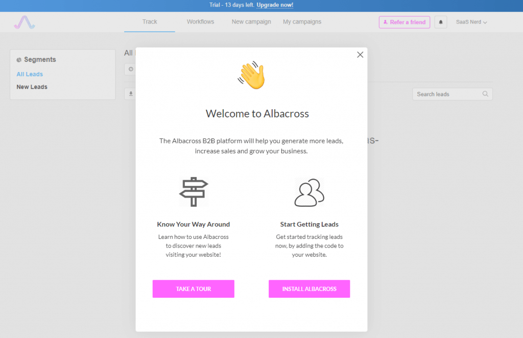
It offered its trial users to both install the snippet code and start getting leads (without product tours), and to learn the way around.
This is a great example of two things:
- It’s based on the Paradox of Choice – a psychological bias that explains how people have a tendency to make better decisions when there are fewer options.
- It has a strong copy – Start Getting Leads – sounds powerful and it entices the users
Nevertheless, both options at the end lead users to the step where they need to install the code.
After the user clicks on “Take a tour” – he’s redirected to the product, and a short, and catchy product tour is shown up:
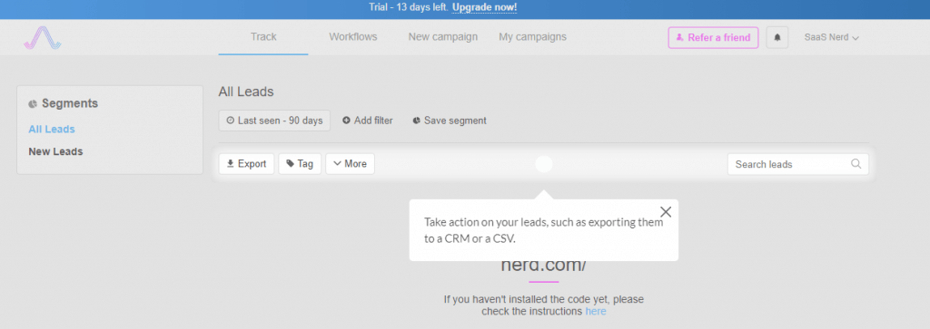
There are no more than 5 most important tooltips. Instead of a long product walkthrough, Albacross decided to create a smaller one, but only with the most important features and options.
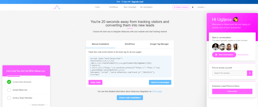
In the end, the user can see an option for installing the Albacross’s code:
And this is the moment where the magic is happening.
What can we learn from this image?
Spicy headline – “You’re 20 seconds away from tracking visitors and converting them into new leads” – entices the users and encourage them to take an action.
Great Checklist on the left – Checklists are great for improving in-app engagement. Moreover, they’re based on the Zeigarnik effect, a psychological bias that explains how people have a tendency to better remember uncompleted than completed tasks. Because of that, they’re motivated to complete the checklist.
Help desk on the right – Feeling stuck? No problem, you can always refer to their knowledge base or ask the live chat support.
In the middle of the screen, you can see exactly what you need to do. It’s clearly explained, and you also have an opportunity to import the code manually, send it to the developer or to upload it through the CMS you’re using.
A combination of all of this resulted in a 53% increase in checklist completion.
If the user doesn’t install the widget, after all, he would receive this transactional email:
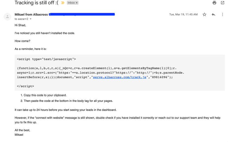
In this way, Albacross team followed up with users who didn’t install the widget on their website.
For Albacross, the combination of in-app experience and transactional email improved the “widget installation” activation event by more than 14% – while it also improved the overall activation rate by more than 33% in just 14 days!
4 things we can learn from Albacross’s success story
As you can see, Albacross used multiple techniques to improve in-app engagement and activation rate:
- Create checklists – They entice your users for action
- Don’t overdo with your product tours – Naturally, anything that forces your users to do something they don’t want will have a negative impact. So instead of creating one long and boring product tour, create multiple smaller product tours with few steps.
- Give options to your users – Don’t force anything. Instead, give them options and make them choose what’s best for them.
- Always be there to help – make sure that your team is always at the top of your users’ hands whenever they need some help.
6. Focus on Hyper-personalized user onboarding
In the last couple of years, personalization took its way in almost everything we do. You can’t make deals through outbound campaigns if you don’t use personalization in your emails.
You will convert more people if you make your landing pages personalized to your website visitors.
It’s the same in user onboarding. Personalized user onboarding will make your trial users fall in love with your product, and thus – it will improve your activation rate and in-app engagement.
For example, personalized user onboarding can increase your feature adoption by 62%.
But, the question is, how can you make your onboarding personalized?
The answer is in collecting the data about your users – but not in an aggressive way:
Venngage, an online infographic maker, does it in style. As soon as you create an account, you would be asked a couple of questions. One of them is to choose the visuals you like the most.
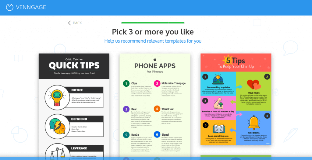
In this way, Venngage personalizes your onboarding.
For building hyper-personalized user onboarding flows, you can always use some of the free or paid user onboarding tools.
Pro Tip: To personalize user onboarding, you should ask for feedback from a new user about their first run experience with an exit intent survey.
The bottom line
As you can see, we’ve mentioned 6 different ways to improve your engagement both on landing pages and on app.
All of the ways are backed up by data or different case studies – and thus, they’re relevant and you can count on that, implementing these techniques, will definitely help you to improve your conversions.
But, here is one final advice. All of us have heard it countless times, but it’s really easy to forget about it.
No matter what – your only goal should be to provide more value than anyone else.
Keep this in mind for everything you do. Whether you’re writing your outbound emails, preparing copy for the landing pages, building the product or creating product tours.
Value is the paramount pillar of everything we do in business – it always was and it always will be.
Bonus Read – How To Choose The Right Mix Of Marketing Channels In A Multi-Channel World

 Diksha Dwivedi
 Harshita Lal

 Manoj Chawda