Table Of Contents:
1. Always be transparent when asking for opt-in
2. Use images in onboarding to speed up the process
3. Give your users a goal to work towards
4. Allow new users to browse commitment-free
5. Reduce friction & time for sign up with a social sign-in
6. Remember to consider
There are over 2.2 million apps in the Apple App store, and 2.8 million in the Google Play Store.
This means that no matter how groundbreaking, unique, or useful yours is, there’s likely not only alternatives but endless app options for mobile users to spend their time on.
This has created a real problem for app creators in the form of a steady decrease in app retention over time. As of 2018, the average app retention looks like this in the first three months of a user’s membership:
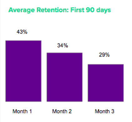
To avoid the endless, expensive loop of acquisition to speedy churn, you need to hook users and create a sense of loyalty as soon as possible, which is achieved with an immediately clear value prop and a killer first impression of your user experience.
As with many things, a first impression has the potential to make or break a new opportunity: whether that’s a job interview or a first date, you have a small window of opportunity to prove yourself.
But make no mistake:
First impressions can be tough.
If you walked into that job interview and ran your mouth about your co-worker relationship problems and your last job then went in for a hug at the end of the interview, you would confidently walk out thinking you blew it. Will they ask you back for another chance if your resume appears on their desk again? Probably not.
The reason that first impressions are tough is because you don’t know your users and don’t know how they will react. This leaves it to guesswork which can be daunting, especially knowing that mistakes can cost you: the average app can lose up to 86% of its users after their first use.
Yikes!
When you’re mapping out what that first user-app interaction is going to look like, it’s important to remember that your users are humans and that you need to appeal to human-like habits when you’re helping them learn the ropes and learn where and how to find value in your app. This is all part of great onboarding.
How to create great onboarding experience
In this post, we will outline five mobile onboarding strategies that will help you understand not only what works but also highlight the behavioural science behind it.
The key for each of these is to always think with a user- first mindset. The more you understand how the user mind works, the better you can appeal to their wants and needs as you roll out the welcome mat.
Stranger Danger
1. Always be transparent when asking for opt-in
Onboarding is the prime opportunity for you to lock in engagement and retention, provided you can score opt in for some levers that will help you out: things like push notification opt-in and location service permission can help you send personalized content that re-engages users. Push alone has been credited for an 88% increase in engagement in apps.
But gaining opt-in status is no mean feat – opt-in rate can be as low as 39% , which would put you out of touch with more than 60% of your user base.
This is because users are often given absolutely zero context about why they should opt in or what their information is going to be used for. All they get is the default pop up that they’ve trained their brain to tune out.
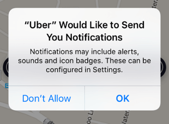
Think about the classic scene in those high school movies where someone is meeting his girlfriend’s parents for the first time. The first question Dad always asks is:
“What are your intentions with my daughter”
Your user has the same question:
“What are your intentions with my personal information”
In a study about what information users are willing to part with and why (not), SAP found that 66% of users expect brands to be transparent with how they will be using users’ personal data.
That just makes sense in today’s landscape – data breaches are happening left right and center, so users are becoming more and more reluctant to dish out their information. Naturally, location or permission to receive intrusive personal messages are things that they are especially wary of giving out to strangers.
How to fix this:
When you are asking for opt-in for push notifications or location, you need to tell your user what this data will be used to do. It’s what modern mobile consumers expect.
Not only that, but it proves that there will be a real value from opting in. If you’re able to show them that the messages aren’t spam, rather tricks meant to enhance their experience, you’ll get better buy-in.
A brand which does this really well: Hopper
The concept of the travel planning app relies heavily on push opt-in to notify users of trip updates they’ve subscribed to watch. Their product is, essentially, useless if it can’t remind people of flight price drops.
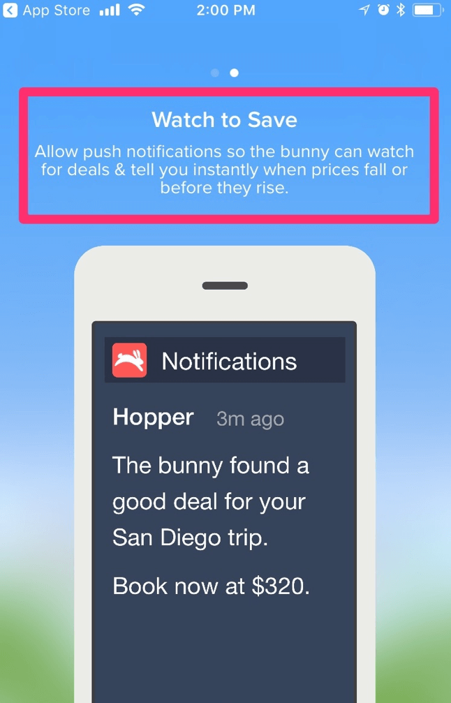
To make sure users understand this key value proposition, Hopper explains why you need to opt-in to take advantage of the product’s full value as part of their onboarding.
Ain’t nobody got time to read that!
2. Use images in onboarding to speed up the process
Onboarding tutorials are great. Not having one is like throwing your user in the deep end and hoping they learn how to swim really quickly. Not only does this risk the creation of frustrated users, but also puts the user in a position to churn faster because they haven’t discovered all of the tricks and features to turn them into a power user.
Not so fast though.
Sometimes, the tendency can be to tell users about all of the things that make your app great:
These are all of our awesome features!
Here is a list of shortcuts you need to be a power user!
This is how you access your account details!
The problem is that all this talk will get you tuned out really quickly. Vevo found in user testing that many users just swipe through text-heavy tutorials without reading any text.
Human psychology explains why visuals hold our attention better than text. We can process images in a 1/10th of a second and understand visual content 60,000 x faster than words. This means that if you’re trying to communicate a lot of important information, it’s best done through images.
How to fix this:
Since users don’t want to spend too much time onboarding, help them quickly process images instead of having to slowly read through text. Engaging them with images instead of adding points of friction will improve the user experience.
A brand which does this really well: Handy
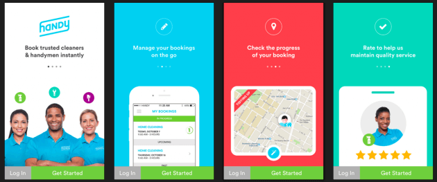
Handy’s onboarding tour is a series of pictures, each accompanied by only a few words at most. This helps the user quickly understand some important tips.
Progress for the sake of progress
3. Give your users a goal to work towards
Are we there yet? Are we there yet?
That’s what users are thinking as they onboard if there isn’t a progress bar. Humans are goal-oriented beings, and often feel lost without one.
Dr. Brad Myers explores this psychological phenomenon in his paper “The importance of percent-done progress indicators for computer-human interfaces”.
The TLDR; respondents preferred to have some indication of progress, and progress indicators increased respondent satisfaction and engagement in the study.
If users are feeling impatient with the number of steps with no end in near sight, then they’ll drop off.
How to fix this:
If this is an area of onboarding that you are particularly struggling with, the solution to this problem is quite straightforward: add a progress bar. According to First Round, it can increase conversions by up to 40%!
To make the implementation of your progress bar extra successful, keep in mind that as humans are we most satisfied by progress, so have a number of steps to completion that’s small enough that each one will make a significant dent on the bar.
Incognito is in style
4. Allow new users to browse commitment-free
SEO and webmaster tool Monsido wrote about how they increased their conversion rate for the free tool to 96% by changing just one button. They changed the copy from “create my account” “Get your FREE website review”
This demonstrates just how easy it can be to improve your conversion. But that’s not what I wanted to point out.
There was a significant drop off when people thought they had to create an account to get their free website review. The thought of having to create an account to get the review was too much apparently.
Often, users don’t want to create an account in order to start browsing and finding value – only when it’s absolutely necessary do they have to, like when it’s time to checkout, or make reservations, etc.
This could be for a few reasons:
Sometimes we are skeptical of the value we will be able to find so don’t want to go through all the effort to find out it was a waste of time. Sometimes we think we ‘don’t have the time’ to make the account because we are too impatient.
How to Fix This:
Whatever the case, humor your users and let them find value from your app right away to get them hooked. The idea behind this is that later they won’t mind having to finally create an account because they are confident in the value that it will bring them, as they’ve found what they’re looking for as they browsed.
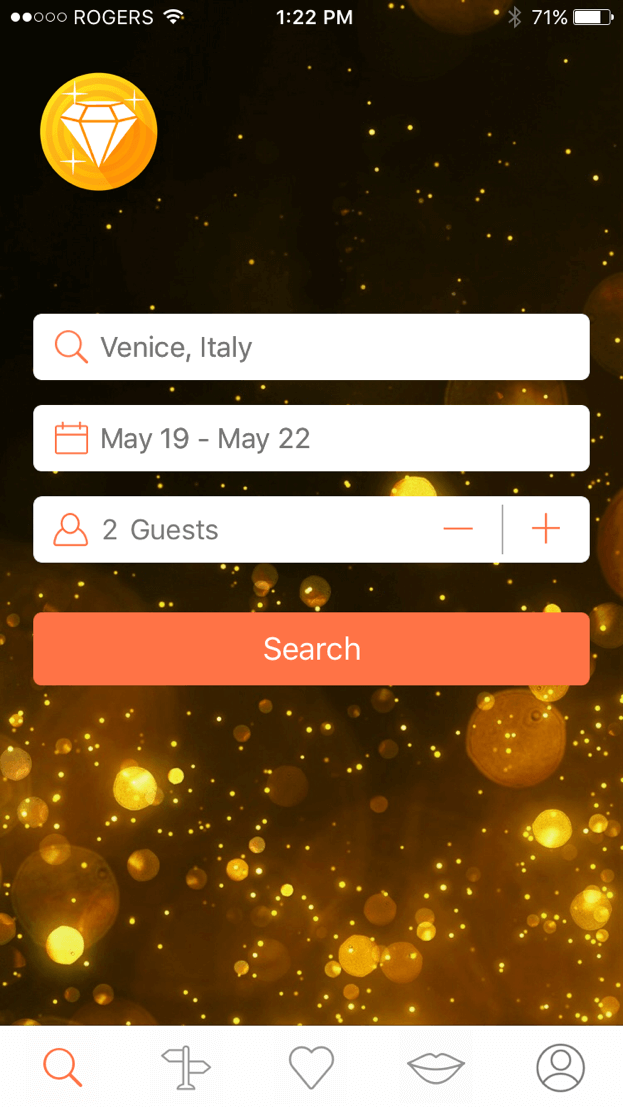
A brand which does this well: Hostelworld
You can browse properties, view prices, read reviews and content without having to sign in. Only when you’re ready to make your reservation do you have to sign up or in. This makes for a really great experience of confidently finding the information you’re looking for before sinking time into an account creation.
Get social to save time
5. Reduce friction & time for sign up with a social sign-in
We are impatient beings – we want everything to take as little of our precious time as possible. Signing up and making an account (and another password that we are going to forget) is too much for us – 86% of users report that they’re bothered by having to create new accounts on websites.
We talked earlier about the example of Monsido and their conversion miracle. But what happens if they really do have to create an account right away? How are you supposed to avoid a high abandonment rate?
How to fix this:
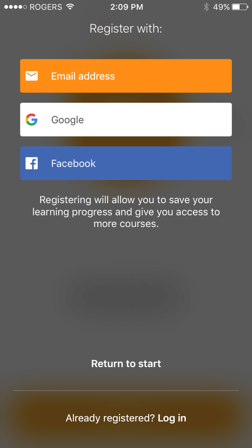
77% of users believe social login is a good registration solution, so that’s a pretty good place to start. Having the option to click one button instead of going through an entire sign up flow (oh the horror) reduces the friction in the onboarding process.
You’ll also be pleased to know that social sign-ins increase conversion rates from anywhere from 20-60%.
A word of caution: Be wary of giving too many options for social sign in. Offering too many can overwhelm users and create a drop-off.
Language learning app Babbel does this well by offering manual registration, with 2 social sign-in options to keep it simple.
Great onboarding starts with a great understanding of your audience
We’ve learned here today that mobile users are protective of their personal information.
They are impatient.
They are skeptical.
They are goal oriented.
(and, honestly, they’re pretty demanding)
But we can’t do anything about that.
What we can do is appeal to each of these qualities with onboarding flows that roll out the welcome mat to mobile experiences that are helpful, intuitive and captivating.
Remember to consider:
- Transparency when asking for opt-in
- The ease of using images, not words, in product tours
- Motivating users with a progress bar
- Allowing users to browse without committing
- Reducing sign up friction with social sign in
You don’t get another shot at that first impression, so do it right!
Bonus Read – Boost Mobile Conversion Rates By As Much As 40%




 Diksha Dwivedi
 Surya Panicker
 Vanhishikha Bhargava


