Conversions are pretty much the key to any good business, right? Everybody knows that. You can’t really have a business if you don’t convert leads into customers and make sales. So you’ve gotten your website completely optimized and it’s doing really well with people…at least, it’s doing really well with people who are viewing it on their laptops or desktop computers.
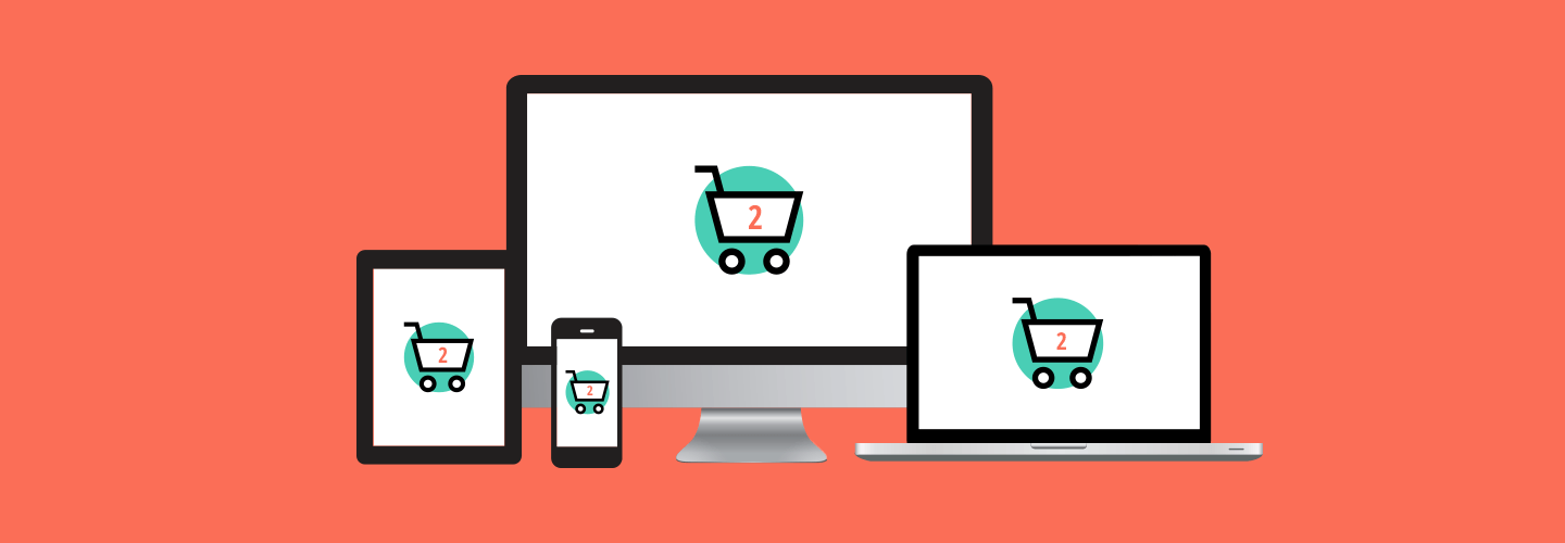
However, and especially since Google’s serious crackdown on mobile responsiveness, it is absolutely essential that your website also converts well over mobile. 80% of customers use their smartphones to shop and 70% of online searches end in a conversion within an hour. So if your website and landing pages aren’t mobilefriendly, you are seriously missing out.
Let’s be upfront about this. Just because your website is mobile responsive doesn’t also mean that it converts well. Sometimes mobile adaptations of your website cause important information to be below the fold or it takes way too much scrolling time. Here are some tips for really amping up your mobile website conversion rate, so that everyone shopping your website on mobile leaves with a purchase.
1. Less is more
For obvious reasons, smartphones do not have the screen capacity that a laptop or desktop computer does. This means that a landing page on a computer (that already takes some serious scrolling time) is going to triple the scrolling time. People are going to get sick of it and leave your site, causing your bounce rate to skyrocket.
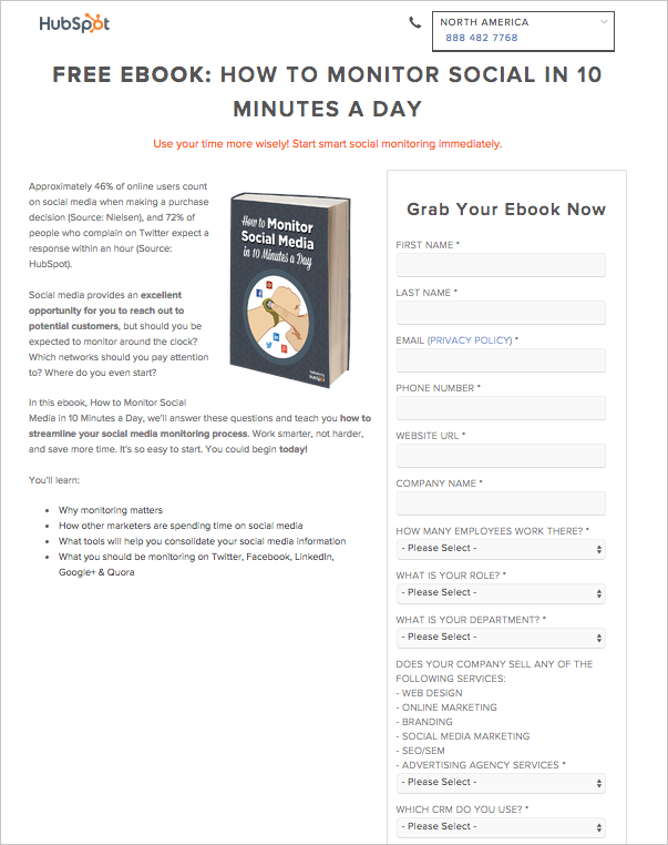
Let’s go over this example of an update that HubSpot made to one of their landing pages to make it convert better on mobile devices.
They made some simple changes to it and were able to turn it into a fourscroll process, which cut their previous eightscroll process in half. This increases the likelihood of a new mobile lead because signing up for the ebook is now so fast and easy.
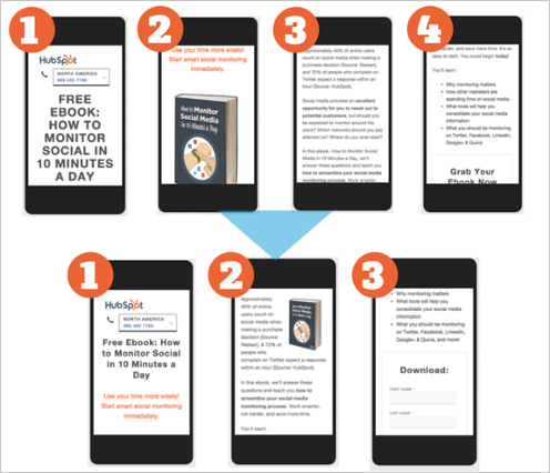
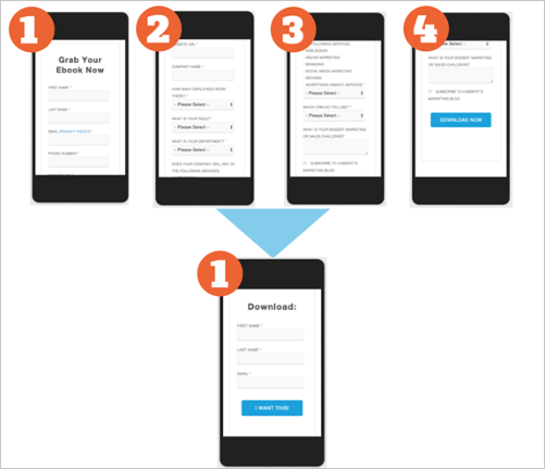
See what we mean? Less is more. Don’t try to cram a bunch of copy onto your landing page. Get straight to the point. People are looking at your website on their mobile device for a reason. So give them what they’re looking for right upfront.
2. Don’t use popup banners
Popup banners are a great way to get more conversions on a desktop, but on a mobile device, it doesn’t really work. So if you’ve ever considered using a popup banner on your mobile website, then we need to have a serious talk.
Don’t. Do. It.
Ever.
Pop up banners on mobile devices will absolutely kill your conversion rate. Popup banners disrupt the buying mindset that your mobile viewer is already in, potentially losing you a sale. (And you do not want that to happen.) You want the mobile user experience to be as quick and seamless as possible.
So when it comes to popups, void it from mobile devices.
3. Give your readers a sense of urgency
Sure, any good e-commerce site is going to create some type of urgency. And they are able to do it by making use of the psychological trick called the theory of FOMO.
FOMO stands for Fear of Missing Out and as you could have guessed, it has a major influence on how consumers behave.
So how do you apply this theory and create some type of urgency? Methods to how you use the theory of FOMO is really up to your creativity. One of the most common and effective ways of creating this urgency is by throwing a special offer into the mix.
Let your mobile users know that you know that they’re visiting your site on a mobile device and that you have a special offer specifically for mobile shoppers only. Since a lot of mobile shoppers are just “window shopping,” this compels users to buy now rather than putting it off until later or until they’re on a desktop computer.
Create an offer like a “buy one get one free” or free shipping or 15% off. Make the offer even more urgent by telling them that they only have 24 hours to buy after putting something in their cart to get the special discount.
4. Create a visible call to action

Depending on your business, sometimes a phone call converts way better than anything else on a mobile device. Don’t make it difficult for potential customers to find your phone number and call you. Create a big, bright, attentiongrabbing button in the middle of your landing page that says “Call now!” that mobile users can click and immediately call your business. Facebook advertising also has a clicktocall ad type for mobile ads as well, so you can also easily take advantage of this.
If your business does well with email leads or sales over mobile, then make your “Download”, “Buy Now,” or “Checkout” calls to action just as easy to find. Tell your website users exactly what you want them to do.
5. Quicker mobile checkout
If you haven’t already gathered this, we want everything over mobile to be as fast and painless as humanly possible. 1, 2, 3, over and out. Sold. Bam.
Your people don’t want to fill out an endless form or go through multiple checkout pages. Instead of simply creating a mobile checkout that mirrors your desktop checkout, design a mobile checkout that requires as little information as possible.
Allow users to process payments via credit card, PayPal, or even processes like Amazon Payments. Have Google Maps fill in addresses, include a visual calendar for dates, and don’t require long forms to be filled out.
By keeping the process as short as possible, you’re decreasing the possibility of shopping carts left abandoned and sales being lost.
6. Limit the number of images
A large number of images can slow down your website like crazy. One of the top reasons for mobile users to click away from your website is a long loadtime. Not only can this lose your business potential sales, but it hikes up your bounce rate like crazy. Make sure that the images for your mobile site have smaller sizes and can adapt to the various screen sizes (mobile vs tablet).
Rule of thumb is to have about five product photos per page. However, if that is bogging down your site, try to limit it to only one feature photo on the main page, with secondary photos posted on a different page.
User experience is everything on a mobile device, and a slow load time does not give off a good user experience. Focus on finding a way for each page of your website to load within 3 seconds on a mobile device, to ensure that nobody exits out of your site.
7. Create a smoother navigation bar with increased spaces
People can be clumsy with their iPhones. We’ve all had that unfortunate phonefallingonyourface moment. And sometimes we also accidentally click a link that was way too close to the one that our thumb was trying to get to.
Don’t let that happen to your customers. If there is anything clickable, keep it a safe distance away from other clickable links. Involuntary clicks can increase your dropoff rate when people get frustrated that they can’t get to where they want to go on your mobile website.
8. Keep users engaged
If a mobile user lands on your website and is immediately faced with a wall of text, that could be pretty daunting and they may just leave your website because they don’t want to read it all.
Instead, start with an engaging headline, videos, or image slides. Incorporate contests and games into your website and landing pages. Do not let new visitors be prompted with the dreaded wall of text. Mobile users tend to have a lower attention span than desktop users and all they want is to find exactly what they’re looking for without having to read a novel to find it.
9. Only include the most relevant content
This goes slightly back to rule #1: less is more. On a desktop sales page, you want to provide as much value as possible. You want a long form sales page with testimonials, product shots, pain points, and more.
For a mobilefriendly sales page, you want only the most relevant content to getting a sale. You want the most important content for your product/service to be above the fold. (On a mobile device, this means the first section of content that they see without scrolling down.) Many mobile responsive websites adapt to only show the product image above the fold. You need to manipulate this so that only a small scroll shows pertinent product information and users don’t feel like they’ll be scrolling forever so get all of the info.
10. Allow the user to switch devices
We don’t ever want to omit the idea that oftentimes people on mobile devices are only window shopping and they will only make the purchase when they get onto a desktop computer. You always want to make it easy for those people.
Give the people what they want by offering an option to get the shopping cart or website in an email so that they can pick up where they left off from a different device. Create call-to-actions like, “Want to discuss this purchase with your spouse? Email it to yourself!” or, “Shopping at work? Buy when you get home!” so that they have an incentive to save their shopping cart for later.
Regardless of how well your website does with mobile conversions, there always will be those people who are mobile shoppers and desktop buyers. Don’t ever miss out on those sales and implement an “email shopping cart” option today.
Let’s recap: mobile responsiveness and high mobile conversion rates are not the same. Even if your website does adapt well to mobile devices, that doesn’t necessarily mean that it converts well. With a whopping 80% of people using a smartphone to search the internet, you want to make sure that your website is fully optimized for high mobile conversion rates. Take all of these recommendations under your wing and begin implementing them to create a seamless mobile shopping user experience.




 Harshita Lal


 Amit Shinde
 Priyam Jha
 Diksha Dwivedi