Everyone has a smartphone, and it’s never far away. People walk, talk, cook, watch TV – you name it – with their phone in hand. In 2022, 92 percent of the time Android users worldwide spent on mobile was occupied by engaging with mobile apps and gaming. How do you successfully engage new users and retain existing ones?
In-app Messages can do just that, enhancing a user’s experience and increasing user loyalty. In the latest Mobile Engagement Benchmark Survey, they found that in-app messaging typically receives 8x the direct response rates of push notifications and companies using in-app messaging increased their user retention by 3.5 times compared to those who didn’t use it at all.
How are in-app messages different from push notifications?
In-app messages and push notifications are key tools in mobile marketing, often used to engage and retain users. However, they serve distinct purposes and appear in different contexts.
In-app messages
These notifications occur within the app’s interface. They’re highly contextual, targeting users based on their interactions and behaviors within the app. They are commonly used for guiding users during onboarding, announcing new features, asking for feedback, or promoting special offers.
They are designed to enhance the user experience by providing relevant information or offers. For example, a tutorial pop-up in a new feature or a special discount offered while shopping in the app.
Their characteristics include:
- They are shown when the user is active in the app, making them more context-specific.
- They reach all active users, not just those who have opted in.
- They aim to add value to the ongoing user interaction.
Push notifications
In contrast, push notifications appear outside the app, typically on a user’s lock screen or notification tray. They are designed to engage users who are not currently active in the app. Push notifications can alert users about new messages, remind them of incomplete tasks, or inform them about important events related to the app. For instance, you might receive a push notification about a special offer or an important update.
Their key features include:
- They can reach users outside the app.
- Users must opt-in to receive these notifications.
- Ideal for urgent messages.
What are the pros and cons of in-app messages?
In-app messages are a powerful tool for engaging with app users, but like any tool, they come with their own set of advantages and challenges.
Pros:
- In-app messages can significantly improve the user experience by providing timely, relevant information or assistance. For example, guiding users through new features or offering personalized recommendations.
- Unlike push notifications, in-app messages aren’t limited by word count, allowing for more detailed communication and more significant product announcements.
- Since these messages reach users while they’re active in the app, they tend to have higher engagement rates compared to other forms of communication.
- In-app messages can be highly targeted based on user behavior, preferences, and demographics, ensuring that the content is relevant and engaging to each user.
- They allow for immediate user feedback, which can be valuable for quick iterations and improvements.
Elevate your App’s user experience with WebEngage’s In-App Notifications.
Cons:
- If not used thoughtfully, in-app messages can become intrusive and annoying. Finding the right balance and timing is crucial to avoid negatively impacting the user experience.
- They only reach users who are actively using the app, missing out on those who aren’t regularly engaged.
- Crafting messages that fit seamlessly into the app’s design and user flow requires thoughtful planning and design resources.
- When used excessively for upselling or promotions, in-app messages can frustrate users. It’s essential to strike a balance and ensure that such messages are timely and relevant.
11 in app messaging best practices for enhanced user engagement and retention
Best in-app messaging requires a balance of timing, content, and strategy to impact your user to take action. Here are some in-app notifications best practices that will resonate with users and encourage continued engagement with your app.
1. Segment your audience to maximize campaign effectiveness
Sending the same message to every user isn’t effective. Customers expect a personalized experience, which is why segmentation is so effective.
By combining demographic information like age, sex or location with behavioral attributes like purchase amount, purchase frequency or search intent/query, you can create a highly accurate user profile that can help you create really diverse, but specific audience segments with unique characteristics. By understanding your users better, you can be acutely aware of their needs and motivations, and this can help you create highly contextual campaigns that convert.
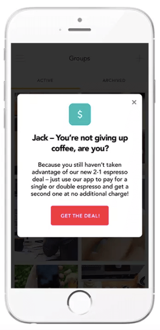
Take a look at the in-app message below. It was sent to a segmented group of users that didn’t take advantage of an earlier promotion. The message even includes the user’s first name, Jack. This is segmentation and personalization at its best:
2. Onboard users with the most important information
Onboarding is one of the most common uses of in-app messaging and can help you increase retention rates by over 50 percent. To onboard a user, you send specific messages that help a new user get familiar with your app. It’s a great way to help users get acquainted with the features you offer, but a lot of brands make mistakes here.
The trick is to not overwhelm your users with too many messages and unnecessary information. To onboard properly, figure out the most important features of your app and streamline the app’s intended usage, thereby creating a standard operating procedure. Remember, you can always reach out later to highlight an underutilized feature or something new. For now, focus on what your newest users need to know to help them get onboard quickly. Of course, the problem-solving element/USP of your app should be the destination in all cases.
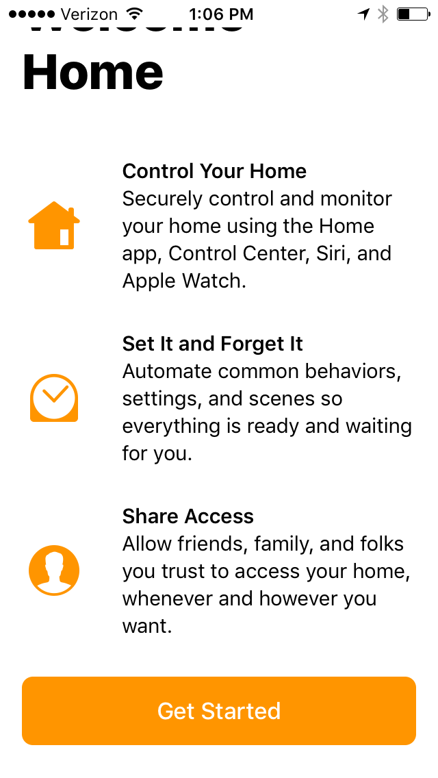
Here’s an onboarding message that focuses on three key features of Apple Home. It’s clear, simple and gives the user a “Get Started” button to move on.
3. Retain existing users
In-app messaging can improve your relationship with existing users as well as new ones. Focusing on retention is important, especially because research shows the probability of selling to an existing customer hovers between 60-70%, while selling to new customers is less than 20%, according to SmallBizTrends. Create an in-app messaging campaign that’s targeted toward the behavior of existing users. In-App messages should feel organic and act like a natural extension of the app in order to have really strong engagement. If your In-app campaigns are too sales-oriented and disrupt the user experience by being irrelevant, then they will fail to engage.
- Analyse the intent of your users to highlight a usage pattern.
- Extrapolate the user’s key motivations that affected their purchase decision making in the past
- Use predictive suggestions that are going to influence the user’s decision-making process
- Leverage personalization tokens from both personal and behavioral attributes in your messaging to create a highly targeted, custom campaign.
- Send In-App campaigns at the right time to the user to maintain high relevance of your campaign
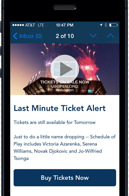
Here’s a great in-app message that’s offered to existing, VIP customers:
4. Create compelling headlines
The headline is the first thing users see, so make it impactful. A great headline will virtually guarantee to capture the user’s attention and egg them to read on and not try to skip the message. With the limited amount of space available, headlines have the make-or-break element for each In-App campaign.
Remember, you’re working with a small space and a limited number of characters. Obviously, referring to UX top tips will help you choose the right text color that stands out and a font that’s easy to read. Secondly, hyper-personalize the message
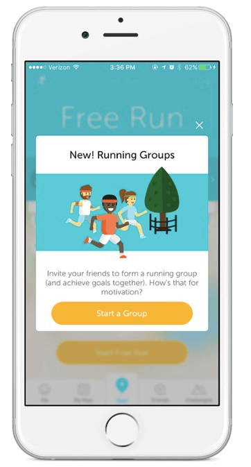
Here’s a great example of a smart headline from an exercise app. It’s short, noticeable and tells the user exactly what the message is about.
5. Design with the user in mind
When you create an in-app message, your focus is naturally on the text. What should the message say? How should you say it? What do you want the user to know? It’s understandable. Creating the actual message is important, but if the design is wrong, even the best-written message in the world is pointless. Here are some great design tips from LeanPlum to explore as you design your next message.
- You need a clean, minimal design. Create an organized format to showcase text.
- Use headlines, a short message, and use bullets or icons to create a list, if necessary.
- Don’t be afraid of white space either. You don’t have to fill every inch of the screen with your message.
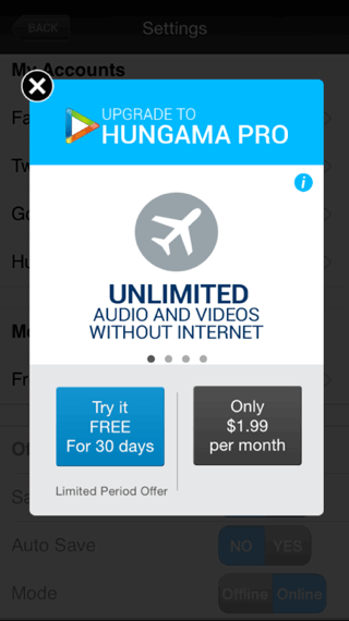
Here’s a great example. This message includes a title, logo, message and two calls to action all in a neat and tidy design. The use of an image carousel, where the benefits of upgrading change automatically, gives the brand a chance to provide more information without cluttering the entire screen.
6. Don’t be afraid of images
A clutter-free design doesn’t mean you can’t embrace images or video. Both forms of rich media can provide a great user experience; so don’t be afraid to use them. In-App messaging lets you use images that add a solid visual punch to your communication. That said, you have to create a design with them in mind.
Pick images or video that you want to use first and design the message and additional elements around it. The image should be captivating and relevant to your messaging, so much so that they convey the underlying theme with subtlety.
Here’s a great example that uses a vibrant picture in the background. The text, message placement and call to action were all designed to work with the image.
7. Let your logo dictate your color scheme
Your branding should be consistent and resonate the app experience with the colors being used. This will build a strong brand association in the mind of the users whenever they see the color scheme. Picking a color scheme for your message can be tricky. If you plan to put text over an image, your color scheme is likely already dictated since you’ll need a text that’s readable on top of the image. But, if your design possibilities aren’t restrained, consider using the colors of your logo as your color scheme.
Most brands have a color scheme that’s weaved through its logo and influences in all branding. Why shouldn’t it influence your design choices for in-app messages too? Using your brand’s colors makes for a hassle-free color choice and it reinforces your brand.
Apple’s Health App does a great job pulling its logo colors through its messaging. The logo is the little pink heart at the top. Notice how the color pink from the logo is used throughout the message.
8. Create a can’t-miss CTA
An in-app message is nothing without a vibrant call to action or CTA. The call to action is ultimately what you want users to do, whether it’s to create a profile, learn about new features or redeem a promotion, which is why it’s very important.
Creating a simple button might not seem like a hard task, but there’s a lot to consider. What color should the button be? What should it say? What font should you use? These are all valid questions, and there aren’t any definitive answers.
However, you want a CTA to stand out, so use a color that pops. The text inside the button should only be about two words and most CTA’s sit at the bottom of the message.
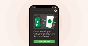
Here’s a can’t-miss CTA that encourages users to make an upgrade:
9. Get the timing right
In-app messaging is all about timing. The messages you send have to make sense of the customer journey. For instance, after a user has finished a certain level in a game, you might ask them to purchase more lives, or when a customer spends a certain amount of money, you’d offer them a discount as a reward.
The idea is to send messages that make sense to the user at the time. Contextual relevance will dictate the engagement statistics of each and every campaign, as the right message at the wrong time will not have the intended results because it will be irrelevant to the user.
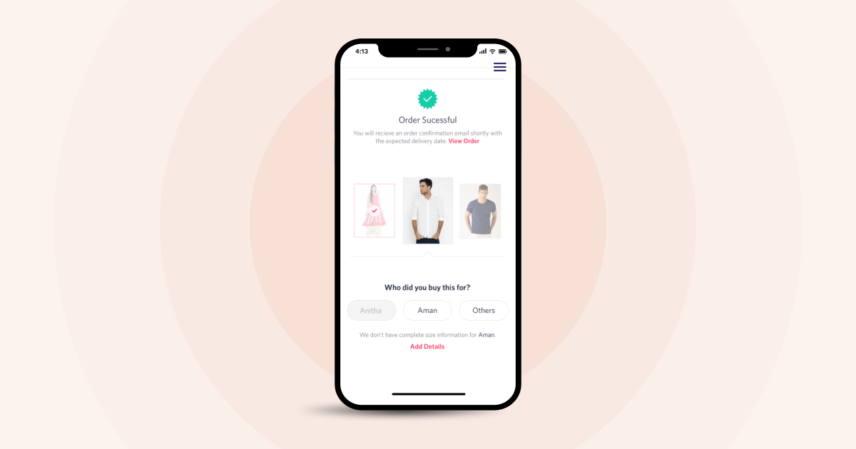
Here’s a great example of an in-app message that asks the user for feedback. The message is prompted by a recent purchase so the timing makes sense.
By paying attention to the time you send messages, you’re more likely to get higher response rates. To do so, you’ll have to mine your metrics for the best times to engage your users.
10. Cross promote products and channels
In-app messaging can grab the attention of your most engaged customers so it makes sense to send some cross-promoting messages. Cross-promote other products you sell or channels that you use to reach customers.
You don’t want to go overboard with cross-promotion, but it’s okay to do a little self-promoting every once in a while.
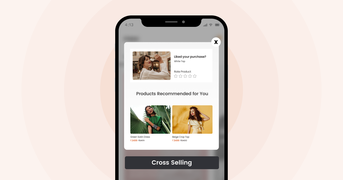
You could encourage shoppers to: follow you on Facebook, enter a contest that’s held on Instagram, join your email list, buy an accessory to a product they already own, introduce users to a new product, or encourage him or her to download another game or app that your brand offers.
Here’s an example of a cross-promotion that encourages a current gamer to download a new game:
11. A/B test all your campaigns
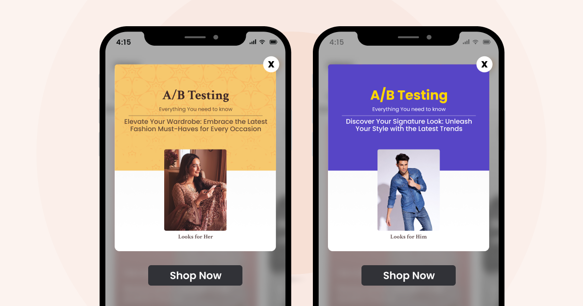
Now, there can always be more than 1 right way of making an engaging in-app message. You can try to incorporate all the best practices, but at the end of the day, it is the users who will define the success or failure of a campaign. With A/B testing, you can run multiple iterations of campaigns for different users and segments, and comparing the resultant performance data with user profiles will help you understand the underlying reasons behind user interaction, and why users did what they did.
For any campaign, prepare 2 sets of message copy and have multiple color themes along with CTA design. This will help you pinpoint the exact elements that work for a particular audience, and your campaigns will have a definite edge in the future.
Wrap Up
In-app messaging has the power to connect brands with customers in a personalized way. It provides a new platform that brands can utilize to build relationships with customers and promote long-term relationships. They allow marketers to reduce bounce rate and increase the amount of time spent on the app.
While in-app messages are effective, they’re only as powerful as the practices you use. These ten in-app best practices provide the guidance any marketer needs to ensure marketing success inside the company app.
To create effective in-app messages that connect with your audience and increase customer engagement, see how WebEngage can help.
Download E-Book – A Marketer’s Guide to In-App Messages


 Prakhya Nair
 Diksha Dwivedi