How do you improve your website conversions? After running hundreds of A/B tests and managing several conversion optimization teams across multiple companies, I’ve found some conversion ideas are just dead-ends.
Some of these ideas are SUPER popular too. We all try them, I certainly did when I started out.
And all they did was waste my time.
Part of finding major wins at any business is knowing where not to go. By avoiding those dead-ends, you’ll increase the odds of striking gold. That’s how you implement CRO across your site and improve conversions and deliver better customer experience. Real CRO experts know where the dead-end ideas are.
When improving conversions on your site, avoid these duds.
Table Of Contents:
1. Having blog sidebars
2. Using aspirational homepage headlines
3. Producing endless premium content
4. Using blog CTAs based on categories
5. Adding social proof
Key pitfalls to avoid
1. Having blog sidebars
When designing a new blog, what’s the first CTA that we add to the template?
The sidebar!
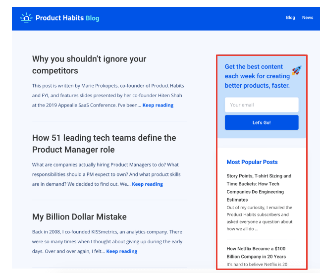
I have bad news. Blog sidebars don’t do squat.
Even on blogs with millions of visitors per month, while using email marketing, you’ll struggle to get any email subscribers, signups, leads, or customers from your sidebar.
The sidebar goes back 20 years (approx), we’re all very familiar with the design pattern. And we’ve all gotten used to ignoring sidebars a long time ago. They’re also easy to ignore, the real content is right there after all.
Either ditch the sidebar or use that space to communicate your key brand messages. Don’t expect to ever get conversions from it though.
Instead, add a pop-up to your blog. They work exceptionally better than any sidebar.

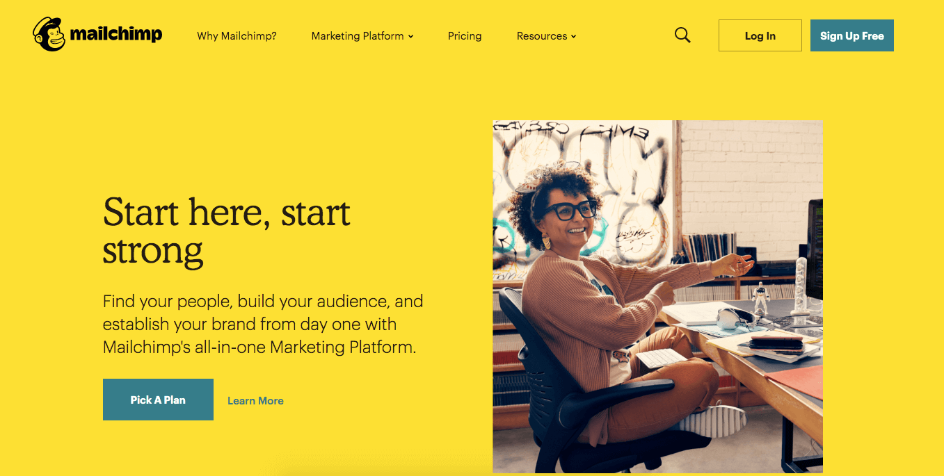
2. Using aspirational homepage headlines
As marketers, we want to change the world and inspire people.
While this intent is genuine, it leads to some behaviours that hurt our conversions. Especially with homepage headlines.
When I sat down to write homepage headlines in the past, I’ve had a mindset of wanting to communicate grand ideas, big wins, and life-changing results. Then I wrote headlines like:
- Live your best life.
- Grow your business even faster.
- Dream bigger.
- Delight your customers.
These headlines are all trash, they’re empty platitudes. And they’ll tank the conversions on your homepage.
The traffic on your homepage is some of the most valuable traffic across your entire site. People want to convert on your homepage. They already heard about you, are open to a pitch, and will follow through if your offer is good enough. A grand but confusing headline won’t persuade them to take the next step.
In my testing, a good or bad headline can swing conversions on a homepage by 30% in either direction. Simply by changing a single sentence, you can increase the conversion volume off your homepage by 30%. You’ll feel that impact on your business immediately.
I know coming up with an amazing, specific headline that positions your product or service perfectly is super difficult. Trust me, the reward is well worth the effort in this case.
Brainstorm a big batch of headline ideas, then try them one at a time on your homepage. Rotate them every month or so until you feel a lift on your conversions.
But ditch the aspirational headlines.
3. Producing endless premium content
One of the most popular tactics for turning visitors into email subscribers is to offer a piece of premium content.
It could be a quiz, PDF, webinar, tool, course, or something else. I strongly endorse this, it’s my go-to method for converting traffic into subscribers so I can pitch them a product or service later. There’s a trap though. I’ve fallen into this trap multiple times myself.
If one piece of premium content works so well, having a bunch would be even better? Right?
Wrong.
Once you have one hit piece of premium content, there’s no reason to offer others. You could have, 2, 10, 50, or even 100 and have the exact same conversion rate on your site.
Way back when I led marketing at KISSmetrics, we had hundreds of premium PDFs and webinar recordings. There was absolutely no impact on conversions as we increased the number of premium content available.
I treat pieces of premium content like the king of the hill. I try out different offers until I find a big winner, then I add that winner all over the site. Great offers tend to work over and over again. The more places that you use it, the more your conversions go up.
I’ll then use that one piece of premium content for years. That’s exactly what happened with our Earning Potential Quiz at I Will Teach You to Be Rich. It gave us a huge spike in conversions so we added it all over the website and it’s still in use today.

After a few years, it’s worth testing new offers again. As markets evolve, there’s a chance you could find an even better offer. And if you do, replace the old offer with the new one.
4. Using blog CTAs based on categories
Here’s one that I’ve tried countless times and has never worked.
Once a blog gets big enough, I always think to myself “We have a bunch of different categories worth of content. Wouldn’t it be better to have a CTA for each category? Won’t people be more inclined to sign up for something that’s relevant to the content they’re reading?”
So I spin up a blog category CTA test by adding new offers to each category and wait for the results.
It always fails.
Not only is it more work because you have to build all the different CTAs and offers, it usually lowers conversions in my experience.
My hunch is that having a bunch of new untested offers on a site introduces poor-performing offers which bring the average conversions down compared to one winning offer across the entire blog.
If I’m right, it would be possible to increase conversions by having a winning offer for each content category. Let’s say that you had a blog with the categories of SEO, conversion optimization, content marketing, and social media. You’d have to find an incredible offer for each of those categories.
But I’m doubtful this would happen in reality for two reasons:
- A winning offer is hard to beat. Winners tend to win over and over again no matter where they’re placed. By their nature, they’re anomalies. That’s why they work so well. The increase from matching categories to CTAs is a minor lever compared to having a CTA for a great offer.
- Coming up with multiple winning offers is really difficult. I typically have to try dozens or hundreds of ideas to find one home-run offer. Trying to find one for each content category would take forever and be more trouble than it’s worth.
These days, I focus on coming up with one great offer for my blog visitors. Once I find it, I serve it to everyone and move on to other parts of the site.
5. Adding social proof
Isn’t social proof one of the core elements for improving conversions?
Yes, it’s on every conversion “best practice” list out there. It’s even one of Robert Cialdini’s famed 6 Principles of Persuasion.
And yet, I have never been able to get a statistically significant increase in conversions by adding social proof to a page. I never bother with testing social proof these days. And if I’m trying to improve a conversion rate, I never expect to get a noticeable lift by adding it.
I do think there’s nuance here.
While I’ve struggled to get a statistically significant lift on direct conversions, I do believe that social proof has an impact on the brand. It helps build a feeling of trust. I personally notice social proof when looking at new websites and it always gives me a feeling of confidence.
That’s why I continue to use social proof myself by adding it right on my homepage:

On any site that I work on, I gladly add a batch of social proof. But once I have it, I move on. I don’t try to optimize it and I don’t worry about proving that it works.
Bonus pitfall: Relying on site speed
This one will surprise some folks.
On every site that I’ve managed, I’ve done a serious site speed improvement project. In some cases, we reduced the site load times by 75%. These were sites that had hundreds of thousands of monthly visitors.
Can you guess the impact that these improvements had on our conversions?
Zero.
No matter how fast we got the site, we never saw an improvement in our conversion rate. And monthly metrics like sessions, leads, signups, and revenue never budged an inch.
I know that improving site speed is a common best practice, tons of conversion rate “experts” recommend a faster site. And yes, you don’t want a horribly slow site. But as long as your site speed is good enough, don’t expect further improvements to tangibly improve your metrics.
That said, I still think it’s worth doing one round of site speed improvements on any large site. I put this into a “branding” bucket. It might not improve metrics but it does make target audience feel better about the site. Even though I can’t quantify the impact, I still think one round is worth the effort.
Here are the main wins for improving site speed:
- Get a good web host, don’t skimp here. And if you’re on WordPress, make sure you have the best hosting for WordPress. These days, there are great web hosts that specialize in WordPress, giving you more security and speed than a standard web host.
- Remove all those extra marketing JavaScript tags. At every company I’ve ever worked, there were a bunch of marketing scripts that had long been forgotten. For example, I found Adroll and Perfect Audience scripts installed across the entire site at KISSmetrics, neither of which had been used for years. Delete that stuff, it slows down sites more than any other item.
- As a general rule, simplify the elements on your site. I know we all love trying shiny stuff but it rarely has an impact. The simpler your site, the faster it’s going to be.
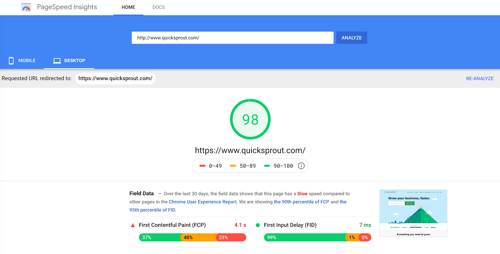
- Use Google’s Page Speed tool and follow their recommendations.
The take-aways
When improving conversions, it’s just as important to know what NOT to do. A great place to start is by avoiding the dead-ends that I’ve hit more times than I’d like to admit.
Not everything is black a white, I’d still go ahead and do these projects:
- Site speed improvements
- Social proof
Just remember that I’ve never seen them tangibly impact conversions on any site. I prefer to ship them quickly and then move on to other projects.
And I avoid these types of conversion ideas entirely, I don’t spend any time on them:
- Blog sidebar CTAs
- Aspirational homepage headlines
- Endless premium content
- Blog CTA’s based on categories
And if you do try them, I hope they give you better results than they did for me.
Bonus Read – 4 Best Practices For Conversion Rate Optimization


 Diksha Dwivedi
 Prakhya Nair
 Priyam Jha

 Ajit Singh
 Harshita Lal