


Did you know that web designers (thus websites) have about 50 ms to make a good first impression?
Yeah! That’s all.
If people judge your website that quickly it is high time you optimize the page spearheading your site – The Homepage. It is the ‘red carpet’ you roll for users to come in and eventually become paying customers.
Often we talk about funnel optimization and end up working around personalizing the user experience around the later stages of the funnel. In the process, the start of the funnel that is the Homepage loses focus.
On the home page users are taking their first step towards knowing you, make sure you get yourself understood. And, understood well.
Any SaaS Website has several goals concerning various departments of a SaaS business. For example, marketing goals would revolve around:
- Creating Awareness
- Generating Leads
- User Engagement
- Increase Lead Conversion Percentage
Similarly, Sales goals would be to:
- Improve Sales Conversions
- Generate more Revenue
The same way the HR department would want job applications flowing from the website, and the support department would want the website to help customers help themselves and reduce the support time.
Your home page, the start of the conversion funnel, could be a deal-breaker if you don’t optimize it.
Let’s look at the important elements you need to focus on to Optimize your SaaS Homepage:
- Make users scroll beyond the FOLD
- Zero in on the footer
- Show visuals of your product
- Be accessible to users
- Use CTA that encourages action
- Explanatory video for your product/business
- Demonstrate how your product works
- Express in one line the value you deliver
- Build trust through testimonials (& client logos)
- Outstanding website content
SaaS website homepage UX design components
The user experience on a site consists of two important elements –
- Users (their goals, your goals for them) &
- Website (its design, technology, navigation, content)
Mentioned below are pointers to optimize the customer experience on a SaaS Homepage.
1. Make users scroll beyond the FOLD
Above the Fold: It is the area that a user sees on screen without having to scroll down.
Gone are the days when websites used to load slowly owing to super slow dial-up connections and primitive hosting. Now websites have become responsive, dynamic, interactive, and there are no such barriers.
Thus, a Homepage not beyond a fold is outdated. Having a comprehensive SaaS homepage is now the norm.
The average difference in how users treat info above vs. below the fold is 84%. That’s good enough reason to focus on the Fold.
Studying Page level data for your site in Google Analytics can give you data points like 8% visitors scroll the complete page, 55% scroll about 25% of the page.
You can also try using tools like ClickTale that create heat maps for your site based on the distribution of users scrolling the page.
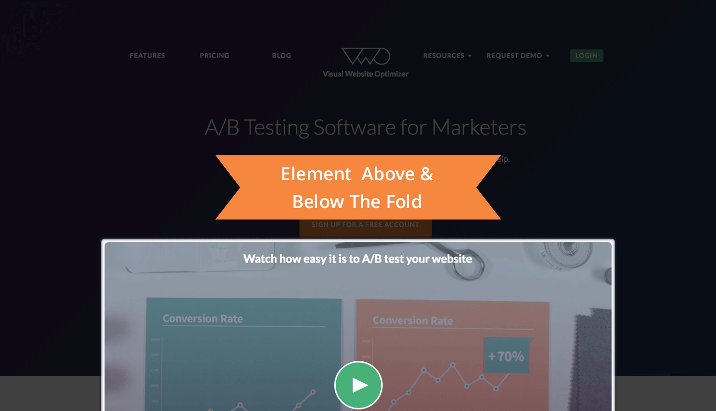
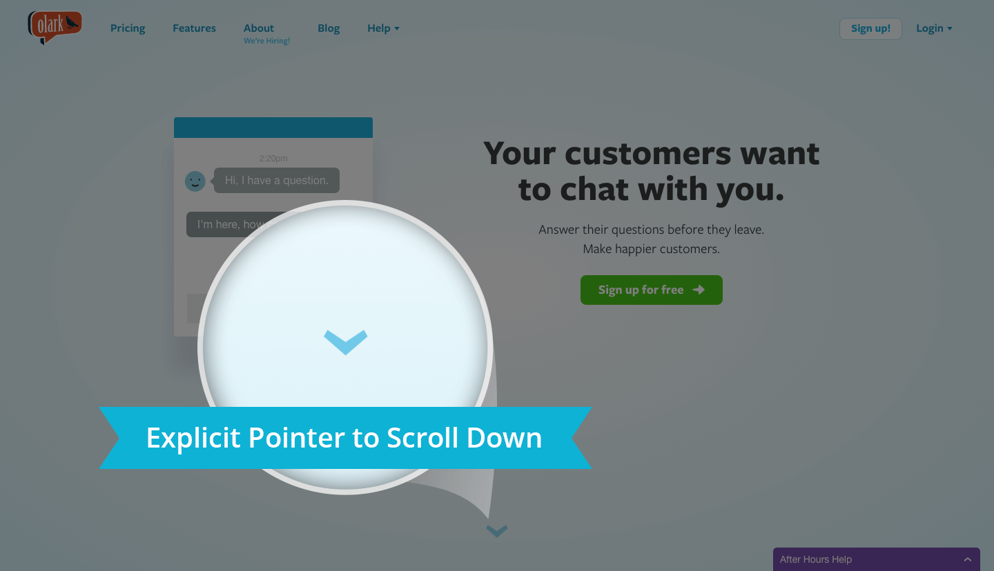
Two tricks that work wonders to induce scrolling beyond the Fold:
- Include an element that begins above the fold and continues down below (screenshot from the homepage of Visual Website Optimizer):
- Give an explicit pointer to scroll down for more (here’s SaaS website design example of Olark).
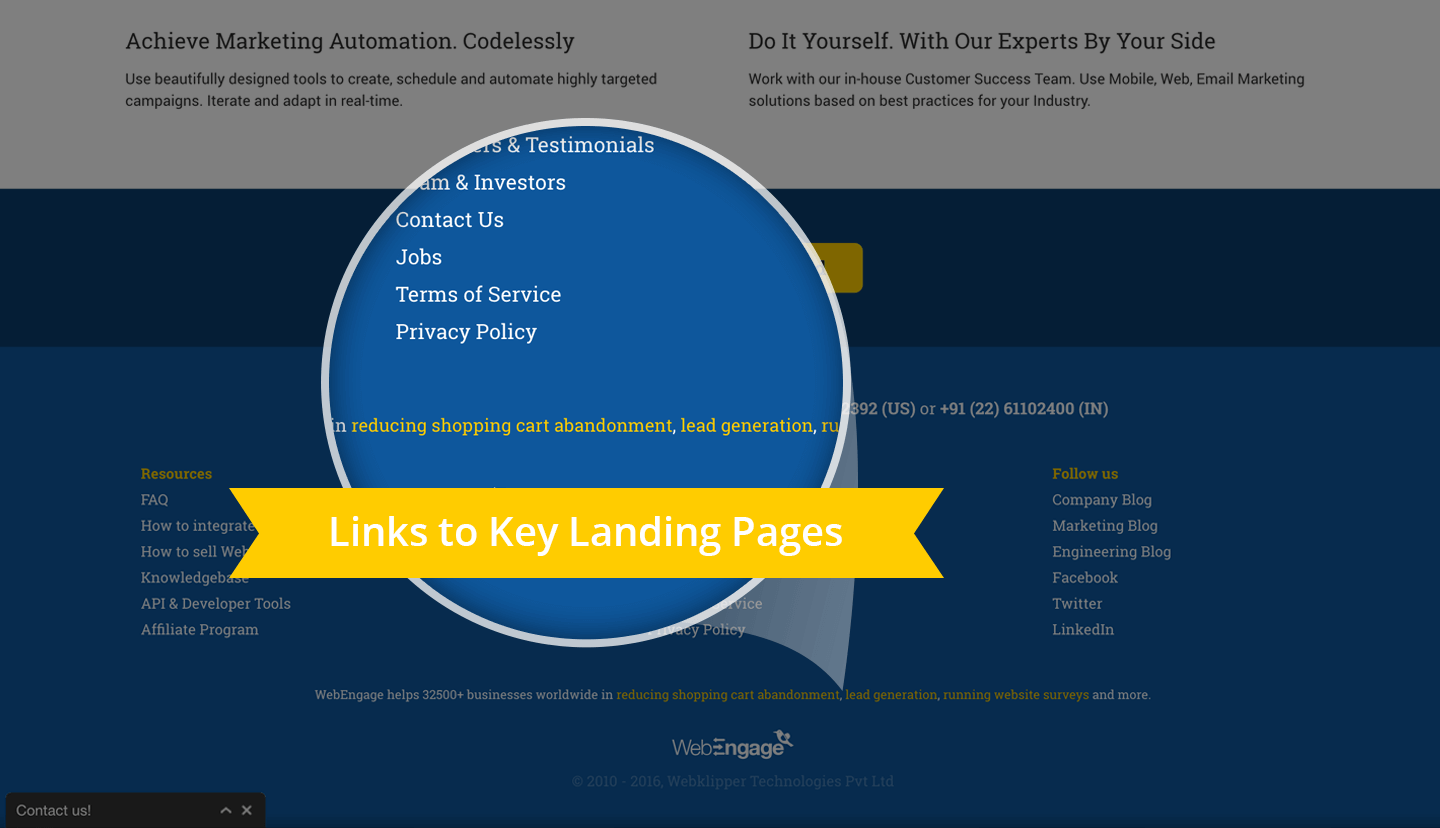
2. Zero in on the footer
Users spend very little time reading the complete copy throughout the homepage, a user searching for specifics having looked at the header of your site will invariably look into footer links.
Place links to important landing pages, sitemap, product info, social media icons, newsletter subscription in the footer.
Links in the footer are more important for a mobile site, as users have to scroll all the way back to the top to delve deeper into the site.
Talking about the importance of Footer on Homepage reminds me of a quick hack to use the footer to drive traffic to Landing Pages. We at WebEngage have seen significant traffic on landing pages sourced from footer links on the main site.
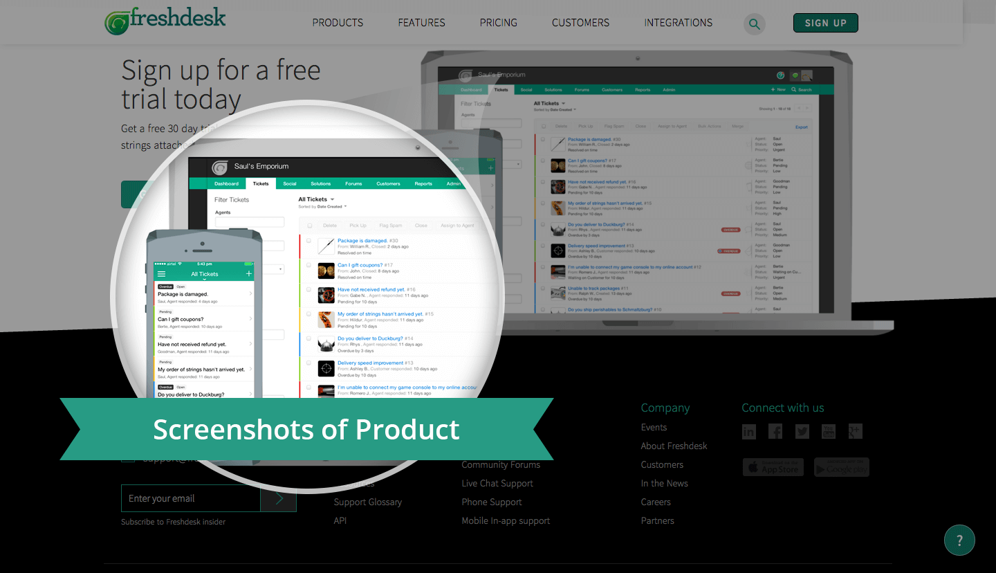
3. Show visuals of your product
There is little chance you and I would buy something we haven’t seen. A sneak-peek that acts as an overview of critical aspects of your product should ideally make it to your homepage.
Give users a glimpse into what your product looks like on the Homepage itself. It sets a tone as to what exactly your product is going to be like.
Determine the right place for placing images using heat maps. Heatmaps are a visual overview of where users click, helps you understand user behavior on your site. They are a source of invaluable insights about how users behave, where they click on your site.
There are of two types Eye-tracking Heatmaps and Mouse-tracking Heatmaps. Studying Heatmaps will enable you to know areas critical to your SaaS Homepage and subsequently use these insights to optimize placement of important elements. You can use tools like Crazyegg, Clicktale, Inspectlet to get Heatmap of your site.
Below is a screenshot from Freshdesk’s Homepage.
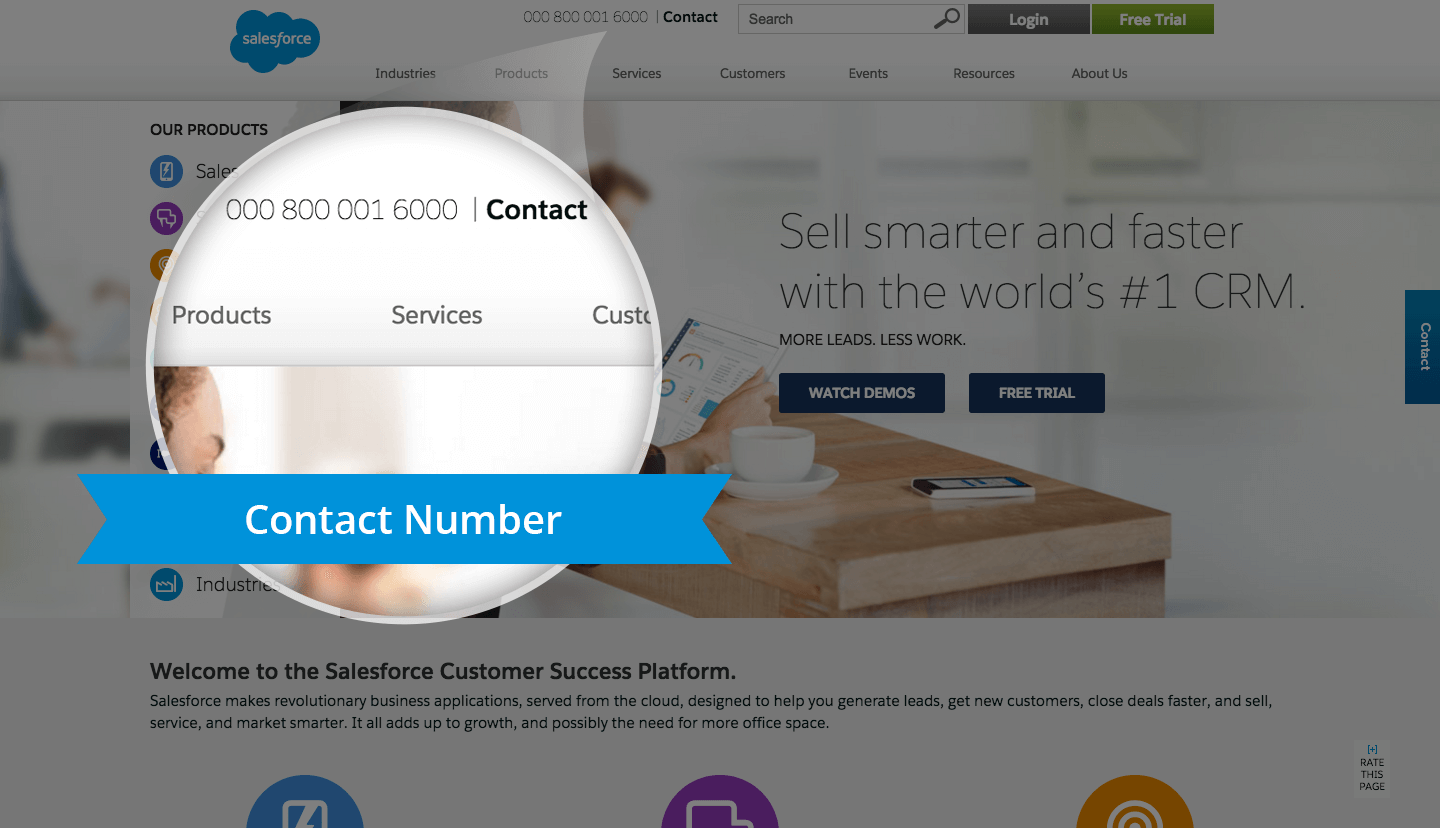
4. Be accessible to users
There are those customers who do not want to wait for your call. They want instant answers to queries.
Do away from inherent complexity in the design of the Homepage and make contact information readily accessible (preferably in the footer).
Secondly, use third-party tools enabling Live Chat with users on the site. Live Chat as an instant query redressal mechanism works wonders for Lead Generation too.
Although you will have to invest dedicated human resource to handle the chat requests. Same goes with displaying helpline numbers or customer support numbers on the Homepage. [Tip- Do the math before implementing]
Here’s an example from the homepage of Salesforce.
Conversion Rate Optimization on SaaS homepage
There are a few elements of the homepage that directly impact conversions. These are predominantly Call to action buttons for sign-up, demo, video or anything else for that matter.
5. Use CTA that encourages action
The homepage or a part of the Homepage should logically conclude with a CTA, meaning that the user should cognitively perceive CTA as something to act upon. As if to click on it is the next obvious step.
Placing a CTA is important and so are other elements of design, color, copy. A simple change in CTA copy can lead to significantly better results.
In CTA Copy:
Benefit + Relevance = Better Click-Throughs
Here, benefit in CTA copy concerns what the user will get after clicking and relevance is the context of CTA placement.
Remember what they say about practice, use the same mantra for optimizing your CTA. Test, Test, and Test. Use data from the Events section in GA to get Click-through-rates of all CTA buttons on the homepage. Run A/B tests to figure out the combination that works best for you.
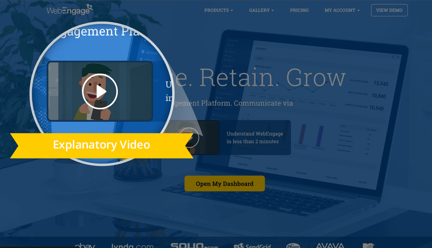
6. Explanatory video for your product/business
Video as a medium makes content easily absorbable; increasing the chances of users getting hooked to the website, & thus the product.
Videos are processed by the brain 60,000 times faster than text.
A short 30 second or a minute-long video introducing your business to the world is a must.
Videos work exceptionally well for SaaS companies. Illustrative videos explaining the process of using your product, how you help your customers, simplify the inherent complexity for users in understanding SaaS products.
Include a call to action at the end of the video for signup or a logical call to action that takes users to the next step. The click-throughs of the CTA also allows you to measure the effectiveness of the video.
Wistia, a tool to create videos, studied 95,000 pages with videos analyzing placement, size of the video, their play rates, etc. They found that videos in the first fold had higher play rate than videos elsewhere on the page.
7. Demonstrate how your product works
For users eager to see your product live in action, a demo is the quickest method to show how your product works.
The intrinsic question behind showcasing your product through demonstration is how much should you reveal? Whether to generate just enough curiosity or give a comprehensive idea of how your product works?
The choice largely depends on the type of customers your business caters to, namely, Enterprise or SMBs. Enterprise clientele expects high touch human-aided demos, real-world case studies whereas SMB’s are content with DIY, free trials. Either way, make demo immersive, involve your customer, and make it relevant.
In WebEngage’s previous avatar as an onsite engagement suite, we used to demonstrate our website surveys and notifications live in action on any site. Although, you can still try the demo here.
In WebEngage’s previous avatar as an onsite engagement suite, we used to demonstrate our website surveys and on-page notifications live in action on any site. Although, you can still try the demo here.
In WebEngage’s previous avatar as an onsite engagement suite, we used to demonstrate our website surveys and on-page notifications live in action on any site. Although, you can still try the demo here.
However, to optimize the elements concerning Demo on the Homepage, you need to put to test the placement of CTA for Demo, the copy in and around it. I have talked about it under the section covering CTA’s.
Messaging component on SaaS homepage
Think of visitors on your homepage spending a maximum of 10 seconds, 30 seconds, 1 minute or more. Each of these segments of visitors will have varying understanding of your business. Aim to make your homepage messaging coherent, succinct and simplified so as to resonate it with your audience.
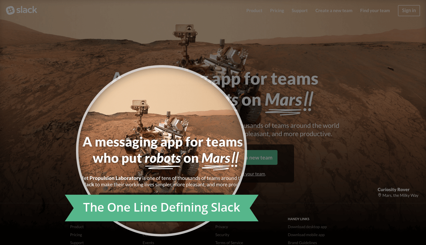
8. Express in one line the value you deliver
In the homepage, on the fold, that one important line in bold that expresses your business to the world is Value Proposition. It is the statement that summarizes why a prospect should buy your product or a use of service.
The attention span of humans (abysmal @ 8 seconds) is less than that of the proverbial Goldfish. Therefore, write a Value Proposition that is Succinct, Distinct, Memorable and Desirable. It should clearly articulate what benefits you bring to users.
Duration of Visit is one metric that usually points towards lapses in Value Proposition. For example, stats like: 70% of visitors have Duration of Visit: 0-10 seconds, possibly indicate that the one line defining your business is not compelling enough.
Slack is my personal favorite when it comes to messaging, they are incredibly witty, refreshing, innovative in their choice of words.
9. Build trust through testimonials (& client logos)
Groove found that good testimonials increase conversions by up to 15% on their Homepage.
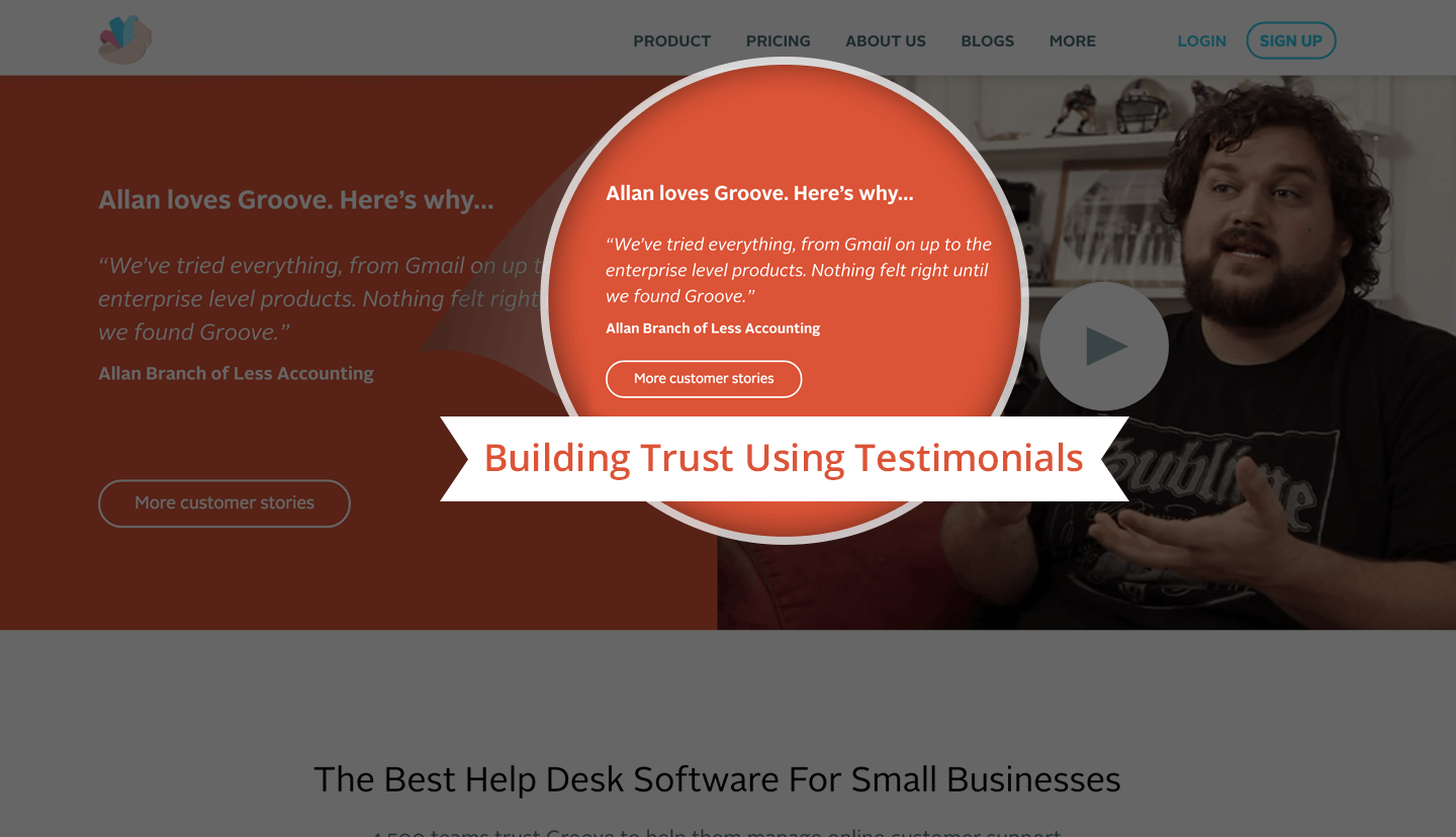
Remember the time you bought something from a shop for the first time because most of the people you knew bought from the same shop.
Now imagine, these people you knew were the great people you look up to or aspire to become. The effect would be tremendous, suddenly buying from this shop out of many in the vicinity gets justified, reaffirmed.
Similarly, there’s also a compounding effect of trust messaging on the Homepage. Trust gets built by showcasing a list of esteemed clientele or testimonials praising your product.
Often there’s a need to optimize placement of these trust-building elements on the Homepage. You can start with understanding user behavior on your site with Session Recording tools.
Using it you will be able to playback everything your site visitors do on your site, as if watching over their actions sitting next to them. Tools like Inspectlet, Usabilitytools help businesses understand user behavior via session recording.
![]()
10. Outstanding website content
”Content has always been the King”
Site content is the ultimate thing that will make a user scroll through the entire website. If gone wrong it would lead to bounce or else if it clicks with the reader; it will lead to conversion.
Showcase your authority, your domain expertise with the links to the resource section of your site. You can also choose to show snippets of Whitepapers, Case Studies to demonstrate your expertise.
Conclusion
The process of SaaS Homepage Optimization is an ongoing process of learning from doing. There is no rule book to it but only methods that you can adapt. There is no one size fits all solution, what works for some site may not work for yours. The next time you decide to revamp your SaaS Homepage use these pointers to get it right. I am sure it is good to get you started. Keep improving.
Bonus Read – 9 Tips To Optimize Your SaaS Website’s Homepage

 Harshita Lal
 Ananya Nigam
 Priyam Jha
 Sharath Byloli
 Diksha Dwivedi
 Niket Raja