Introduction
Making web push notification mistakes is easy, but they can be a powerful tool for BFSI brands looking to engage customers and drive conversions. But getting them wrong can have serious consequences, including customers blocking your notifications or damaging your brand’s reputation.
But first, why should you care about web push notifications? Well, studies have found that web push marketing can potentially reach around 85% of all internet users, making it a valuable channel for BFSI brands.
However, to effectively engage customers, BFSI brands must understand their audience, use analytics to gain insights, and include cultural context that resonates with their customers.
For example, as an investment company, sending investors web push notifications about market trends and updates can help them make informed decisions about their portfolios. However, sending too many notifications or notifications irrelevant to a customer’s investment goals can lead to disengagement and customers blocking you.
Or maybe you’re a bank. In that case, sending customers timely notifications about upcoming payments and account balance updates can help them stay on top of their finances and avoid late fees. On the other hand, sending irrelevant notifications about promotions or rewards irrelevant to a customer’s spending behavior can lead to customers avoiding further notifications.
Here, we’ll discuss the seven web push notification mistakes your BFSI brand could make and how to address them. You can drive customer engagement and conversions effectively by avoiding these mistakes and delivering personalized, relevant, and valuable notifications.
Mistake #1: Not personalizing your notifications
Regarding web push notifications, customers expect to be treated specially. Just like you, your customer too gets annoyed when they’re at the receiving end of generic and bland messages (think of those WhatsApp forwards during Diwali, Christmas, and Holi).
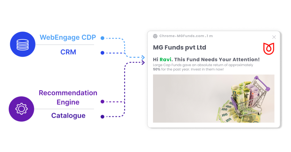
Not personalizing or segmenting your users and sending everyone the same message could spell a recipe for disaster. You cannot even stop at personalization based on name and transactional information like the customer’s title, purchase history, etc. What you need is hyper-personalization. Here, you delve deeper into the customer’s psyche and use behavioral and real-time data to create relevant communication with them.
Suppose you run an online banking service, and a customer has started the application process for a credit card but abandoned it midway. To recover this customer’s interest, you could send them a web push notification with a hyper-personalized message. Using their behavior and history on your banking website, you unearth the following:
- They have a history of paying their bills on time.
- They had previously expressed interest in a rewards program.
- Web push notifications led to the highest engagement for this user in the past.
Now, you can send hyper-personalized web push notifications where you customize the credit card benefits and offer them a lower interest rate or a higher credit limit. You could also mention the credit card has reward points and highlight some of the program’s benefits.
Hyper-personalized recommendations, reminders, and offers lead to 3X the conversion rates over messages that only do a basic personalization. In a 2022 Redpoint Global survey, 74% of the customers said their brand loyalty came from feeling understood and valued rather than discounts and loyalty perks. In addition, 64% said they bought products from brands that showed they knew their buyers.
WebEngage helps you hyper-personalize your web push notifications. We empower you to fetch real-time data from your WebEngage Customer Data Platform, catalogs, and recommendation engine to craft perfectly tailored notifications.
Mistake #2: Flooding users with notifications
Don’t bombard users with notifications because they agree to hear from you. Be mindful of the customer’s peace of mind and how you could disturb them with your frequent web push notifications. Just because users allow your notifications doesn’t mean they want to hear from you every few minutes.
When you litter with spammy push notifications, it sends the wrong signal to your user. It tells them that you don’t respect their time or privacy, nor do you deserve their trust. Misuse the notification privileges you’ve been given, and you risk getting blocked.
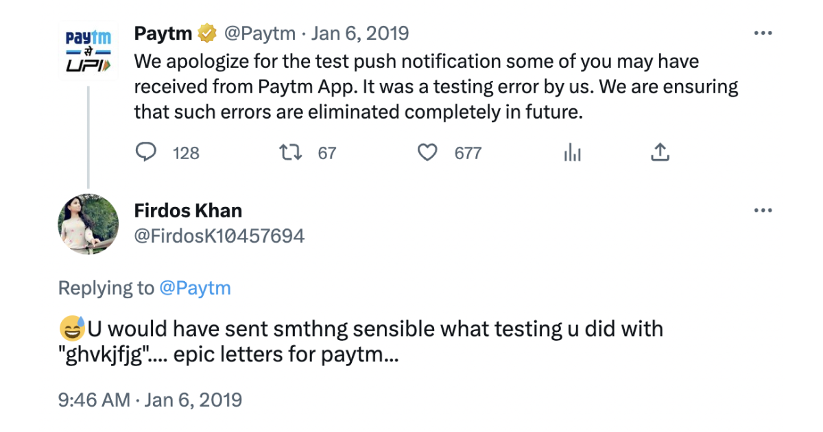
In other words, don’t make your app or website a ‘notification hellscape‘. Studies show that it takes 32 mins for a person to get back on task after they get a notification. Also, intrusive interruptions make people feel more burnt out and overwhelmed. Imagine how annoying it is to break someone’s focus and ask them to opt for a service or buy something they’ve never expressed an interest in.
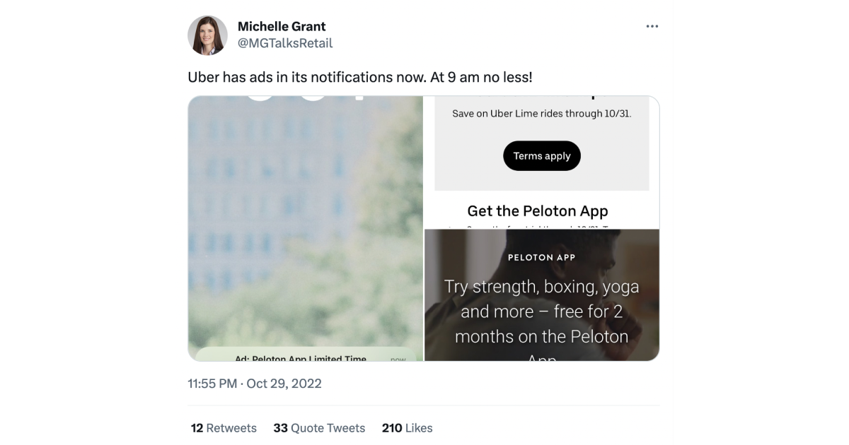
Also, avoid being invasive. Bombarding users with new features, account upgrade requests, or third-party ads are some of the dark patterns or manipulative user interface tricks companies must be careful about.
Over 50% of users find most push notifications useless and annoying. So, besides personalization, you also need to keep in mind the timing of your messages.
The timing and frequency of your notifications might depend on the industry you’re in. For example: for hospitality and travel industries, you can send 2-3 notifications during peak hours, whereas for fitness and healthcare, or software and gaming, your frequency should be lower.
At WebEngage, we enable Frequency Capping on our campaign management tool, and that lets you control how many campaigns your users receive in a day, week, and month. You can also specify the gap in time between consecutive messages.
Mistake #3: No options for users to tailor their notifications
You need to give users a choice between no notification and every notification. Give users an option for preferences when they opt-in for web push notifications.
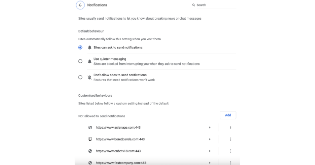
You can also track the kind of products or pages they’re checking out on your site to give them the relevant information. For example, if you’re a banking website, users would appreciate high-priority alerts when there’s a high-value or foreign transaction done on their account.
Giving users just the “yes” or “no” option for push notifications isn’t the best idea for your business. Data shows that due to this binary choice, around 60% of users opt out of push notifications. Don’t you think that that’s a significant chunk of prospects lost because of a lack of options?
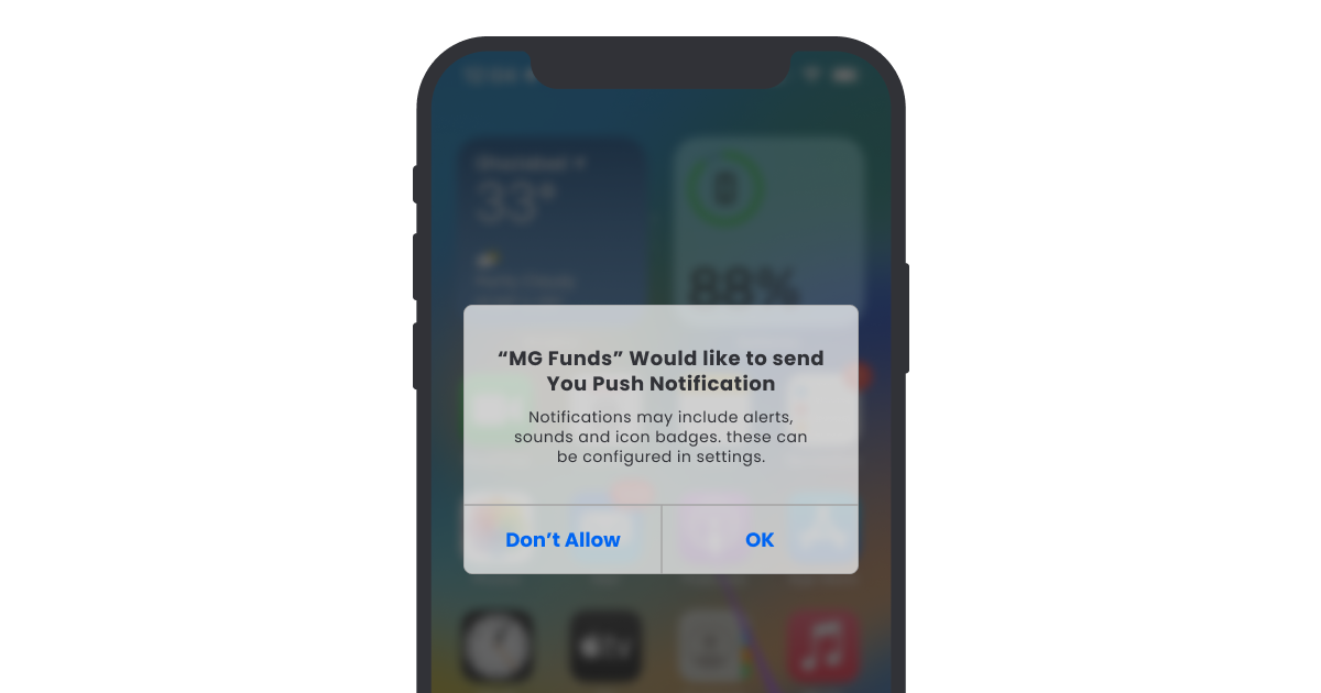
Instead, you could opt for a two-step permission process.
- Step 1: Explain to the user what they could miss out on by not allowing notifications.
- Step 2: Give them the choice to opt-in or block out the web push notification.
That way, the user makes an informed choice, and you, too, don’t lose out on a customer simply because they didn’t know how they might have gained from your notifications. This may make your reachable base a little lower, but they will be more interested and engage better. BOOM! Higher CTRs on your relevant user base.
Mistake #4: Sending notifications without any context
Notifications are valuable when done in the right context at the right time. So, when the user gets a notification gently reminding them to pay their bills right before the deadline, they’ll be grateful for that web push notification from you.
However, when you regularly annoy them by urging them to take a car or a house loan when they’ve never shown interest in these services, they’re most likely to block your push notification privileges.
Push notifications have their time, place, and relevance. Show the user you care about them, and you’ll likely get a positive reaction.
Say you’re a credit card company that provides rewards and cashback on purchases made with its cards. Users might appreciate notifications about rewards or cashback earned from using their credit cards or other financial products.
Wondering how to send them the most relevant notifications? Use the machine learning algorithms to understand user behavior, such as:
- Their purchase patterns (days and times when they generally use your website).
- The time zones they’re in.
- Their responses to surveys.
- What they like or share on social media platforms.
WebEngage’s Journey Designer helps you to engage with your users in the right context, precisely at the point where they are in the buyer’s journey.
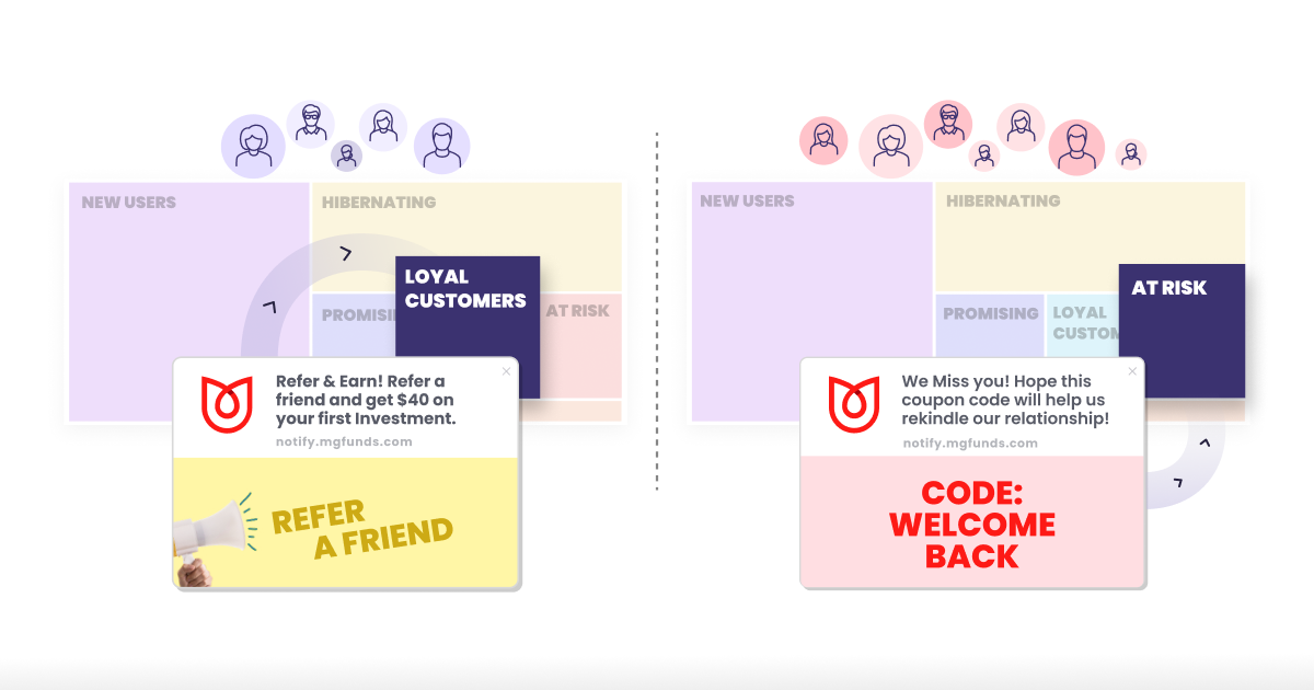
For example, depending on when you’d acquired the user, you could send them:
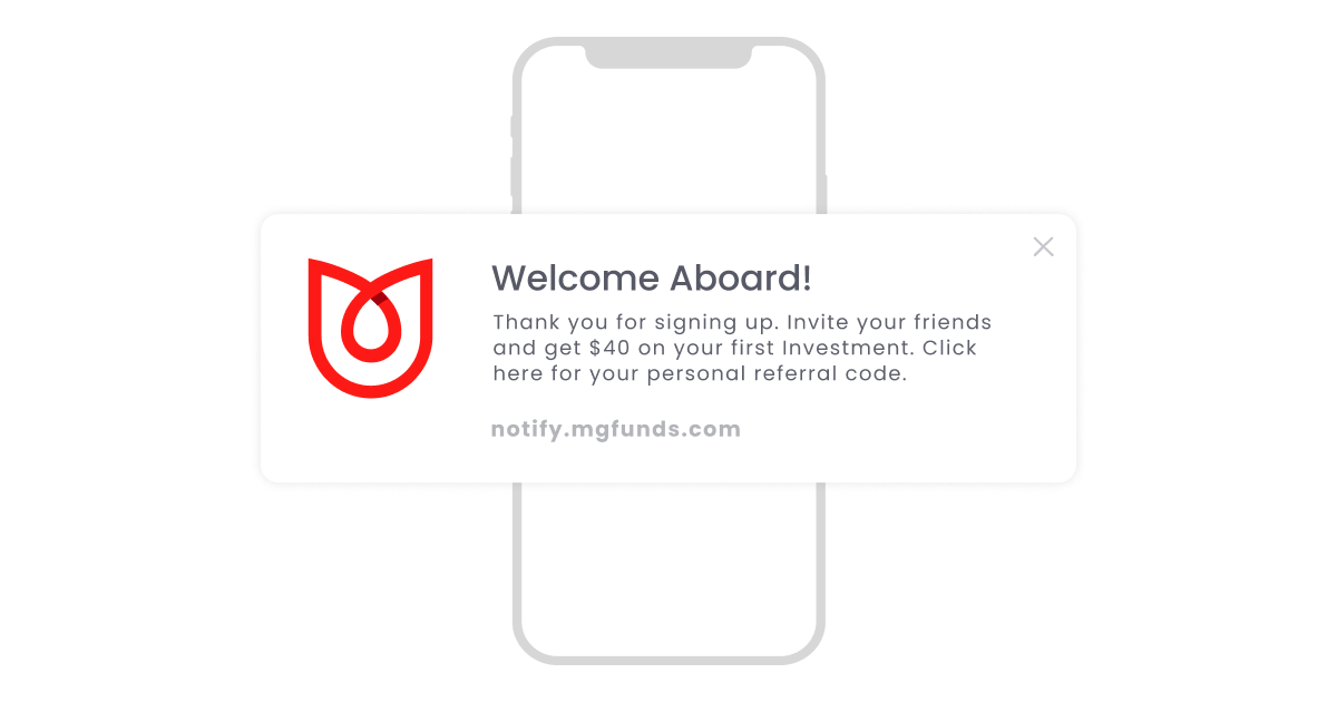
- A welcoming message with a CTA that motivates them to become loyal customers.
- Recommended products or content depending on their behavioral pattern on the website.
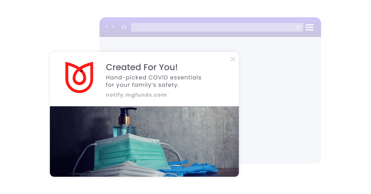
- Send them reminders about the items left on their abandoned carts.

Mistake #5: Wasting the users’ time
You can do this in many ways, including:
i. Bad linking
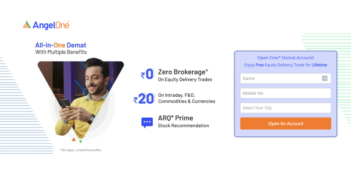
Today, users have short attention spans and hectic lives, so retaining their attention is crucial. According to scientists, people can pay attention to a screen for only around 47 seconds. Take them directly to the offer or product page instead of leaving them on your landing page and letting them wander around your website searching for the deal.
Suppose you’re a bank offering a limited-time offer on your credit card with zero percent interest for the first year. You send your customers a compelling and well-designed CTA that takes them to the homepage. Now they have to search through the website to find the offer. But their baby is crying in the background, or their phone lights up with a social media notification. Your deal is forgotten, and you just lost a sale.
The landing page where you direct the user should have all the information they need to take action quickly. A well-designed CTA can boost your marketing campaign outcome by 40%. You snooze, you lose!
ii. Don’t ramble (make it short, sweet, and spicy)
People don’t have the time to read a rambling message to figure out what you’re talking about. Regarding push notifications, KISS (keep it simple, stupid!). However, remember to make it fun with emojis (given the industry you’re in). Studies show that industries like business and finance, utilities and services, and retail benefit the most from emojis.
A push notification containing emojis can not only spice up your message but also increase the open rate by 85% and improve your CTA by 9%. Some emojis users love to see include thumbs up, pointing finger, winky face, thinking face, celebration, rocket, fire, and eyes.
iii. Missing CTA/Incorrect Use of CTA
Without a CTA or a precise one, you’ve captured your users’ attention for nothing. Be careful of sending them CTAs that are generic or that don’t give them any precise direction to act on.
Also, don’t confuse the user by giving them too many options when they reach your landing page. Keep your CTA precise and specific to the campaign you targeted them for through the web push notification.
Don’t commit the blasphemy of multiple CTAs in your text/image/CTA button. This is the best way to confuse your audience.
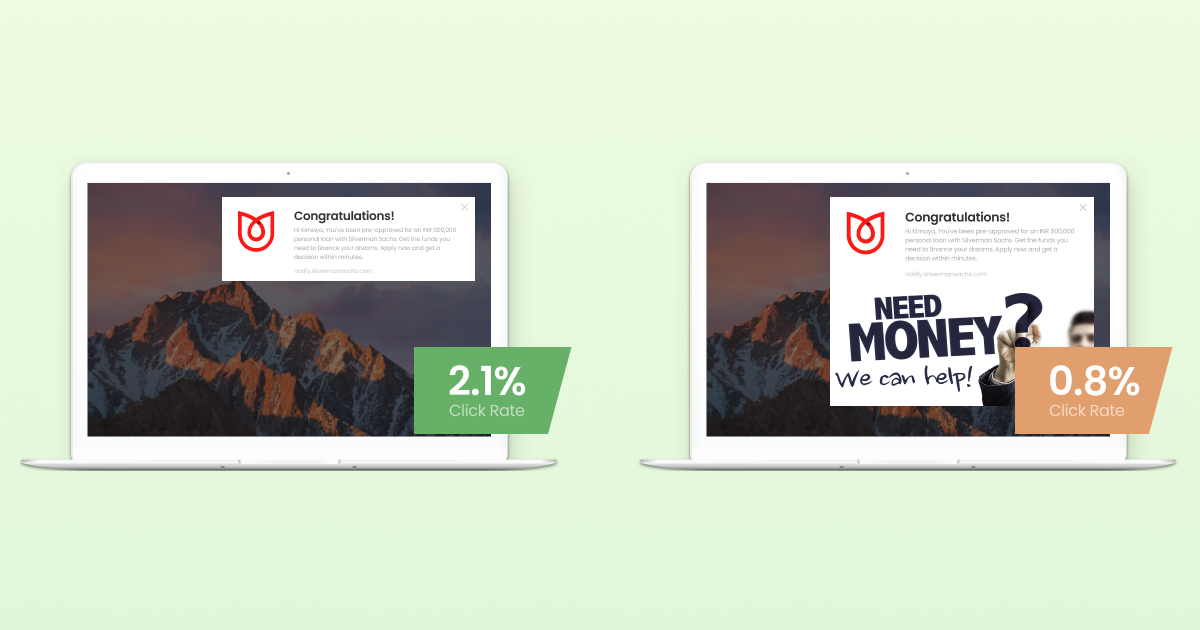
Make sure to test your CTAs for effectiveness and optimize them when needed. The CTA should be specific and in sync, with the user segment you’re targeting. This is where A/B testing will be helpful.
Mistake #6: Not keeping the user location in mind
Imagine the sound of trivial notifications waking you up in the middle of the night.
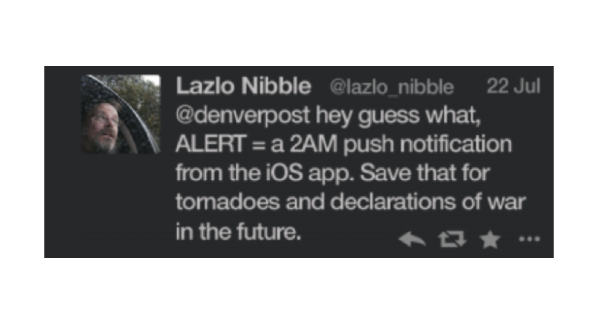
That’s a sure-shot recipe for getting blocked. On the contrary, research suggests that sending push notifications according to user convenience could boost reaction rates by 40%. For example, when you’re working with a remote team with members in different time zones, you don’t want to lose your sleep to the disturbing noise of incoming messages.
Platforms like Slack let you pause notifications for specified periods, which is incredibly useful during such times.
To understand the right timing, you need to gather customer analytics and usage statistics data to find out when they’re most active, the time zones and country they’re in, and so on.
With WebEngage’s real-time customer segmentation insights, you can get target users when they’re most active instead of invading their downtime and getting blocked.
Mistake #7: Not tracking the key user metrics
Life might be a journey without a map, but imagine driving your car to the office in peak hour traffic without any idea of how to get there! The same goes for web push notifications. Unless you track the metrics of your progress based on your desired goals, it’s almost impossible to reach your sales targets.
The best web push notifications aren’t the ones you develop and send out to the big, bad world without checking on them any further. The best push notifications are continuously tested and tweaked based on feedback, analysis, and optimization.
Analyzing the users’ visit and click statistics and A/B testing are some of the most effective ways to determine how your web push notification is performing and what could be improved upon. Research says that A/B testing while sending push notifications can boost open rate by 56%.
With WebEngage’s A/B Test for Campaigns, you can send different versions of your web push notification to small groups of users and analyze which is the best performing one. We’ll then take the winner notification and send it to your larger audience.
Bonus: When not to use web push notifications
- User acquisition: Your push notifications are strictly meant for people who’ve opted for them. With the new data protection laws, it’s even more crucial that you never target users who’d not opted to hear from you.
- Requesting app ratings.
- Sharing messages without a goal. For example, wishing them on a festival without asking them to take any relevant actions. No, thank you.
Final Thoughts
Web push notifications can be an effective way to gain customer loyalty and grow your sales. However, there are essential things to remember while creating and sending these notifications. Simple mistakes can lead users to block you and cost you your sales.
However, we understand that it is difficult to do it all by yourself. And that’s why we at WebEngage are here to help you craft the most engaging and effective web push notifications that users love. With our user-friendly drag-and-drop editor and a range of templates, you can build your web push notification campaigns quickly and easily without technical knowledge.
What’s more? Our real-time performance trackers would help you tweak and improve your campaigns. Now you can share your exciting deals, company announcements, and new product launches with everyone, including your anonymous users.
85% of our 800+ global customers witnessed an improvement in customer retention, and 90% saw a boost in engagement. Here’s how we helped some of our customers:
ANGEL ONE: India’s leading stock broking firm, witnessed a 2X boost in website conversions in 6 months with WebEngage. Read more to know how.
COVERFOX: The second-largest insurance aggregator in India, used WebEngage’s Journey Designer to increase policy renewals by 30%. Read on to know how.
Listen to what some of our delighted customers have to say about the impact we helped them create.


 Harshita Lal
 Inioluwa Ademuwagun
 Ananya Nigam
 Sharath Byloli
 Ajit Singh