Ever noticed your favorite brand announcing a flash sale through a quirky banner that pops out of nowhere? Or has a website made a buying recommendation complementary to the product or service you bought?
If your answer is yes, well then, my friend, you have been pop-notified.
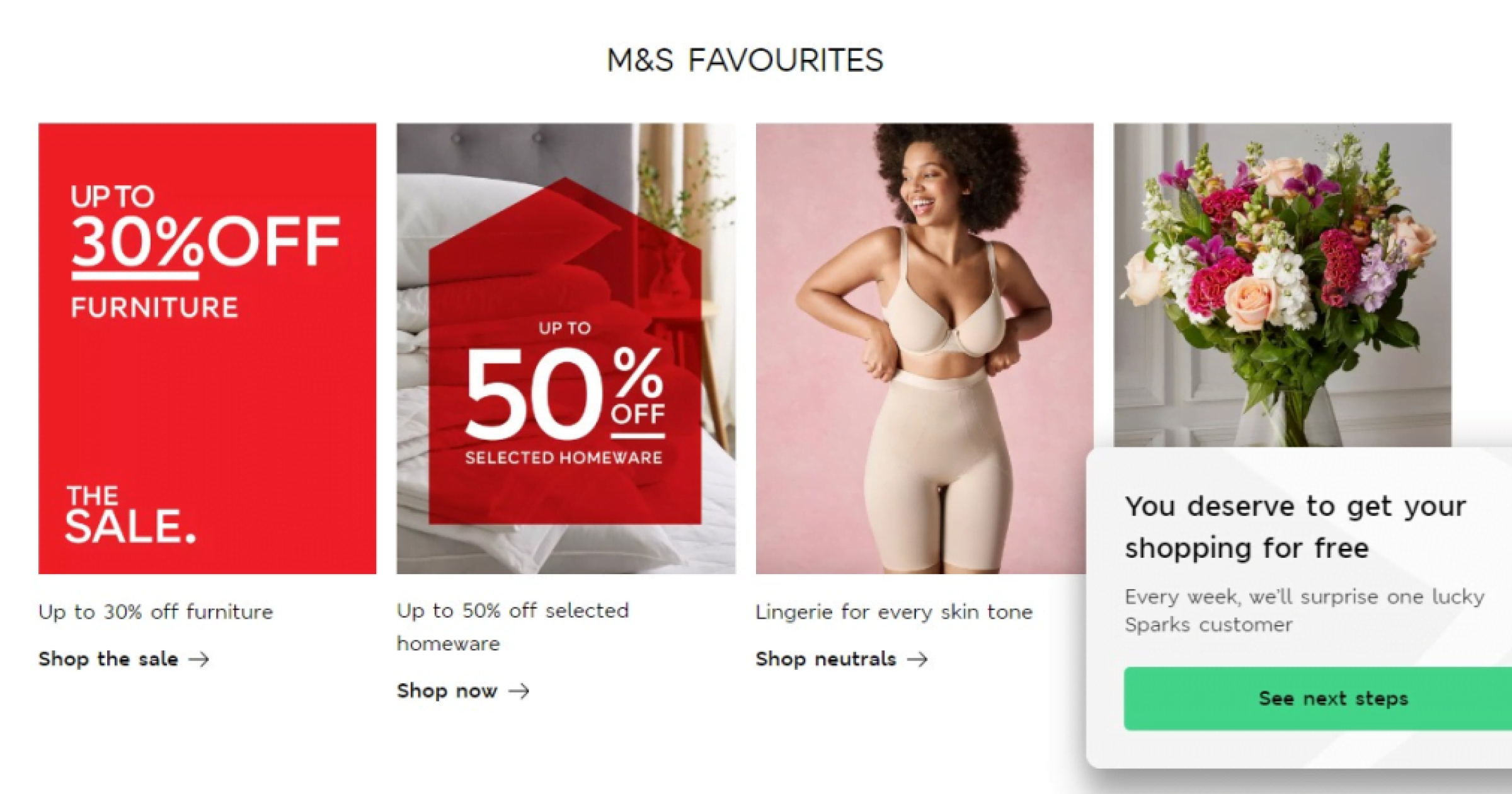
Seasoned marketers know that discovery is critical to building successful products. Almost 50% of buyers make unplanned purchases on receiving a personalized nudge! For instance, here’s a perfect example of Marks and Spencer using a pop-up notification to inform users about an offer.
It’s a remarkable way to time pop-ups to a user’s action. In this case, if a user spends too much time on the website and doesn’t buy, M&S lures them with an offer. What a cool way to nudge users. Right?
Pop-ups are touted to be a powerful tool in the marketer’s arsenal to enhance customer experience at every touch point. Using rich media like images and emojis & personalized targeting becomes an incredibly seamless way to deliver messages to active customers and help them discover something unexplored on the website.
How are pop-ups different from push notifications?
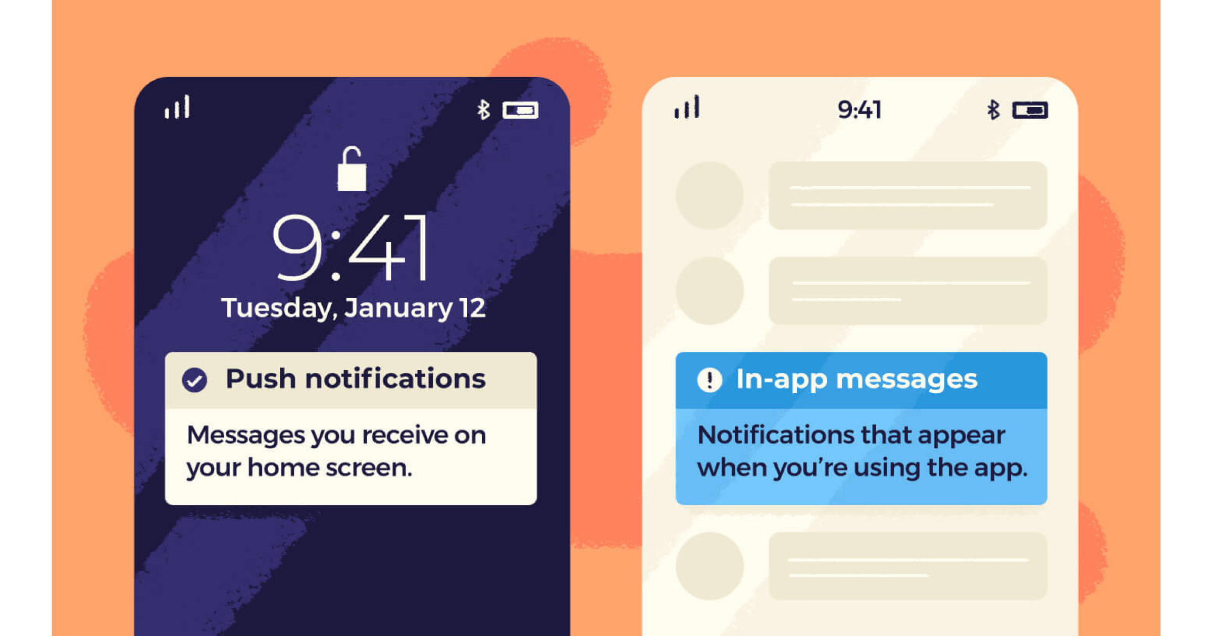
Pop-up notifications are a new mini browser, banner, or window a user didn’t intentionally open. They just appear on the website while browsing. The most common use case of pop-up notifications is to inform a user about a significant update or offer.
Push notifications (PNs) are a style of messaging delivered to the user directly on the lock screen or home screen. In other words, PNs are delivered to the user even when they are not active on the website, web, or app. They can be agnostic of any user event at that moment.
Take a look at some of the critical differences between push & pop-up notifications:
| Push Notification | Pop-up notification | |
|---|---|---|
| Mode | Can reach the user outside the ecosystem of the website, even when they are inactive | Can only be shown when the user is on the website and is usually triggered by an action |
| Target Audience | Push notifications are an excellent re-engagement tool since they reach inactive customers | Pop-ups primarily help in engaging or retaining an active user |
| Intrusiveness | Users can disable push notifications, a highly likely outcome when they become intrusive and spammy | Pop-up notifications can only be skipped, not turned off |
Importance & benefits of pop-up notifications
In an article published by Optimonk, the average conversion rate for a website pop-up is around 11%, making pop-ups one of the most effective ways to convert users. Thus, a well-designed pop-up targeted at the right users can unlock several essential goals which include:
- Higher engagement: Contextual and well-timed messaging based on where the user is in their buying journey can prove incredibly valuable in keeping users engaged. Braze claims engagement is 131% higher among users who received pop-ups than those who did not.
- Increased retention: Pop-ups are the e-commerce equivalent of someone who greets you at the store. Using pop-up notifications at high friction points, like a paywall or data collection page, can reduce user churn. All you must do is keep the messaging crisp, contextual, & attention-grabbing.
- Better conversion rates: Imagine a well-timed discount coupon popping up on the user’s screen just before purchase or a countdown pop-up that creates a sense of urgency – these personalized pop-ups lead to instant conversions.
A website pop-up aims to motivate users with an intuitive and straightforward prompt that brings value to their experience and elicits action. These meaningful experiences drive them towards instant gratification and reduce friction in the journey.
Why do you need to use pop-ups?
Pop-ups help in achieving everything from higher engagement to better retention. But the success of any pop-up campaign (measured by click-through rates) depends on answering four essential questions: who, when, where, and why.
Here, click-through rate (CTR) is a function of who is receiving the pop-up (audience), when & where they are receiving it (timing & placement), and why they are receiving it (purpose & targeting)!
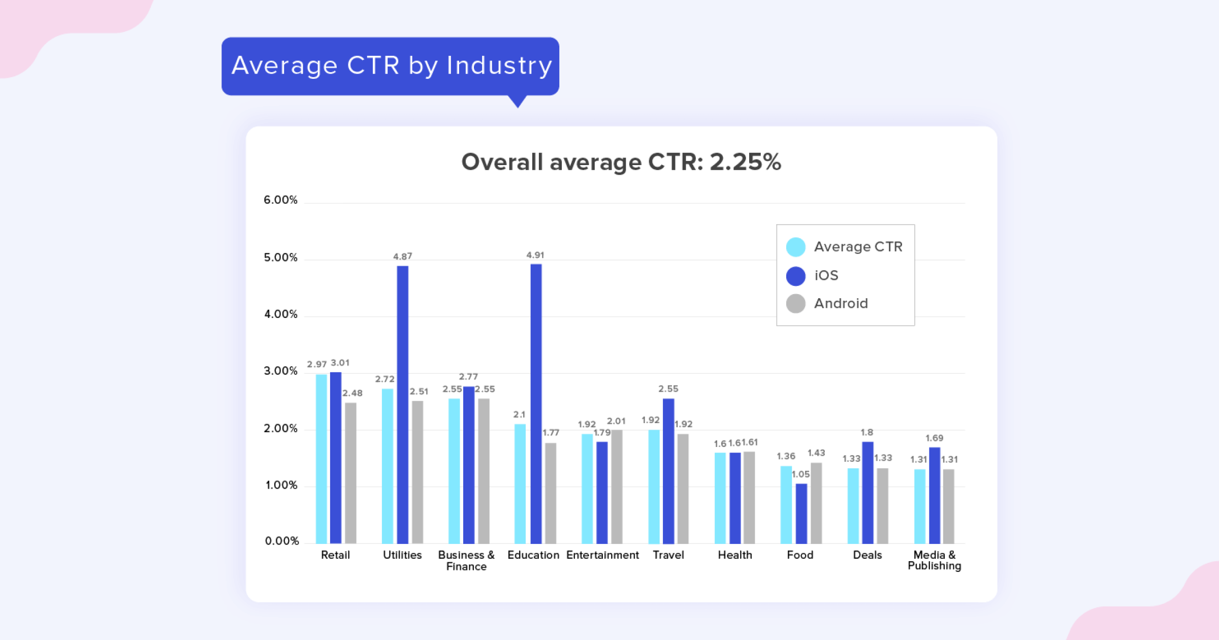
To achieve a higher CTR, marketers must define the why (i.e. the goal). For instance, if you want to increase AOV or improve the health of cart abandonment, should you show a pop-up on the checkout page or while the customer is browsing? This decision needs to be made post-traffic analysis of the website that tells you when your customer really drop.
- Acquisition: Pop-ups don’t support direct or new customer acquisition; however, they can help you resurrect inactive customers. Ever wondered how a website knows when you’re about to leave your cart and move on?
- Engagement: Imagine a highly active user slowly inching towards a dormant phase – In such a case, send them a pop-up reminding them about their core activity or new proposition that may reactivate the users.
- Conversion: This is a core success metric that depicts how many users have ultimately taken the desired action ( product purchase, subscribing to a newsletter, or sharing information).
- Retention: An indicator of loyalty, retention defines how many customers continue to use the product/service over time. You can use cohorts on the WebEngage dashboard to identify dormant users and run campaigns to bring them back to life.
Once you know your goal, the next step is to identify the target audience. A few examples of target groups are new users, returning users, inactive users, social media followers, newsletter subscribers, or users who exited abruptly.
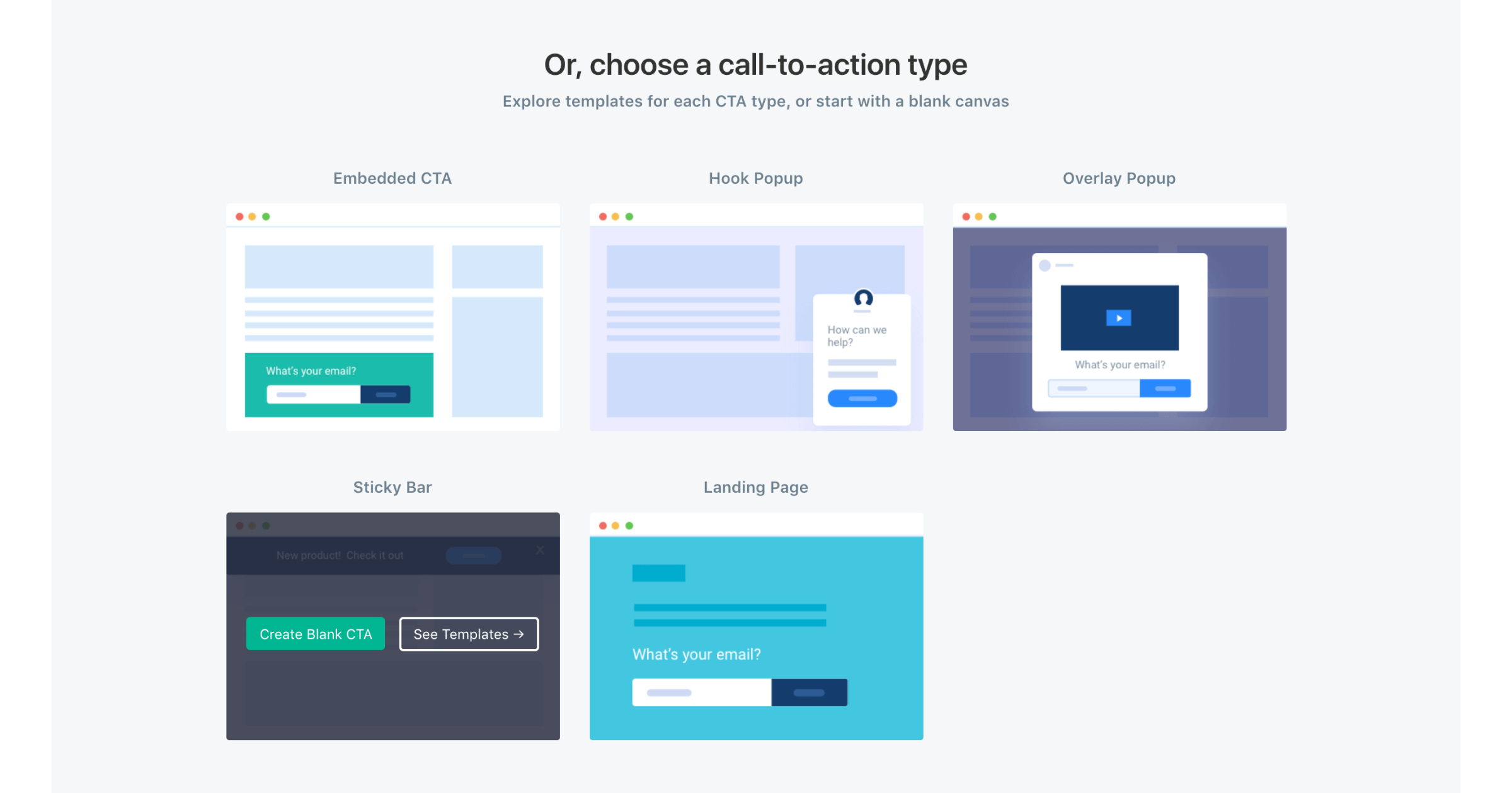
The last step is to decide on the timing & placement of the pop-up. Marketers can choose the most effective type of notification from a sea of predefined layouts on WebEngage (below are a few examples).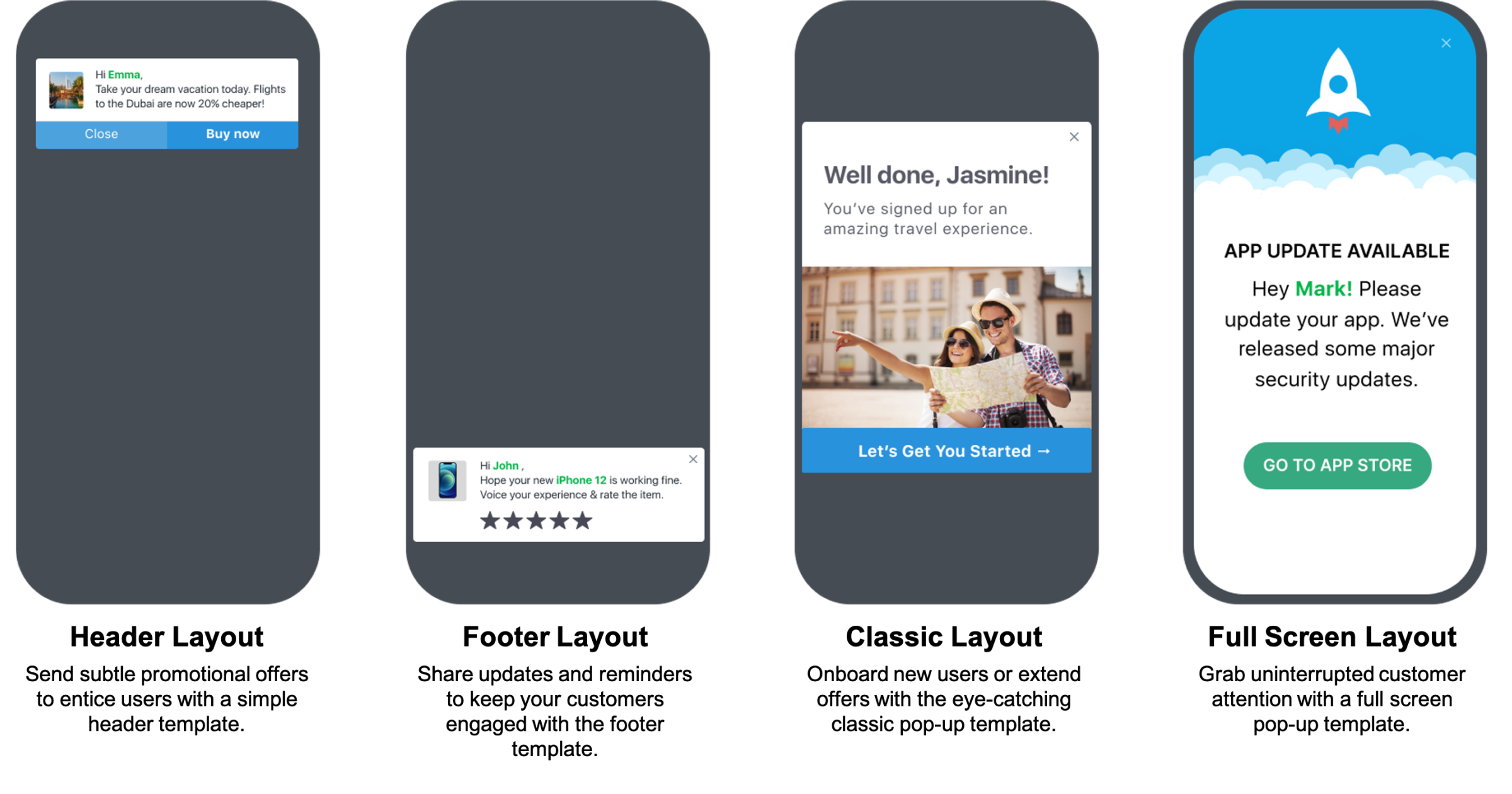
Use Cases for Personalized Pop-Up Notifications
Personalized pop-up notifications are known for being versatile and grabbing users’ attention. Here are examples of a few events based on which you can target customers better:
- Page URL based: Personalisation based on which page or section of the website the users are in is called URL-based targeting.
- Customer type based: Determine if it is a new, existing, or reactivated customer. This information can be used to run onboarding/conversion / re-engagement campaigns.
- Geolocation-based: Did the monsoon come early in a specific part of India? If you were an e-commerce marketplace, would you not suggest your users from a specific location to stock up for the rainy days? You could run targeted ads based on the geolocation of your user.
- Time-based: Starbucks rewards people on their birthdays & anniversaries for being loyal members. This can be constituted as a time-based pop-up where time denotes an hour, a day, or any important event!
- Transaction-based: Want to incentivize users who have a cart filled with products worth a certain amount? Simply target them with discount pop-up notifications to complete their purchase. Transaction-based targeting also encompasses sharing of order status & other wallet updates.
- Offer-based: Reaching out to users with an offer will surely have the highest conversions and generate much transaction-based value. These are the most impactful ways to resurrect plummeting sales, bring old users back, and share a new update.
Best Practices for Pop-Up Notifications
If you ask your next-door friendly marketer about why and how they use pop-ups for best results, their answer would be simply by facilitating the right information at the right time.
Here are some tips on how to make pop-ups the most effective tool in your marketing arsenal:
- Notification Schedule: Timing is not just about when to send notifications, but more importantly, about when not to. Users hate to be disturbed during bedtime or work hours. They also don’t want to hear from brands first thing in the morning or too often – so avoid that.
- Personalizing notifications: Relevant & on-point messaging ensures better conversion & higher sales. So, ensure you know your customer’s individual needs & preferences for the success of your pop-up campaigns. Try their name or wordplay with the product they’re engaging with.
- Consistency and frequency of notifications: The message is often lost if the sending frequency of your pop-up notifications is low. But if the opposite happens, users may feel annoyed by the repetitive messaging, which could lead to uninstalls. To maintain the balance, try to not send more than 2-5 notifications a week.
- Value of the message conveyed: Your pop-up adds no value if it doesn’t convey the message in a concise & simple manner. More importantly, if the CTA doesn’t redirect the user to the right place, they will merely drop off. Build precise journeys that make the customer experience seamless.
- Ease to respond or exit: Pop-ups are attention-grabbing by nature. But don’t risk removing the exit option from it. Avoid forcing the user on a journey they don’t enjoy. Remember, even if the pop-up is closed, the message has reached them!
Tips to Design Effective Pop-Up Notifications
Getting your users to love pop-up notifications as much as you do is a function of four things: format, placement, copy, and design. And we’ve got you covered; this is how you can create the most compelling pop-up.
You must understand where to place the pop-up notification on the screen. Here are a few options to explore while setting up your pop-ups.
- Lightbox popups: As the name suggests, these pop-ups take over the user’s screen by covering the website’s content and making the background dim.
- Slide-in pop-ups: These pop-ups usually appear on a smaller portion of the screen, and do not interrupt the website contents otherwise. Here, you allow users to go about their business on the website without stopping or hindering their journey.
- Dialogue box pop-ups: These are similar to the lightbox pop-up but slightly more engaging and interactive in nature. Lightbox pop-ups usually flash information, but the dialogue box usually expects users to engage – you can ask for details, feedback, etc. A good-looking image or question can reinforce your argument, convey more information, and encourage action.
- Fullscreen welcome mat: Need we say more? They’re what they sound like – a full-screen welcome mat that’s hard to ignore. They guarantee a high click-through rate but at the expense of a poor experience. You never know if your users are in the mood for such an intrusion.
- Floating bar: Ideally placed at the top or the bottom of the page, floating bars are a common website information disbursal layout. Like the slide-in pop-ups, they are highly non-intrusive and commonly used for a quick update.
Once the placement is determined, you must choose the event that triggers the pop-up. Does that pop-up appear on
- Click: when a link, image, or button is clicked?
- Scroll: when the user reaches a specific point on the page?
- Time delay: when a user spends a predefined amount of time on the page.
- Exit-intent: when a user attempts to leave the page.
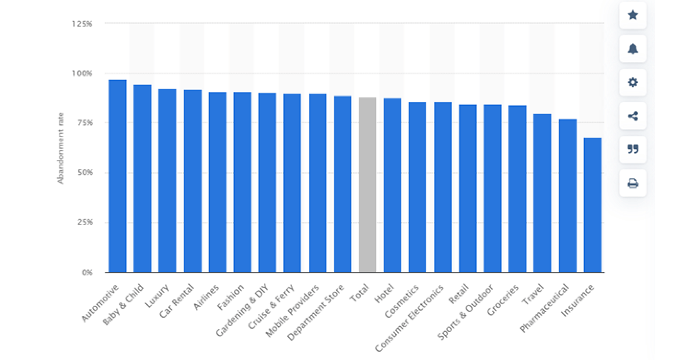
On average, 69% of carts are abandoned across industries and websites – using a pop-up here could make or break your sales funnel. A discount? A testimonial? A freebie? Some free shipping? Run A/B tests on your audience, figure out what converts higher, and then create a robust pop-up that compliments your website.
The next critical step is to write a compelling message. An impressive copy can potentially prevent users from perceiving pop-ups as intrusive and annoying. So, here are four tips on how to curate compelling pop-up copies:
- Keep your message simple: Use action words, and instead of speaking about the features of your product, focus on how it benefits your users. Convey their incentives in an obvious, specific, and concise manner.
- Back it up with social proof: Customers love to learn from others’ experiences. Strengthen your communication by sharing any form of testimonial, customer stories, customer ratings, or feedback to trigger social proof/influence.
- Create FOMO: Humans are also social beings and react well to emotions such as exclusivity & urgency. Use powerful words to trigger the fear of missing out to get a desired action.
- Have a clear CTA: Let the user know what you want them to do. Distinguish the CTA button by placing it in a box and using different colors & power words like “enter” or “subscribe”.
But can a great copy make up for bad design? No, design is equally (if not more) important for the success of a pop-up campaign! A Backlinko survey claims brighter-colored pop-ups outperformed dull ones by 51.3%.
So what goes into cooking a perfect pop-up?
- Using your brand colors and allowing users to generate maximum recall
- Writing a copy that elicits an emotion, & drives action
- Using fonts that align with your branding guidelines
- Creating snackable, & appealing visuals in conjunction with your offering
- Picking the perfect time slot to stay relevant
Here are a few more design elements that can make an impact:
- Stay away from generic templates: Experiment with colors, elements, and typography to grab the user’s attention.
- Retain the brand’s identity: For better brand recall experiment within your brand’s guidelines for better brand recall.
- Allow the CTA to breathe: Your call-to-action must be easy to find & prominent. A crowded design is unattractive, distracts the user & lowers the CTR.
Lastly, iterate while deciding the format, placement, copy, and design. Create multiple combinations, experimenting with the length of the copy, headlines, CTAs, and overall designs.
Top Ways to Leverage Pop-Up Notifications
Now that you know why pop-up notifications are important and how you can drive up engagement, retention, and acquisition using compelling notifications, it’s time to explore the use cases!
Using pop-up notifications to promote a product and offer is one of the most common ways to alert your customers. Other popular ways are seeking feedback, upselling, or cross-selling.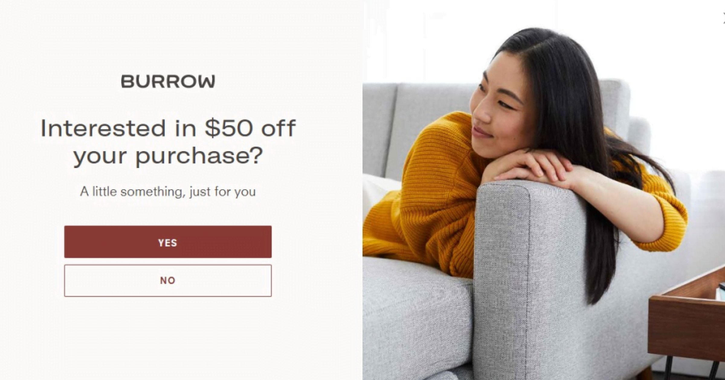
Sky’s the limit for marketers to utilize pop-ups as a medium to reach out to their users, and speak to their customers at an optimal time. We’ve also observed a few brands making great use at checkout points or even gamifying pop-ups.
Limitations of pop-ups & how to avoid them
Website pop-ups are an incredible way to talk to your users and deliver information without much hindrance. However, it’s worth knowing what not to do – because simple mistakes can cause any campaign to tank.
- Demotivate users to engage: Too many prompts can ruin the user experience. Do keep a check on the frequency & timing of your pop-up notifications so as not to annoy users.
- Use generic templates & irrelevant messaging: Repetitive designs, copy, or irrelevant information is a big turn-off. To avoid this, marketers must approve only those campaigns that add true value to the business.
- Miss mobile optimization: As many as 75% of web designers feel that the nonresponsiveness of a website for mobile is the reason why users leave it, claims Sonary.
- No testing: Creating a great pop-up that converts, is contextual, talks to the users, and offers value is no rocket science, however, requires some thoughtful thinking about users.
Conclusion
Pop-up notifications are a definite game-changer for marketers struggling to improve website retention and engagement. The key is in keeping things simple and intuitive. WebEngage offers a suite of pre-built templates that are tried and tested by 100s of marketers.
Whether you’re looking to address cart abandonment or share an offer code – pop-up notifications can unblock you creatively. Effective pop-ups should be concise, appealing, crisp, and personalized. Need help in understanding what works best for your industry? Reach out to our team at WebEngage and harness the full potential pop-ups for your brand.



 Prakhya Nair

 Diksha Dwivedi
