Table Of Contents:
1. Abandoned Cart reminder with out-of-stock update
2. Category based personalised newsletter opt-ins
3. Masking push notification permission
4. Notify about price change in wish-list items
5. One step checkout
6. Inventory update
7. Flash Sale
8. Feedback rating
9. New version
10. Cross sell
In-app messaging has gradually become the favorite of marketers because
- Unlike push, an in-app message isn’t time-sensitive. So you won’t have to critically evaluate the right time to send an in-app message, as users see it whenever they are active on the app.
- There is no text limitation in it and you can also incorporate images, videos, forms or their combination.
- There is a zero risk to sink in the spam folder or even promotions tab like email.
- In-app message, unlike email and push, doesn’t require the user to opt-in.
- And most importantly, in the case of in-app message you don’t run the risk of getting instantly skimmed and swiped right like email and push. You enjoy dedicated attention of the user.
But the biggest advantage in-app message avails is that, through it, you send your message to an already engaged audience. So it sets the highest possibility for your message to get attention from your readers.
However, the biggest downside of in-app messaging in comparison to push and email is that it cannot be employed for acquisition or even pull inactive users. It does what it does only when the user has decided on using the app.
Working with a good number of e-commerce companies, we had a rare fortune of being privy to some of the best use-cases of in-app messages, which have solved incredible problems for these firms. In this post, we are going to highlight the best ten use cases of in-app messages that we came across.
Bonus Read – Boost your sales using intelligent user engagement on Mobile App
1. Abandoned Cart reminder with out-of-stock update
When to show (Trigger)– The inventory of abandoned SKU in the cart is lesser than 5
Whom to show (Segment)– All users who have added items to the cart and haven’t completed checkout
Example-
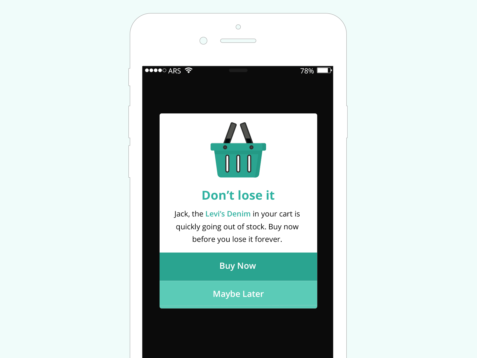
So far, email newsletters and retargeting campaigns were the only mediums to engage and convert the cart abandoners. The in-app message could be another potential alternative to persuade shoppers to finish their purchase.
Now, there could be several use-cases around cart abandonments like
- Offering personalized discount to ‘high volume’ buyer segment
- Sending a regular reminder about abandoned products post certain period
- Setting urgency by declaring the product to be going out-of-stock
We used the third one for the current use-case.
2. Category based personalised newsletter Opt-ins
When to show- When the total time spent on the app in a session is greater than 60 seconds + the user is inactive for more than 5 seconds
Whom to show- All users who have accessed women’s category for greater than 5 times in their last 10 sessions + the user is not already a subscriber
We added ‘inactive for more than 5 seconds’ condition because we don’t want to abruptly pop a request if the user is doing something on the app.
Example-
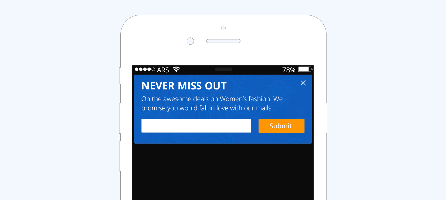
Essentially, you need to push users to subscribe to our newsletter only when they have shown significant engagement with the app. You can calculate engagement of a user by any of the following metrics- time on the app, number of purchases, feature usage etc. The point is that better the engagement metric, higher the possibility that the user loves your app and wouldn’t mind knowing more through newsletters. We took time-on-app in this case to evaluate the engagement.
Now, you can also go one-level deeper and add more context to the message by figuring out the category which the user has shown most interest in. In this use-case, we are showing the above message only to those users who have accessed ‘women’s category for greater than five times’ thereby making it more targeted and increasing the possibility of signup.
3. Masking push notification permission
When to show– The user completes the checkout
Who to show– All iOS users
Example-
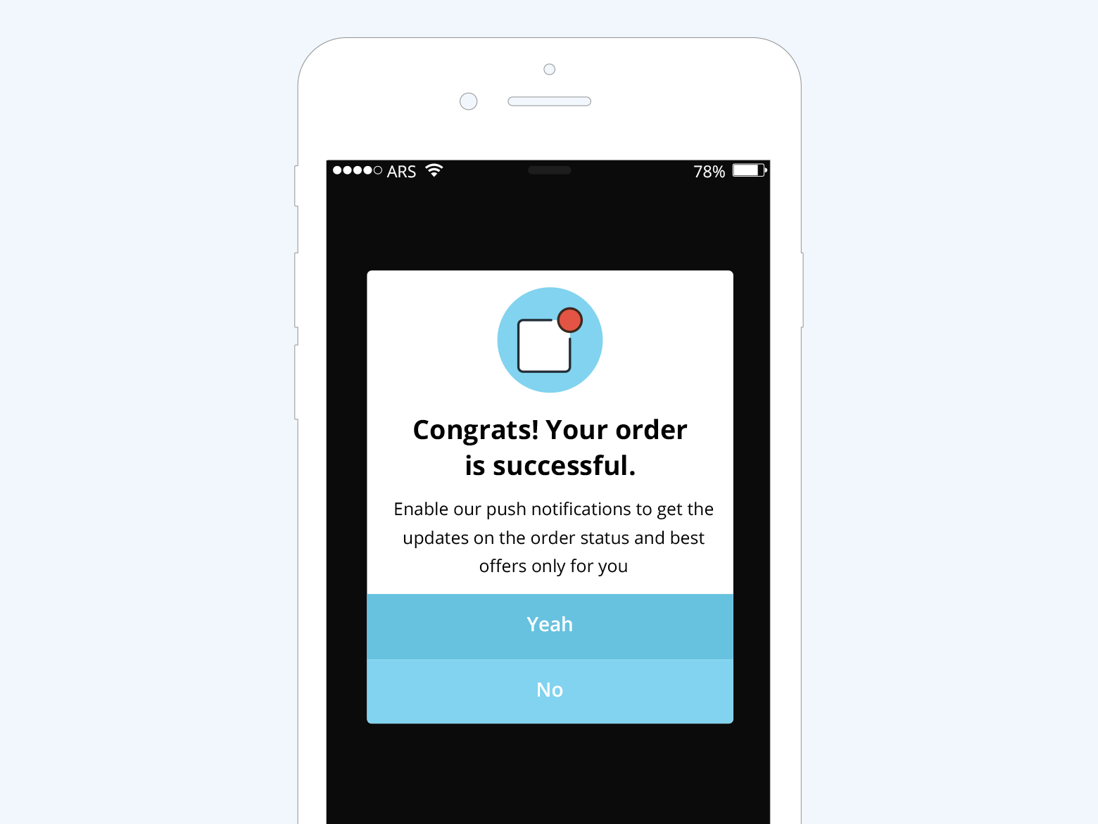
Push notification is intrinsic to the mobile marketing of any e-commerce business. In fact, in the absence of e-mail address, this is the only medium to pull back inactive users on the app, who are 60% likely to never return to it a day after install.
Why this use-case only for iOS users?
In Android, a user is automatically registered for push messages during app install, however, on iOS, the app has to explicitly seek your permission to send you push messages. The app takes permission through an iOS permission screen which app owner gets the opportunity to launch only once.
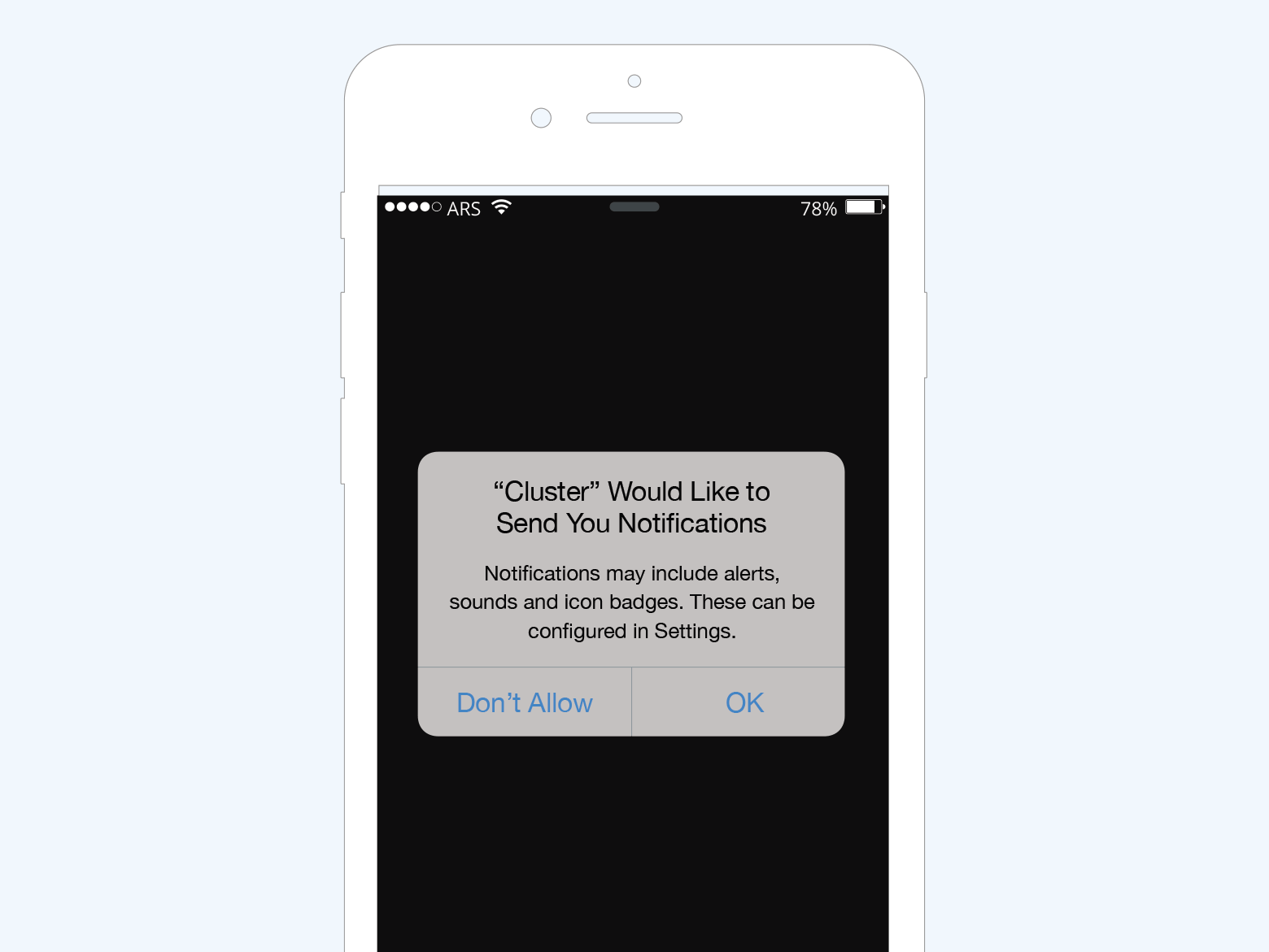
If the user denies you the permission, the only way you can have his approval is if personally changes his phone settings, the probability of which is as high as your optimism. So, essentially what you got inherently covered in Android is another big fight in iOS.
However, iOS SDK also allows you to launch a custom iOS permission screen before launching the actual system permission dialog. This allows you to defer the triggering of system permission dialog in case the user makes a negative opt-in choice on the custom screen. You may proceed to trigger the user permission dialog, in case of positive opt-in from the user.
Saying that, before you think of seeking user’s permission to send him ‘push’, you have to be assured that he loves your app, which can be gauged from any engagement metric. (we took session count as the metric here) Further, you also require giving a solid reason as to why the user should subscribe to your push notifications. The above use case is targeted only to those users who have completed the checkout on their iOS device. On completing checkout we are encouraging them to receive push notifications to get the update on his order.
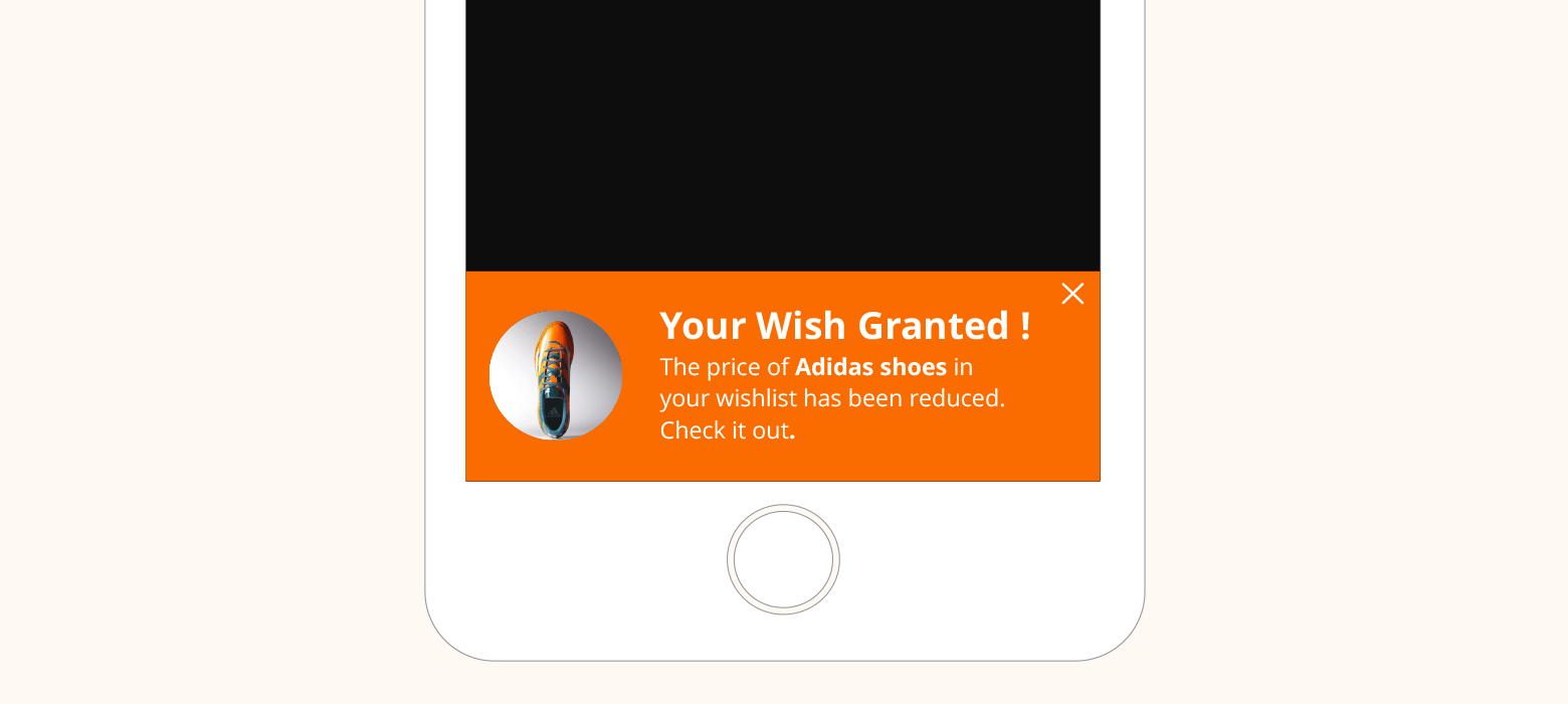
4. Notify about price change in wish-list items
When to show– The price of the item/s added to the wish list have been reduced + the user has launched the app
Whom to show– All users who have at least one item in their wish list with the corresponding SKU
Example-
If the price of the product that the user is interested in has reduced, then it seems quite logical why would you want to notify her about the same. But so far, it has been one of the most difficult problems to crack both in online and offline space but now you have an awesome capability to automate this.
However, the in-app message in the above use-case would work only if the user is engaged. If the user is inactive for x days post the price has been upgraded then naturally in-app message is not going to work. We would have to employ mobile push notification to nudge user towards conversion.
5. One step checkout
When to show- When the user clicks on ‘Checkout’ button
Whom to show- All users who paid via credit card in last two consecutive transactions + the credit details of the user is not saved
Example-
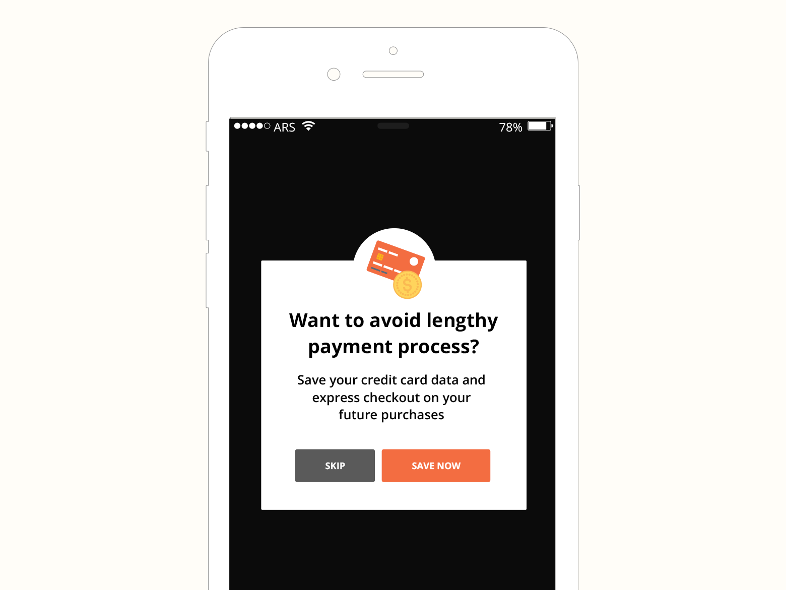
For express checkout, a user needs to save his credit card details in the system. This would let him escape the lengthy payment process. In the current use case, we are encouraging users to add their CC details so as to enable ‘Express Checkout for subsequent purchases.
Naturally, we are going to show the above message only to those users who have transacted via credit card before. We have created the segment accordingly.
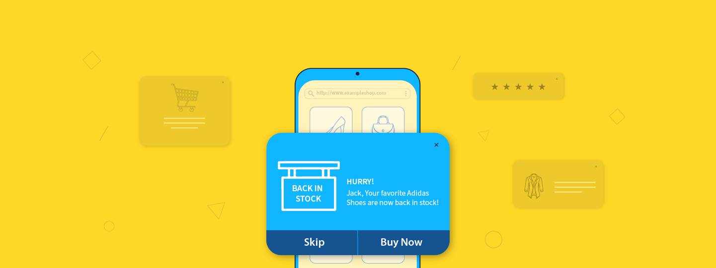
6. Inventory update
When to show– The user has launched the app + inventory has been upgraded
Whom to show– All users who have opted to get notified for an out-of-stock SKU and the corresponding SKU is back in stock now
Example-

Oftentimes, a product in demand is out of stock and the user chooses to get notified through a widget if the product is restocked in future. An in-app message could be employed to convey users in the event of such occurrence.
7. Flash Sale
When to show– The user has launched the app
Whom to show– All users whose gender is Female OR users who have transacted products belonging female category in the last 6 months
Example-
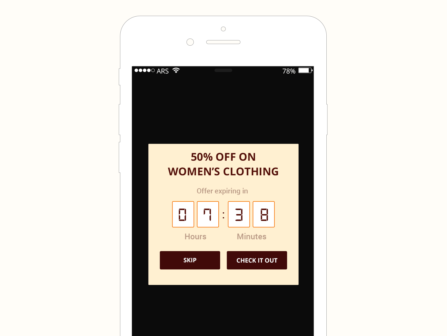
There is a day-specific offer running in a particular category, like Women’s in this case. So while creating the segment, we take into account all the female plus the users (who could be male) who have purchased a women’s product.
The above in-app message should also be coupled with an email and depending on the value of the offer, you can also contemplate sending a push and text.
8. Feedback rating
When to show– The user has launched the app
Who to show– All users whose delivery of the immediate last purchase has been recorded + the user has not been fired this in-app message before, for the purchased product
Example-
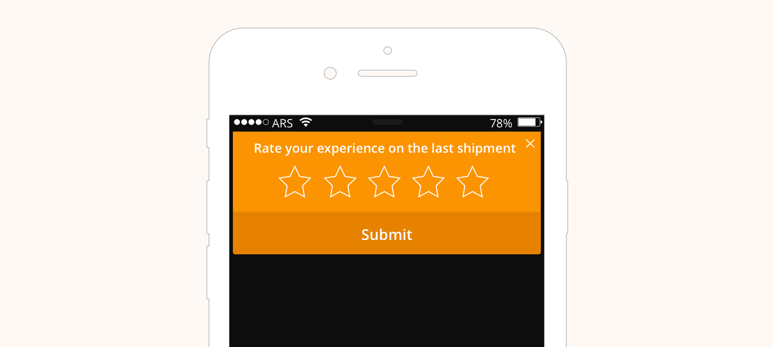
Marketing automation gives an incredible capability to ask for feedback at the precise moment when it should be asked. In the above example, we are asking for feedback on shipping experience after the delivery. Similarly, there can other important use-cases too around seeking feedback. For instance, we can also automate asking feedback about checkout experience post checkout, about the new feature on the app once the user actually uses it or about new upgrade.
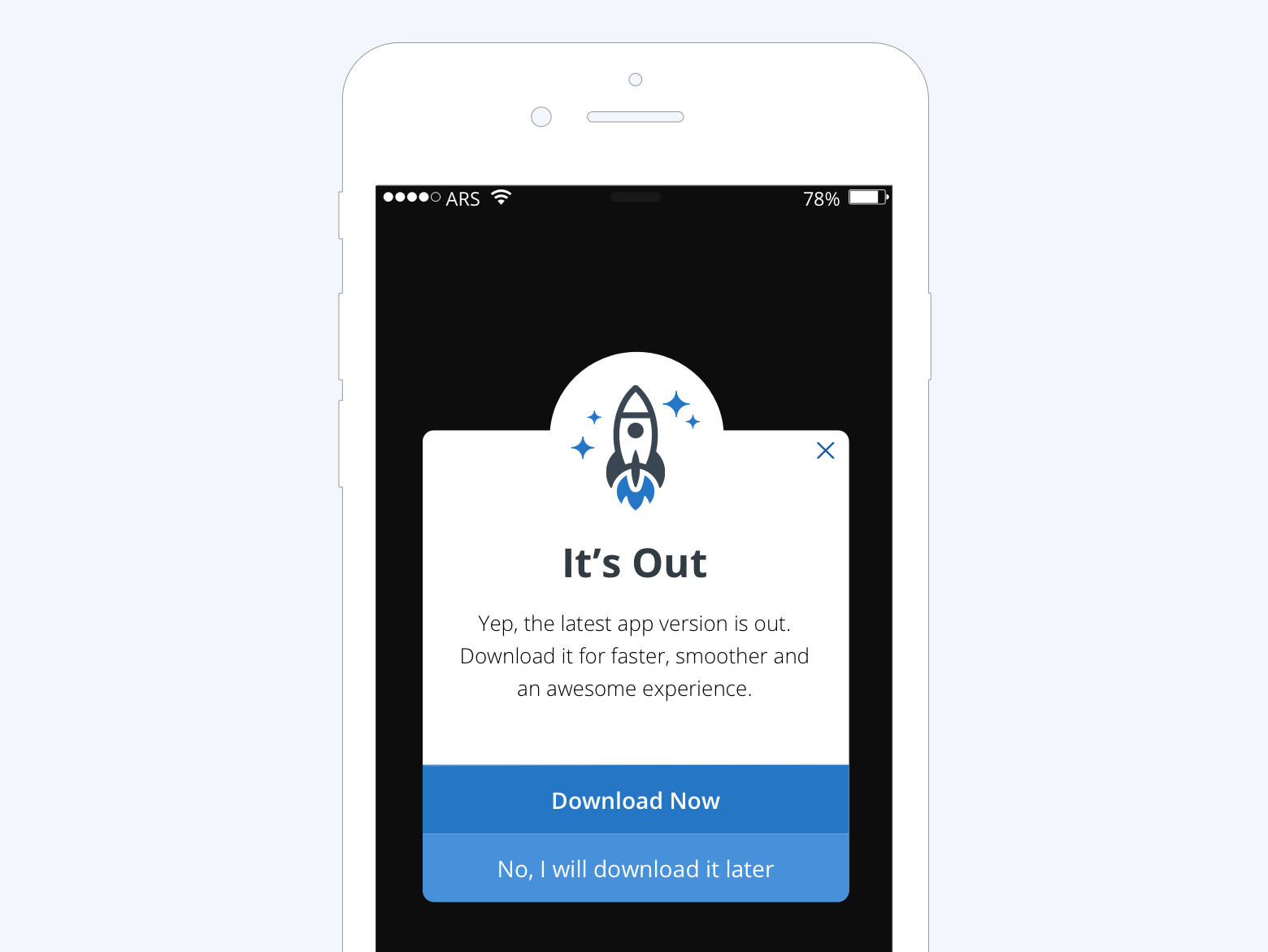
9. New version
When to show– The total time in the current session is greater than 30 seconds
Whom to show- All users whose app version is not V 2.0(say App 2.0 is the latest version)
Example-
10. Cross sell
When to show- The user clicked on ‘Add to Cart’ button
Who to show- All users
Example-
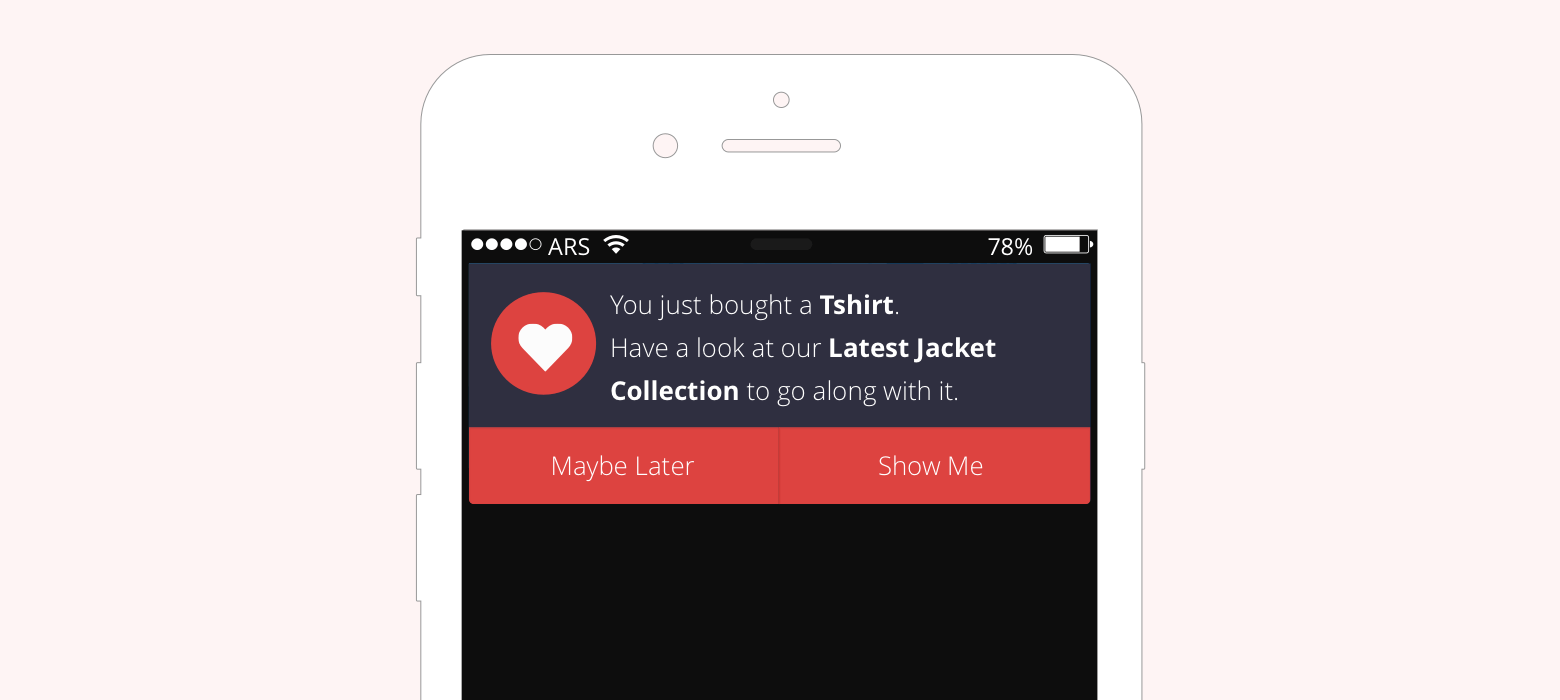
Providing maximum value to one customer and increase his cart value is better than scouting for 10 new customers. On desktop site, due to its relatively larger real estate, it is possible to show customized product recommendations on the visible screen. However, on mobile, this thing largely misses out which could be compensated with an in-app message with a custom product recommendation.
Conclusion
Marketers should exercise discretion in using this so that it doesn’t earn the reputation of bad-popups.
Finally, like I said, exercise maximum discretion to ensure that your in-app message seems part of the flow and doesn’t come across as an intrusive popup.
For e-commerce stores, messaging mediums like in-app and push notifications hold enormous significance, as they are keen on engaging with their user-base more on mobile than desktop.
Check out WebEngage’s dashboard if you wish to see the live demonstration of the use-cases stated above.
Bonus Read – Boost Your User Retention Rates. Follow these 11 best practices for In-app messaging
How To Set Up Your Next Back-In-Stock Alert In Just 5 Minutes




 Diksha Dwivedi
 Prakhya Nair
