Table Of Contents:
- Track and improve checkout conversion using analytics
- Help customers convert in real-time using live chat
- Replay user sessions to spot and fix conversion issues
- Keep customers in your checkout with real-time notifications
- Run tests to tweak and improve the user experience
- Support users to abandon their carts, to increase conversion
“Shopping online: it’s easy when you know how”
Want to know what a real online checkout looks like? here a video for you:
In spite of the video above taking a humorous view of the online checkout process, it’s still very close to the reality; lengthy processes, long forgotten passwords and timeouts. Everyone has come across something annoying, frustrating or just plain stupid when they’ve tried to complete their purchase online. To retain customers and drive sales the online retailer has to find ways of minimising issues and delivering a fun, engaging shopping experience. On average, 31% of customers convert through the checkout – that leaves a huge 69% potential for you to make an improvement on your checkout conversion rate. Think how each 1% would impact your bottom line.
We’ve compiled 6 key techniques for checkout conversion improvement, guaranteed to keep customers and drive business. We’ve also added in 18 additional professional tips that we’ve gathered from our experiences with customers to really help you boost your customer engagement. What’s more, you’ll also find a rough guide on the level of difficulty to implement and likely impact on improving your conversion rates.
Download Impact Story –Achieve 166% Uplift In Your Online Conversions. See how MyGlamm, an online color cosmetics brand, did it.
1 – Track and improve checkout conversion using analytics
Implementation effort: Low/Medium | Impact: High
In a physical shop you can track how customers are moving through your store with your eyes and with technology. However, the shop floor doesn’t come with a tool such as Google Analytics or Mixpanel. These tools are perfect for showing the e-tailer how customers are using your e-commerce site. Set these up correctly and you’ll soon find out where your pain points are in the checkout process.
The first step is to map out your conversion funnel. Most e-commerce sites follow the product page > cart > personal details > delivery > payment > transaction complete process. Your analytics tool of choice should be able to map these out. If you’re using a tool like Google Analytics there are a wide choice of help sites that will assist you in building your own checkout conversion funnel. You’ll soon see where people are exiting the process.
Attrition is a common issue within a checkout and it can come in the form of ambiguous messages, unclear signposting or something as simple as not localising language (zip code vs postal code for example). Whilst these may not directly trip customers up, they can certainly disrupt their flow.
Pro tip 1: Install Google Analytics even if you have other analytics tools in place. The sheer volume of helpful guides available makes this an accessible solution for newbies and pros alike. Installation is fairly easy, however, you will need to put some effort into customisation if you want the best out of it.
Pro tip 2: Within Google Analytics and other platforms such as Formissimo you can also track interactions between form elements. For example, you may see that the personal details page has a high exit rate and you can use the technology to find out which form element is causing them to drop out. Furthermore the above options will also allow you to view this by country, by device and so much more. For example, your form may not accept a particular type of entry which is causing people on certain devices to exit your checkout in frustration.
Pro tip 3: Set up instant Google Analytics e-commerce conversion alerts so you can track this closely and be swiftly alerted to any changes such as a broken form. This is a hidden, yet super powerful, Google Analytics feature which goes underutilised.
2 – Help customers convert in real-time using live chat
Implementation effort: Medium | Impact: High
How often have you been stuck on a checkout page without an easy way to contact someone for help? Maybe the postal/zip code isn’t recognised? Or your username is no longer working so you cannot sign in and use your details?
Checkout best practices suggest minimising navigation items and other links on the page when progressing through the checkout.
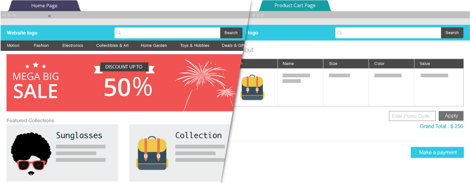
It makes sense to streamline the process. Why confuse customers and clutter the display when simple and seamless is the key? Find out what happens when your customers hit a snag. Some retailers offer a telephone number or link to contact customer services via email. Others provide something even more useful, especially for the time-strapped, instant gratification requirements of the average customer…
“Take the pro route: go for live chat”
If a physical store has an assistant, there is no reason why the virtual one shouldn’t have one too. Install a live chat tool to get the feedback you need. Installation of some form of script within your website is fairly quick and you must ensure that you have one or more operators in place to deal with any enquires. A big advantage of live chat is that a single operator can manage multiple ‘chat windows’. Live chat tools also offer a fall-back so that customers can send you an email if you’re unavailable.
This feedback from customers can make a big difference in understanding where you can improve your checkout process, from delivery options through to payment.
The fall-back option
If you don’t think you’re ready for live chat, install a customer contact form to allow customers to drop you an email. Customer contact forms allow you to function light on resources. A large number of enquiries can be handled by few people due to the asynchronous nature of the conversation. Having said that, even in the case of contact forms, you need to respond ASAP and the customer will need to check their email for a response. Allowing customers to talk to you in real-time could encourage them to complete their transaction and its great for getting them to go home with that impulse buy. Much like an in-store assistant might.
Pro tip 1: When starting out with live chat, target either a single page and/or your most expensive traffic channel such as paid search. Limit the number of live chats to allow you to scale up as you can. There’s no excuse to not give this a try whether you’re a team of one or 1000.
Pro tip 2: Some tools allow you to pass details from the user’s browser to a live chat client or contact form if you’re using one; use this to send the basket details and the source of traffic through to help the chat attendant personalise the chat experience.
Pro tip 3: Ask your developer to send data to your analytics tool each time a customer contacts you via live chat or the online form so you can track the impact on conversion rate, basket size and other valuable parameters.
3 – Replay user sessions to spot and fix conversion issues
Implementation effort: Medium | Impact: High
Spy on your users? Yes, but not in the NSA sense. What we’re suggesting is installing code on your website which records the user’s interaction with your site within their browser. Every mouse movement and every click can be recorded in code and ‘replayed’ so that you can see those actions overlaid onto your website.
You should ensure you’re protecting user’s Personally Identifiable Information (PII) by masking out credit card fields and anything else for which you’d not feel comfortable asking users’ permission directly; most tools allow this level of customisation. The insights gleaned from this level of analysis can help you uncover issues which might otherwise be hidden behind data.
This is a widely adopted conversion optimisation technique and there is an array of browser or server based solutions which have their own advantages and disadvantages in application. In simpler terms you’re deciding on whether you will install external software attached to your website (cheaper, quicker) vs hardware (more expensive, more accurate). Software services such as SessionCam and UserReplay with which you add some code to your site to track user activity, can allow you to record users easily on your site for a relatively low cost. Services like Tealeaf on the other hand, require hardware to be installed to record user activity which creates a bigger cost but provides the benefit of tracking 100% of data with better storage and retrieval. For the many companies small and large the software service route suffices.
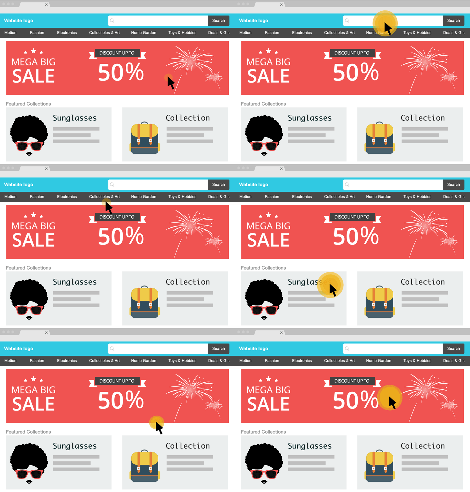
Pro tip 1: Most of the session replay tools allow you to create alerts under certain conditions. You could use this to alert you when error messages occur, such as a payment error, or if users spend too much time on a particular section or click specific links or buttons. It also means you don’t need to watch every, single video.
Pro tip 2: Session replay tools often record the entire user journey from the first page visited right through to the checkout, assuming that’s where you’ve triggered the video. Quite often the user journey helps you to understand their mind-set and uncover the reasons behind why they did or did not convert.
Pro tip 3: Watching session replays is a great way for others in your team to build up an understanding of your customers. In the early stages it’s often worth making it a habit for designers, developers, analysts to watch at least one user video a week.
Bonus read: 6 Best Practices For Customer Retention: E-commerce
4 – Keep customers in your checkout with real-time notifications
Implementation effort: Low | Impact: High
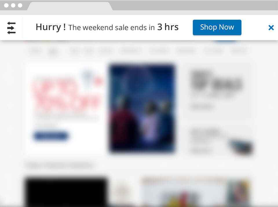
Website notifications are a superb way of keeping customers in the checkout queue. Especially when you can remind customers of the great offers they are about to lose out on, or the limited time they have to use them. Think about your weekend sale. How about a subtle way of reminding people in the checkout section that there is only a little time left before these offers expire?
There are a few methods you can use to deliver the message: via a pop-up at the bottom of the page, a subtle banner across the top or bottom of the page or, if you’re targeting users leaving the checkout, as a modal pop-up in the middle of the page.
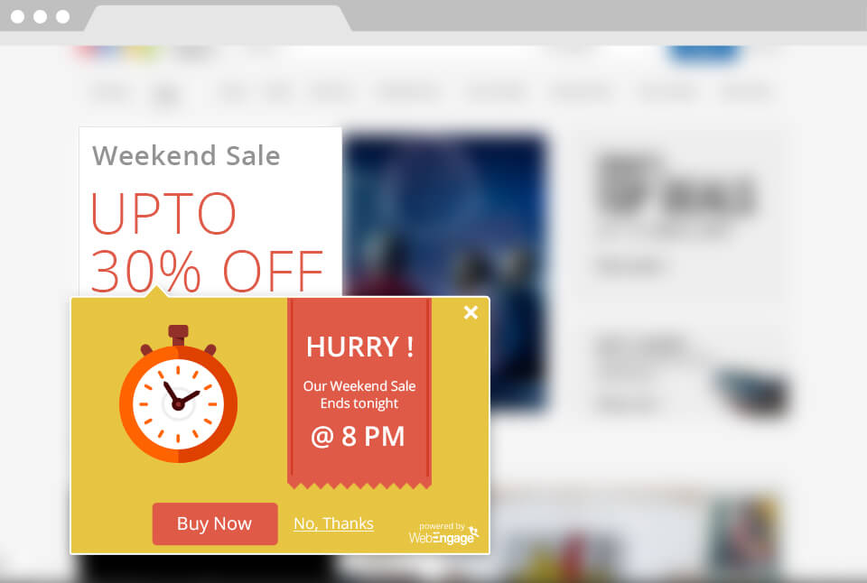
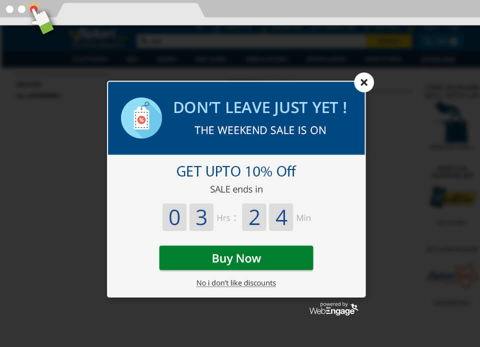
Each method serves a purpose. The boxed pop-ups bottom left or right are a little disruptive and force the user to look at them without necessarily stopping what they’re doing. The top or bottom bar is more subtle and less disruptive.
The modal pop-up (by modal, this means the user has to interact to continue) is common practice when the user is moving away from the website. The term is ‘exit intent targeting’ which involves tracking the user’s mouse movement and, when it hits the toolbar area of their browser, it is assumed the user is about to close the tab or window. A disruptive exit intent notification here can be a good way to really hook customers back into your checkout, but be careful as incorrect use in the most critical part of your website could have a detrimental effect. Luckily you’ve already implemented analytics and intelligence alerts so you’ll know if things have gone wrong.
Pro tip 1: You can usually pass additional details to the notification tool, such as which marketing channel they came from. Reserve a special promotion for those arriving via paid channels where your cost per acquisition is higher as converting these users is more imperative.
Pro tip 2: Another idea is to send data to your notification tool on whether the user is new or a returning customer. For the latter, perhaps you could give them a special loyalty incentive as you’re targeting lifetime value? Or maybe you just want to reserve special incentives for new users as your cost per acquisition is important. Whichever option you choose, this tool can build customer loyalty and brand engagement.
Pro tip 3: Ensure you test notifications across your key devices. A subtle pop-up on the bottom right of a desktop screen could take the whole screen on a mobile device. It takes only one mistake to potentially lose a client for life.
5- Run tests to tweak and improve the user experience
Implementation effort: Medium | Impact: High
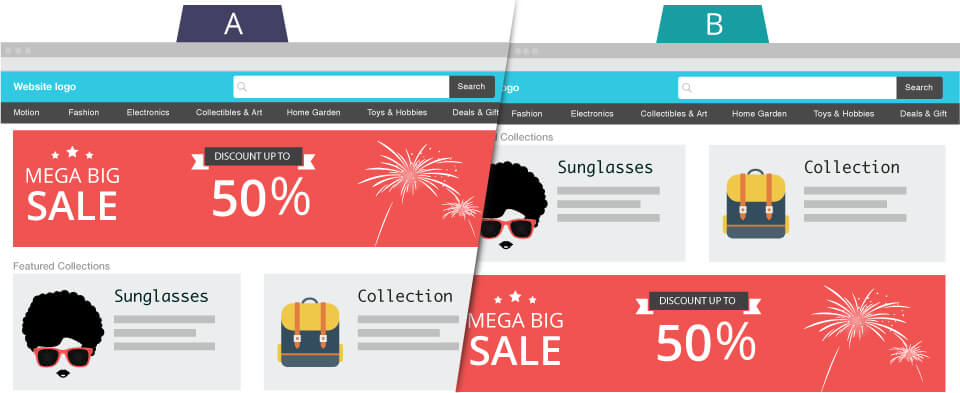
AB or ‘split’ testing is a methodology used to test any element of your website that the user interacts with. This could include buttons, colours, links, images, designs, copy and functionality. For example, many e-commerce websites offer the ability to pre-populate the address using a zip code/postal code lookup service.
You can test that functionality to see the actual impact on checkout conversion or even time to checkout. While checkout conversion is the primary goal, you could test checkout based cross-sells to discover the impact of adding a small extra item to the cart and the impact on conversion rate and average transaction value.
You could also assess whether a green button works better than a blue one – it all depends on what you’re planning to achieve. Plus, if you’ve implemented analytics and are viewing user videos, you should have a number of ideas as to what you want to test. There’s a wide choice of tools ranging in price and functionality and lots of helpful advice online about which to go for.
Pro tip 1: Combine your analytics and user recordings alongside your AB tests to really understand how well your tests are performing. You’ll not only want to know which test won, but why it did. This will allow you to then feed those results back into the next batch of ideas for testing.
Pro tip 2: Use AB testing on new checkout features that your development team is rolling out. It’s possibly the most important part of your site and yet often things are not tested and checked. For example, if you decide to add a login/guest checkout screen to the checkout process, why not test with and without this option to give you a baseline on how this impacts checkout conversion and time to convert.
Pro tip 3: Use a website survey on your confirmation page and ask users for exacting feedback on the checkout process. Over the past five years we’ve seen that often the web analytics will show that users are converting, however, when you ask customers what could be improved they’ll often provide feedback on things you just hadn’t thought of.
6 – Support users to abandon their carts, to increase conversion
Implementation effort: Medium | Impact: High
It doesn’t make sense to let users abandon their cart, let alone help them do so. And yet this is a rich solution that can result in converting later on. There are two sides to this coin. The first is the growing number of users accessing e-commerce sites via mobile and the low e-commerce mobile conversion rates. The theory is that users often browse on mobile and buy later on desktop. The second aspect is that if a user is not ready to purchase yet, then no amount of offers or promotions will convert them. They may be waiting for pay day or they’re taking a look at a few different websites or planning for some future event. In this case, there are a few options to consider.
- Abandoned cart emails – this is common practice in e-commerce, if not slightly overplayed. This runs on the assumption that if a user exits the website after you’ve collected their email, then they’re open to converting later thanks to a nicely laid out email asking the customer to complete the transaction.
- Remarketing ads – this is based on targeting consumers via a cookie or email address, depending on the advertising platform in use, with the products they added to their cart but didn’t purchase. Often these can be hit or miss and it is worth testing to see if it works for your brand.
- Save for later – the idea here is that you actively promote the option to save the cart for the user to come back to at a later date. This is useful for supporting those cases where your product is likely to be purchased around key dates.
- Remind me later – this is a spin on save for later, except you also send an email to the user at a specified date in the future.
There are benefits to having these options, even if it feels counter-intuitive to offer an easy exit from your checkout.
Pro tip 1: Now that you’re aware of AB testing, these are all items worth adding to your AB testing plan!
Pro tip 2: There are software services that help tackle cart abandonment which usually take a % of uplift in sales as commission. It’s a zero cost way of testing but be careful of signing up to anything long-term, just in case it doesn’t work out.
Pro tip 3: Remarketing ads can be developed from analytics data, from user cookies (data files) on your site or from a list of email addresses, such as Facebook remarketing. You should test each of these methods to find the best fit for your business. There are software services available which offer retargeting but they often work with ad platforms like Facebook and Google Display Network (GDN) directly.
Summary
We’ve shared a number of techniques here we have seen clients gain success from. But how do you prioritise your battle plan for improving cart conversion? We encourage companies we work with to slay the low hanging fruit quickly. Fix the gaps where customers are almost ready to part with their money then work your way to other parts of the website.
We’ve listed these techniques in the order we would recommend any business to implement them. However if you have already implemented one or more then you’re already doing a great job. If you’ve implemented all 6 techniques you’re way ahead of most businesses! If you believe there’s something we’ve missed or have opinions on these techniques please leave your comment below.
Download Impact Story – See how Yayvo, Pakistan’s largest eCommerce company, increased its conversion by 8%




 Diksha Dwivedi
 Harshita Lal
 Niket Raja
 Anmol Mewada
 Ananya Nigam