Let’s start this article in the good old way with some statistics.
A 2019 report revealed the following data regarding the rising significance of mobile:
- In a world with a population of over 7 billion, there are 2.7 billion smartphone users in the world
- 62% of smartphone users have made a purchase through their phone
- There were 194 billion app downloads worldwide in 2018
- Mobile apps are projected to generate 188.9 billion US dollars in revenue
And in case those weren’t overwhelming enough, here are two other eye-popping statistics from the same report:
- From 2013 – 2018, global smartphone sales were valued at $522 billion
- The mobile industry will contribute to $4.8 trillion to world GDP in 2023
- There will be 6.83 billion smartphone subscriptions in 2022
Bonus Read – How Your E-commerce Store’s Mobile App Can Boost Sales With Intelligent User Engagement
The Mobile Web (website) vs. Mobile App debate
Responsive design has resulted in websites that are fully functional via mobile devices. However, when companies want to streamline the conversion process, the development of native apps proves more beneficial. And the argument really does not have to continue. Smart companies have both.
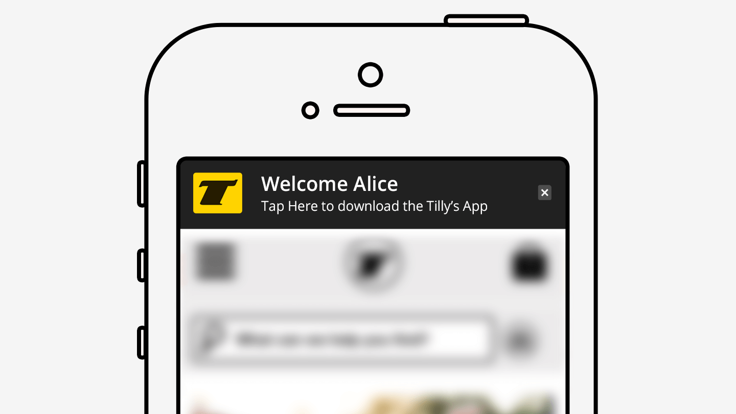
When search results take a user to a mobile website, a prompt to download the native app can appear at the top of the landing page. Users can tap to download the app and complete their business. They can then uninstall the app and re-install when they decide to return. It’s a fluid process, but a good one.
The controversy over which is better does not have to continue – users will keep an app if the site is one that they frequently use; they will uninstall and re-install if their use is sporadic. Time to get over it, and start on the path to improving your app conversion rate.
So What about CRO via Native Apps?
There are a lot of “gotchas” in the development of native mobile apps that will impact your conversion rate. But here is a list of 6 tips that will easily increase your mobile app conversion rate.
1. TIP 1: Test, Test, Test
2. TIP 2: Personalize
3. TIP 3: Send non-intrusive notifications
4. TIP 4: Maximize usability
5. TIP 5: Reduce difficulty of forms
6. TIP 6: Make e-commerce conversions easy and seamless
TIP 1: Test, Test, Test
Remember, CRO is directly tied to UX, so every function of your app must be tested. This can be expensive and pretty challenging for time management. If you don’t test, your consumer will take care of it – by bouncing and never coming back. In general, you want to ensure that the app successfully and quickly downloads to each device for which it has been developed. When updates are available, there needs to be a way to push out to the user. Test on every device with the operating system for which you have developed the app.
You can save some time and money on testing by using a device emulator. Another option is a real device cloud, so you can even test when you may not have the actual device. And automate your testing when you can – this is a big time-saver.
TIP 2: Personalize
It’s easy to personalize experiences on mobile apps. Users can set preferences at the onset, and apps can track user behavior and engagement, and then make individualized recommendations. Apps can also identify locations of users and provide content related to that geography.
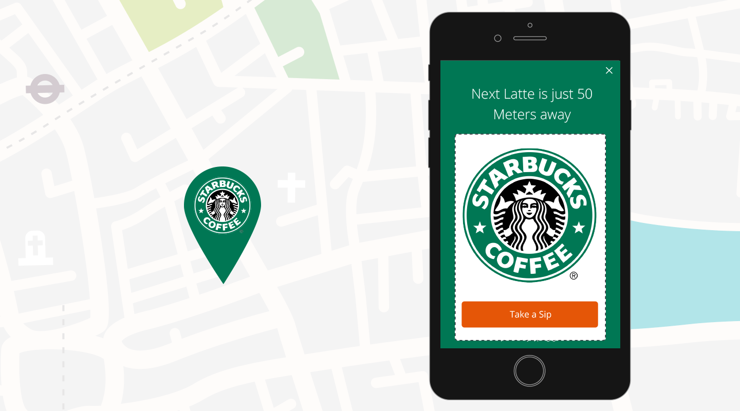
Personalization does not just enhance UX, it improves CRO. When users feel “pampered,” there is a better chance for
s.
TIP 3: Send non-intrusive notifications
There is no doubt that email campaigns are a huge part of CRO efforts. But, because of email “overload,” open and conversion clicks have dropped over time. So instead of emailing, send app notifications. They are quick and easy, and can either be of the “push” or “in-app” type. The push notification will pop up no matter what a user may be doing on his device. The in-app variety will pop up only when the user is on the actual app.
Source: vwo
There is some evidence to suggest that push notifications have resulted in 40% click-through rates. Obviously, businesses have to be judicious about the use of notifications and very frugal with their content for notifications.
But on top of everything, here are the questions you need to ask, so that you honor rather than irritate your users:
- Is your data/information time sensitive – are users watching for something? (e.g., e-Bay bid)
- Do you need to send reminders? A shopping cart still sitting there? A form not finished?
- Is your app location-specific? Do you need to notify to point users to something that is nearby?
- Is there a news-related event that relates to something your user has been following?
Some general guidelines:
- Ask a new user if s/he wishes to receive notification and, if so the try to understand what kinds? This is a part of personalization that demonstrates your concern for individual tastes. This can reduce uninstalls.
- Parse notifications for geography and time zones, as well as user interaction behaviors and chosen settings.
- Know your users. The user base may change over time. Using analytics to develop a clearer persona relative to app usage (when, where, for what purpose) will make your notifications less intrusive.
Bonus Read – Here Are 10 Steps For Increasing Mobile Website Conversion And Traffic
TIP 4: Maximize usability
Visitors access your app for two reasons: they either want to browse your product or service offerings, or they want to make a specific purchase. You need to be poised to honor both purposes and to determine how you can optimize your app conversion rate within those two purposes. Consider all of these usability factors that will impact your CRO.
- Be welcoming to all users, no matter their purpose – searching, browsing, purchasing.
Here are things that should be noted about this clothing retailer’s mobile website:
- The user is prompted at the top of the page to tap to download the native app for greater convenience.
- The user can either search or browse. There is a search box, a login icon as well as a location finder.
- The lower half reminds the user of a big benefit – free shipping.
- The lower half is cut off – something that “tells” the user to scroll down for more. Developers have actually found that leaving a half completed image at the bottom encourages users to scroll down.
It is difficult to know whether the user is in the browsing/searching mode or in the purchasing mode. But offering options can both inform you and accommodate the user. If users browse through a specific line of products, chances are they are considering a purchase; if a user hones in on a specific product, then a purchase is imminent and filters and purchase support should be displayed.
But if a user has no search history with you, the design of the page should let that user declare his/her intent. Here is how ToysR’Us does this very well: Users can go to “special offers” or “browse by product type.”
Final Tip: Make sure users can easily switch from searching to browsing – it will increase your app conversion rate as opposed to bounces.
- Provide for the Fact that Users will Cross Devices in the Conversion/Purchasing Process
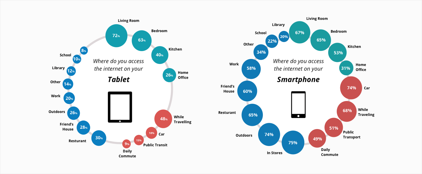
This is an area of a lot of mobile conversion research right now. Any type of conversion may cross devices in the course of user research and decision-making. A phone is with a person during the day and is used for short sessions. The PC is used for longer sessions, usually in the evenings and on weekends. And the tablet? Well, it appears to sit on tables to be used during the course of other activities, such as watching TV.
Here is an infographic developed by Forrester Research that provides “geography” of the tablet vs. the phone.
But conversions can occur through a process of all devices.
Consider this scenario – A user receives a text message from a friend regarding a site selling the purse she has been looking for. She accesses the site and browses the purses, perhaps on her PC at work. She goes home and purchases the shoes using her tablet, via the site app.
TIP 5: Reduce difficulty of forms
Filling in forms via a mobile app is obviously much more difficult, especially via smartphone. That means you will only be asking for the bare minimum of information – name and email address. Here is some great information related to the length of forms and app conversion rate, provided by Quicksprout.
Infograph- How to optimize contact forms for conversion
Hubspot studied 40,000 landing page forms and concluded that forms with only 3 fields had almost doubled the conversion rates of pages with 4 fields – something to keep in mind.
While you are designing forms for your app, and considering the bare minimum of information requirement, there are some other considerations that may also impact your app conversion rate.
- Captchas: your users are in a hurry while filling forms. While captchas may have a purpose on other devices, they are irritants and time-waster on a mobile app. In fact, the video app “Animoto” ran its own test on captchas and found that they had a 33% uplift in conversions when the captcha was removed.
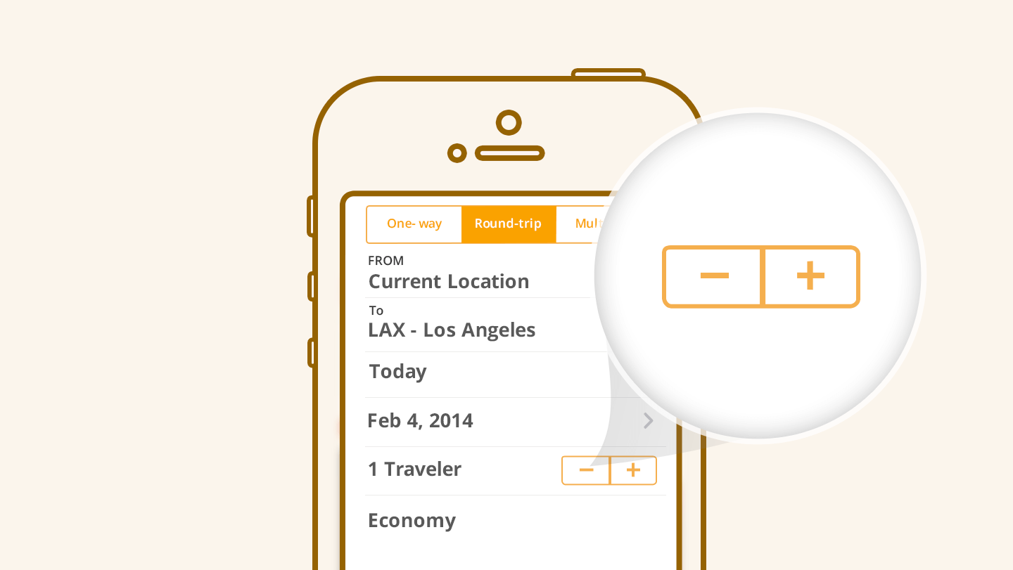
- Another research indicates that mobile users hate drop-downs – don’t use them. Stepper controls are good when appropriate:
TIP 6: Make e-commerce conversions easy and seamless
If users experience any difficulty with a purchase via your mobile app, they will bounce, abandoning their shopping carts. All of the features from the review of a product, to adding it to a shopping cart, to going through the checkout procedure must be tested regularly. And any new functions that will make this process easier, faster, and more seamless must be incorporated as they are developed.
Here are some of the important features.
Method of payment
Users who are in public may be hesitant to pull out their credit cards in order to go through the laborious tasks of entering all of these numbers, name, expiration date, etc. If the customer decides to wait until later when s/he has privacy, then the cart is abandoned at least temporarily, and you can only hope they return. The better strategy is to offer options such as PayPal or other well-known and trustworthy payment systems. Then a customer will make that purchase without fear of financial information being stolen.
Guest checkout is a must
No one on a mobile app wants to open up an account and complete your registration forms. The guest checkout procedure is faster and far more convenient for someone who is probably engaged in other activities.
Search feature
You will have to be most careful about your search feature. The user has to find what s/he wants quickly and will generally have less time to browse and is not willing to swipe through page after page of products. A voice search feature is absolutely necessary but it must also be effective and only pull up relevant products. A predictive search should be considered, too, now that the technology is here.
Save for later
A mobile app user may not find it convenient to complete a transaction at the moment, for reasons discussed above and because of interruptions while in the process. A “save for later” option can mean that the conversion is not lost, and that the user may indeed return to complete the transaction. You have nothing to lose by adding this feature and everything to gain if that user returns.
Scanning features
Remember – an exceptional mobile UX is one that is easy and quick. When a customer can achieve his/her goal fast, that customer is happy and more likely to return. Smartphones can now scan credit cards – fast payment – and then delivery details are provided. If you incorporate a scanning feature in your native app, you have removed all of the typing in of numbers and addresses. This is a much-enhanced experience and one that many of your competitors will not be offering.
Mindset and tools for Native App CRO
CRO has been a part of UX efforts for many years. Until now, developers have taken a rather holistic approach to CRO as they created responsive designs for mobile websites, trying to perfect CRO on the desktop and then making it do for mobile. With the advent of native apps, however, all of that is changing, as it should.
ECommerce has hit the mobile world at an astoundingly rapid rate. This should not be a surprise – after all, 80% of Internet users also have a smart phone. But CRO has always focused so heavily on desktop UX because that was the platform for all the traffic. Now it is estimated that by 2020, more than 50% of all online sales will be via mobile. And so tools had to be developed to evaluate CRO capability via mobile.
Here are some of those tools that you should consider.
- UserTesting: In addition to the testing suggestions already made, this company can provide you with actual videos of users engaged with your app, giving their thoughts as they navigate and perform functions.
- WebEngage: Here is a way to have your users surveyed regarding the usability of your site
- AppsFlyer: You can track all of your conversions in real time
- CrazyEgg: Get heat map overlays showing hot spots, bounce spots, and general sequence of travel through your app.
While CRO is still intimately tied to UX, it has come unto its own as a separate facet of web and app development. And CRO for mobile platforms must be separate from CRO for desktop platforms. If you have any reservations about a differentiated CRO effort for your mobile app, consider this. Research has shown that when specific CRO steps are taken for mobile platforms, app conversion rate can go as high as 160%.
Bonus Read – 5 Mobile Onboarding Strategies That Actually Increase Conversions




 Prakhya Nair
 Diksha Dwivedi
