We’ve all written some amazing content in the hope that people will love it, talk about it, and bring you more business. But did you know that not having the right placement of your CTAs can actually kill your content? We’ve outlined below, some amazing Call-To-Action tips to help you increase your traffic conversions.
Table Of Contents:
1. What is a Call-To-Action (CTA)?
2. What’s the benefit of CTA optimization?
3. How to optimize your CTAs?
4. Useful Call-To-Action tips
5. Call-To-Action takeaways
>What is a Call-To-Action?
A call to action (CTA) is exactly what it sounds like: a call or request for your audience to perform a certain action. This action could be anything! You may want them to purchase your book, connect on Twitter or Instagram, or even make a purchase. Literally, anything can become a call to action when you ask your audience to do something and provide actionable directives.
Most CTAs take the form of a button or message placed prominently and strategically to attract optimal attention. The goal is to be as clear and visible as possible.
The strategic design of any call to action is centered around catching the reader’s attention. The way this is achieved is based on the audience, your desired brand image, and the setting in which the CTA is placed.
That said, there is no one template or structure for creating effective CTAs so long as they stand out, and effectively communicate your message to the reader. I’ve seen a wide variety of effective CTAs – each with varying color schemes, fonts, images, designs, etc. – all of which grabbed the audience’s attention, and were designed to effectively connect with the audience.
Bonus Read – Here Are 10 Steps For Increasing Mobile Website Conversion And Traffic
>What’s the benefit of CTA optimization?
Many different businesses, organizations, and websites can benefit from CTAs. As we learned above, CTAs are used to prompt the desired action from users, highlighting their importance to online businesses.
A few situations where CTAs could be useful are:
- An apparel company wants customers to purchase their limited-edition t-shirt – Possible CTA, Grab’em before they’re gone.
- A business consultant who wants his audience to purchase his book – Possible CTA, Pre-book your copy now.
- A software (SaaS) company wants you to activate your free trial of their program – Possible CTA, Claim your extended free trial.
- A webmaster wanting you to subscribe to his email list or blog – Possible CTA, Get all the good stuff right into your inbox.
In essence, if you have ever wanted your audience to perform an action, not only can you use CTAs to enable this, but you can also optimize them to improve your conversion rate for the action you wish your users to take.
>How to optimize your CTAs
When I’m tasked with optimizing a website for conversion rate, one of the first elements I look at is how the calls to action are designed and optimized.
When you look at some of the most successful CTA strategies, you’ll notice that they all make use of basic psychology. We’re going to review some of these tactics so that you, too, can use these strategies in your call-to-action campaigns.
Yes, it’s commonly known that basic psychology plays a large part in marketing. But it doesn’t stop there and something as specific as CTA optimization can also involve the understanding of psychology.
For instance, have you ever seen an advertisement in your social media feed, where you saw the post, read the caption, and soon after, found yourself paying for something you didn’t really need, and previously had no intention of purchasing?
I have! And I’m sure most others have, as well.
By using only an optimized post and caption, the advertisement took us through the stages of information presentation, to creating desire, and ultimately convinced us to make the purchase. This is an example of a CTA campaign that is optimized for conversions.
Every business should be concerned with just how effective their CTAs are. With over half a billion websites on the internet, you must make sure that your website is competing within your industry.
Thankfully, it isn’t hard to create a CTA campaign that will give your visitors a good reason to convert.
>Some useful tips to make your CTA campaigns more compelling and conversion-oriented
1. Create a button
You might find it funny, but ironically, you will not find a proper CTA in a large number of Email marketing campaigns. And by proper CTA, I mean a button and not a link/hyperlink.
So first and foremost, always create a CTA button. Don’t confuse your audience by being creative and giving them a fancy icon, text, or image to click on. There are many places on your website to showcase your “artistic flair”, but your CTA is not one of them – this will only result in lost conversions & lost opportunities.
You do not want your audience to guess where your CTA button is. If that happens, they will simply not react.
Your audience will only react to CTAs that are clean, clear, and stand apart from their surroundings, making them highly recognizable. Be very clear of what you want your user to do via your CTA, and you have a better chance of getting them to do it.
2. Repetition, repetition, and more repetition
Every time you see something, visually, your brain takes in this information and processes it to find patterns or themes. It then stores this information so that it can recognize it faster the next time; This is what we call one’s memory.
As a marketer, you can take advantage of the brain’s unconscious propensity to search for repetition or recurring themes and use it to benefit your CTA strategies.
An example of what this looks like is when people incorporate phrases like “Save Money” or “Make more Money” throughout their page. By the time the consumer even reaches the CTA button, their mind is already connecting that they will save money if they perform the requested action, like making a purchase, email signup, or chatting with a representative.
You can create multiple CTA buttons on a page so that the user can decide to convert at any point as they scroll down the page. Depending on the length of the page, 2 to 3 CTAs are usually enough; Don’t go overboard with it.
3. Create urgency
You may have also noticed that a lot of retailers make their sales seem like some sort of emergency. This is because marketers use certain phrases and words that send subtle signals, making you think you’ll miss out if you don’t act fast.
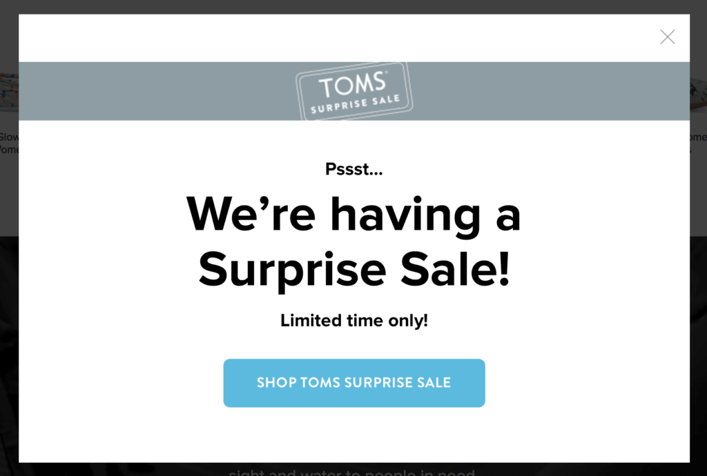
For this reason, a lot of promotions use phrasing like “Limited Time” or “While Supplies Last” because people are more likely to buy right now if they feel like they won’t be able to tomorrow. This is also the reason that a lot of promotions have the word “now” in the offer. When you create a sense of urgency in your offers you’ll prompt people into buying and it will result in a higher conversion rate.
This tactic is known as ‘scarcity marketing’, and it uses phrases such as “Going Fast” or “Offer Expires’. The effectiveness of the strategy revolves around people thinking that the product is scarce or that the deal is a once-in-a-lifetime chance. They feel pressed to make the purchase or perform an action before it is too late.
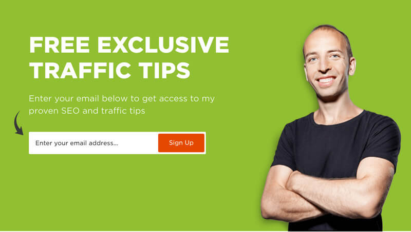
Another, among the very powerful Call-to-Action tips, is providing a sense of exclusiveness to the consumer. For example, instead of trying to grow an email list using a generic “Sign Up Now” CTA, try making a banner that says something like “Get Insider Tips” or “Be the First to Hear”. This exclusivity prompts the consumer to sign up because they feel like they are getting access to something that others could not.
4. Provide a benefit
When consumers consider making a purchase, they subconsciously evaluate the benefits of making the purchase versus the cost they must pay. To get your customers to convert at a higher rate, focus your CTA text on solving a problem or providing an outcome rather than citing product specs.
This is a mistake that a lot of marketers who are new to the industry will make. They will tell you about all the features of the product or service when they really should be telling you about the outcome that the product will provide or a problem it solves.
For the most part, people aren’t interested in the product, itself, but the problem it solves. For instance, customers don’t purchase a coffee maker because they really like coffee makers – although, some coffee freaks might. Rather, they purchase it because it solves a problem: That is their need to brew coffee. It is this outcome that they are purchasing, not necessarily the coffee maker, itself.
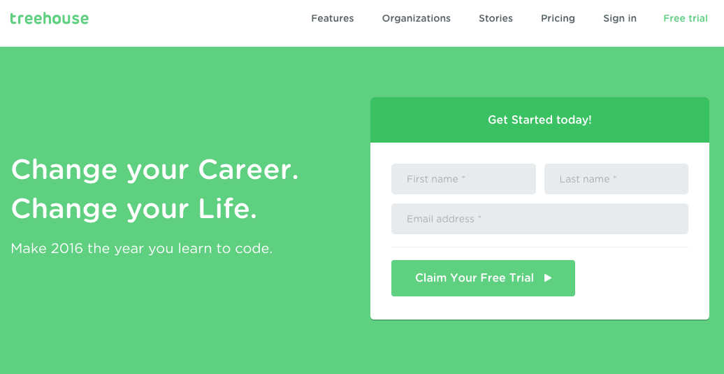
In the above example, Treehouse doesn’t sell the process of learning to code; Rather, they sell the outcome! They focus on what you can do, and how you can change your lifestyle once you’ve learned to code. When you promote the outcome – a problem that is solved, or an experience – rather than just the product or service, you will see your conversion rate increase considerably.
5. Reduce the risk
When considering a purchase, most consumers weigh the risk involved. You can make it easier for customers to convert by completely removing any risk associated with the purchase. Two common risks are the chance that it isn’t exactly what they need, and that it isn’t durable. Many companies implement policies like ‘Money Back Guarantee’ to ensure satisfaction, and even offer ‘Lifetime Warranties’ to guarantee quality.
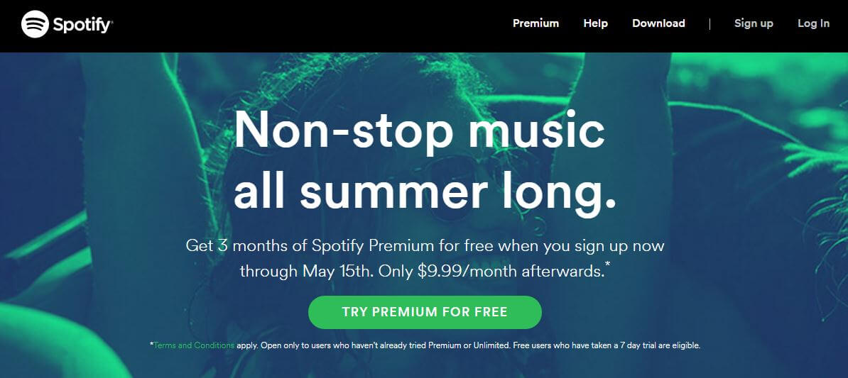
If a consumer is hesitant about making a purchase, a ‘Money-Back Guarantee’ will put all these fears of purchasing to rest and may even reassure the customer’s decision to purchase. Another popular method of circumventing consumers’ apprehension is to offer a free trial for a limited time, as Spotify has done.
Make sure that your CTAs clearly communicate your policies so that customers are not apprehensive about the purchase. For example, if you want users to sign up for an email list, make sure that they know the tips you provide are free and that there’s never going to be any obligations to pay. Also, let them know that they can unsubscribe at any time. Alternatively, if you are trying to get the user to purchase a product, make sure that they know there’s no risk because you provide a money-back guarantee and an extended warranty on your products.
When your CTAs follow this suggestion, they will effectively relieve much of the apprehension that customers may have about purchasing or performing an action, making them much more likely to convert.
6. Fonts and text size
Fonts and text sizes are a major part of any call to action. The problem, however, is that there is no one universal font or text size that is correct for every CTA. Every CTA campaign is targeted at a different audience and must also remain consistent with the brand image of the proprietor. For instance, your CTA appearance will change, depending on whether you are a skate shop, a law firm, a university, or even a blogger.
Each audience is unique and reacts differently to various CTA appearances. This is where you should conduct split (A/B) testing to discover which fonts and text sizes are right for your audience.
7. Choose colors that convert
When you are selling online, it means that all you have is virtual space to display your products or services. Visual and audio communication is extremely important to the success, not only of your CTAs but also your entire online presence. This is why it’s very important to choose the right colors.
When people see colors, the subconscious mind naturally invokes associated emotions and perceptions. Since your main form of online communication is through visual presentation, you will need a color that prompts the customer to take the desired action.
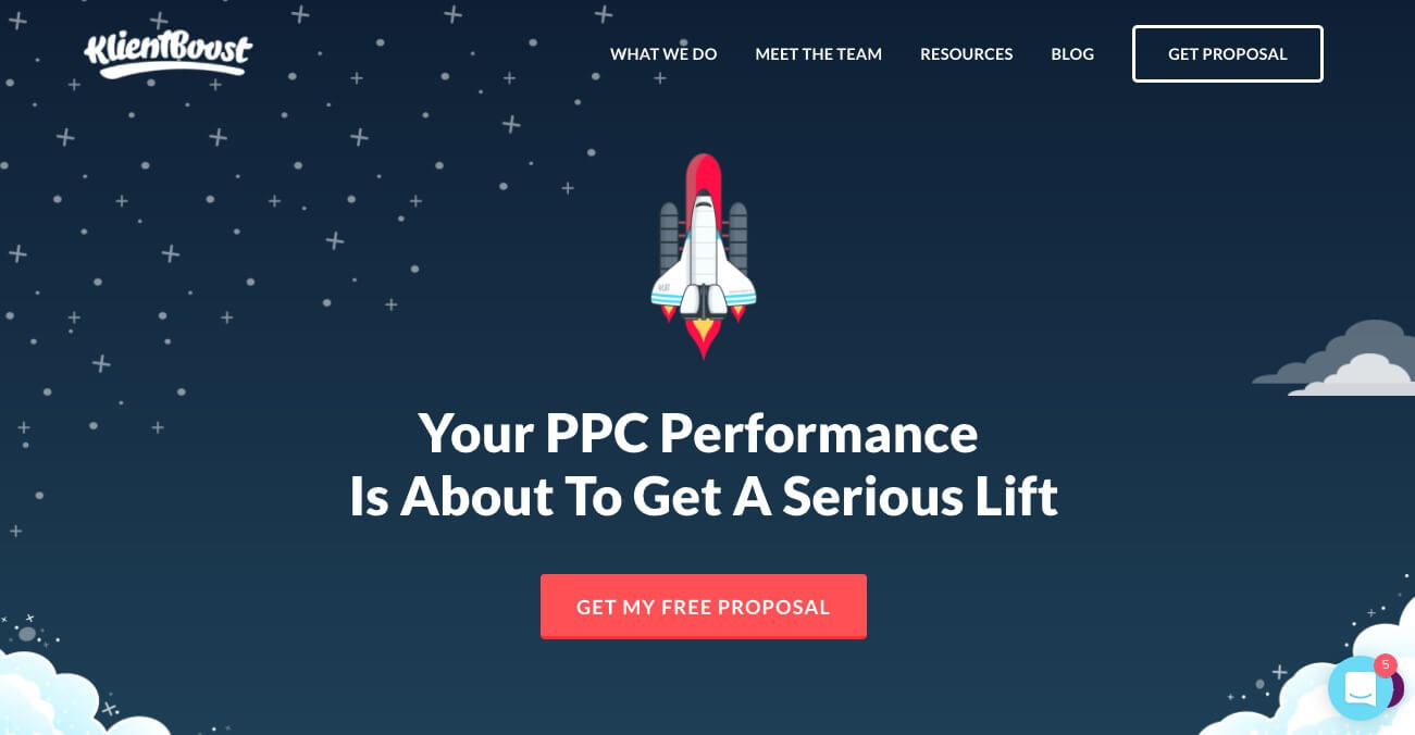
One of the most important Call-To-Action tips is to get your CTA button noticed by more users by making sure that it “pops” of the page at the user. To do this, pick colors that contrast to the other colors on the page so that the CTA stands out. If the CTA blends in with the other colors on the page, it could be overlooked. If the CTA is not vivid, users will subconsciously overlook it.
8. Ask at the right time
So far, we have only covered how you can prompt users to perform a certain action by optimizing your CTA buttons. However, just as important as the visual presentation of your campaign is the timing with which you reach the user.
One method that we use to reach users before they leave a webpage is through the use of pop-ups, or “welcome mats”.

Have you ever been on a website where about 15 seconds to 1 min after opening the website, a pop-up appears, requesting that you take a certain action? Sometimes, it’s an email subscription. Other times it’s a promotional discount code or even a registration.
Welcome mats, or pop-ups, provide a less invasive method of reaching users with a CTA, without ruining the user experience of the webpage. Further, since you can program the CTA to appear soon after the user lands on your website, it eliminates much of the risk of a visitor leaving your website before seeing your call-to-action.
9. Optimize with Split (A/B) Testing
It’s easy to create your CTA campaign – you’ve decided on your design, message, colors, and placement – and sit back and expect it to work. But there’s a huge difference between expecting your campaign to work and testing it to develop the best possible version of your CTA campaign. In essence, guessing versus proving.
This is why we conduct “split testing” – otherwise called “A/B testing”.
Split testing allows you to isolate single factors within your CTA design – text size, font, colors, placement, etc. – to discover which one converts the best. This process of split testing allows you to identify which variables your audience subconsciously reacts to, and helps you optimize those factors.
It is crucial, however, that you only test one variable at a time so that you can isolate (as best as possible) the reason why one campaign performs better than the other. So, you might test one color against another – each version for a week at a time – but don’t change both color and font style; Changing both variables would inhibit you from identifying which variable was responsible for the higher conversion rate.
10. Personalized CTAs
A new development in the world of inbound marketing is that of personalized CTA messages. This is a HubSpot feature and allows you to show different CTAs to different users based on a variety of variables, which you can set according to your needs.
These messages pull the information from previous interactions or subscriptions and use that information to address the user personally and customize the user’s experience.
For instance, you may want to show visitors from the UK a different CTA from the one you show American users. You may also want to show a different CTA to second or third-time users (returning users) than the one you would show to your first-time users. You can also display varying CTAs, based on which platform referred the user to your site, what pages they visited on your site, and any actions they performed while on your site.
In this way, you can target your users with highly-personalized messages, unique to their situation and interests, resulting in higher conversion rates. The more accurately you can target your audience and speak to their specific needs, problem, or situation, the better chance you have of catching their attention and converting them.
>Call-To-Action takeaways
As we have seen, you can use your understanding of basic psychology to optimize your calls to action, helping you increase your conversion rate. Whether you want to grow your email list, sell more products, or even get more social media followers, optimized CTAs can help you achieve your goals. By applying these steps to your CTA campaigns, it will decrease customers’ apprehension and increase your engagement and conversion rates.
Bonus Read – 4 Tweaks To Improve Your Online Conversions





 Ananya Nigam
 Harshita Lal
 Prakhya Nair